7 Cluster Analysis
This chapter introduces cluster analysis using K-means, hierarchical clustering and DBSCAN. We will discuss how to choose the number of clusters and how to evaluate the quality clusterings. In addition, we will introduce more clustering algorithms and how clustering is influenced by outliers.
The corresponding chapter of the data mining textbook is available online: Chapter 7: Cluster Analysis: Basic Concepts and Algorithms.
Packages Used in this Chapter
pkgs <- c("cluster", "dbscan", "e1071", "factoextra", "fpc",
          "GGally", "kernlab", "mclust", "mlbench", "scatterpie",
          "seriation", "tidyverse")

pkgs_install <- pkgs[!(pkgs %in% installed.packages()[,"Package"])]
if(length(pkgs_install)) install.packages(pkgs_install)
The packages used for this chapter are:
- cluster (Maechler et al. 2025)
- dbscan (Hahsler and Piekenbrock 2025)
- e1071 (Meyer et al. 2024)
- factoextra (Kassambara and Mundt 2020)
- fpc (Hennig 2024)
- GGally (Schloerke et al. 2025)
- kernlab (Karatzoglou, Smola, and Hornik 2024)
- mclust (Fraley, Raftery, and Scrucca 2024)
- mlbench (Leisch and Dimitriadou 2024)
- scatterpie (Yu 2025)
- seriation (Hahsler, Buchta, and Hornik 2025)
- tidyverse (Wickham 2023b)
7.1 Overview
Cluster analysis or clustering is the task of grouping a set of objects in such a way that objects in the same group (called a cluster) are more similar (in some sense) to each other than to those in other groups (clusters).
Clustering is also called unsupervised learning, because it tries to directly learns the structure of the data and does not rely on the availability of a correct answer or class label as supervised learning does. Clustering is often used for exploratory analysis or to preprocess data by grouping.
You can read the free sample chapter from the textbook (Tan, Steinbach, and Kumar 2005): Chapter 7. Cluster Analysis: Basic Concepts and Algorithms
7.1.1 Data Preparation
We will use here a small and very clean toy dataset called Ruspini which is included in the R package cluster.
data(ruspini, package = "cluster")The Ruspini data set, consisting of 75 points in four groups that is
popular for illustrating clustering techniques. It is a very simple data
set with well separated clusters. The original dataset has the points
ordered by group. We can shuffle the data (rows) using sample_frac
which samples by default 100%.
ruspini <- as_tibble(ruspini) |>
  sample_frac()
ruspini
## # A tibble: 75 × 2
##        x     y
##    <int> <int>
##  1    44   149
##  2    13    49
##  3     5    63
##  4    36    72
##  5    31    60
##  6    66    23
##  7    34   141
##  8    97   122
##  9    86   132
## 10   101   115
## # ℹ 65 more rows
7.1.2 Data cleaning
ggplot(ruspini, aes(x = x, y = y)) + geom_point()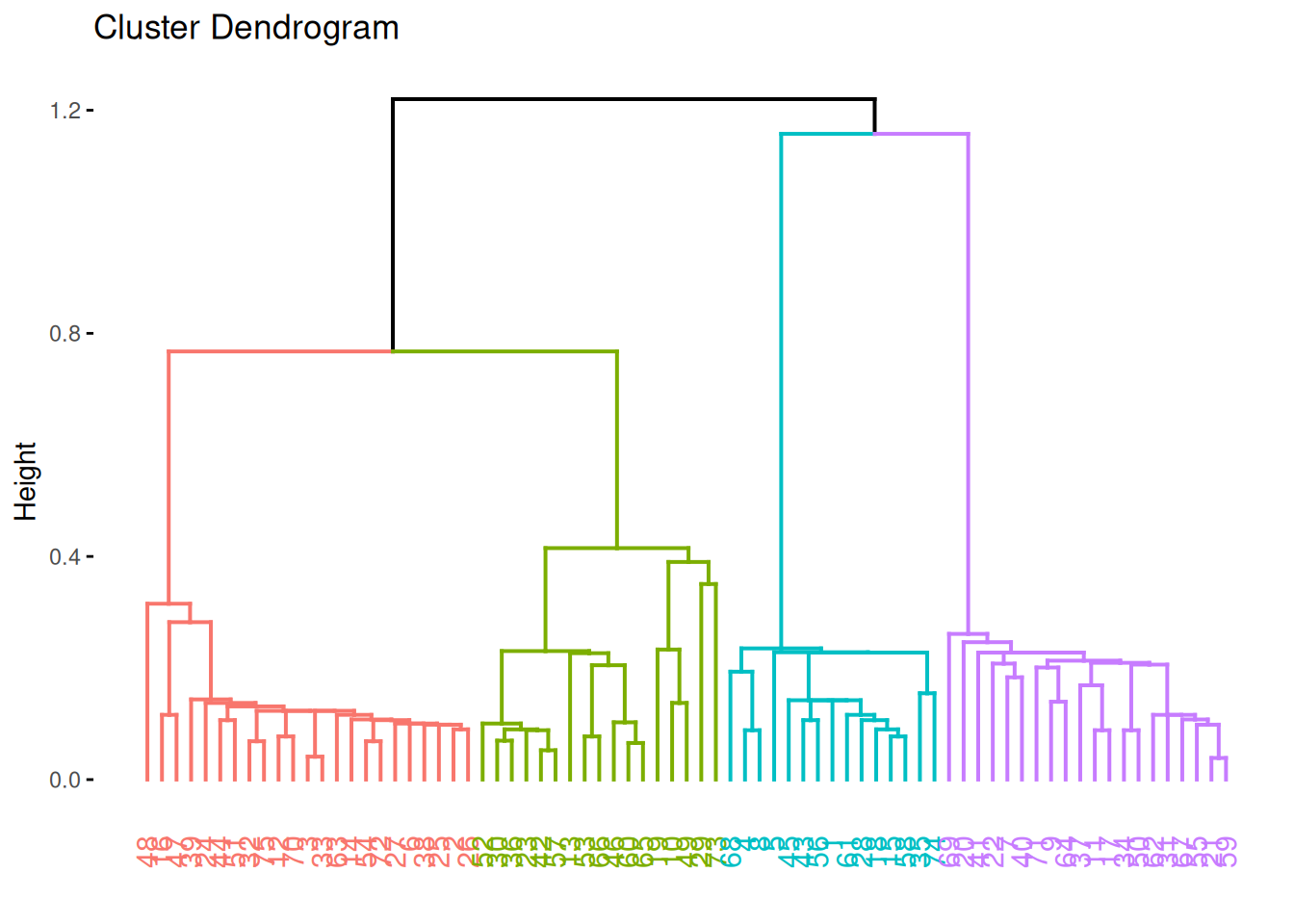
summary(ruspini)
##        x               y
##  Min.   :  4.0   Min.   :  4.0
##  1st Qu.: 31.5   1st Qu.: 56.5
##  Median : 52.0   Median : 96.0
##  Mean   : 54.9   Mean   : 92.0
##  3rd Qu.: 76.5   3rd Qu.:141.5
##  Max.   :117.0   Max.   :156.0
For most clustering algorithms it is necessary to handle missing values and outliers (e.g., remove the observations). For details see Section “Outlier removal” below. This data set has not missing values or strong outlier and looks like it has some very clear groups.i
7.1.3 Scale data
Clustering algorithms use distances and the variables with the largest number range will dominate distance calculation. The summary above shows that this is not an issue for the Ruspini dataset with both, x and y, being roughly between 0 and 150. Most data analysts will still scale each column in the data to zero mean and unit standard deviation (z-scores).
Note: The standard scale() function scales a whole data
matrix so we implement a function for a single vector and apply it to
all numeric columns.
## I use this till tidyverse implements a scale function
scale_numeric <- function(x) {
  x |> mutate(across(where(is.numeric),
                function(y) (y - mean(y, na.rm = TRUE)) / sd(y, na.rm = TRUE)))
}
ruspini_scaled <- ruspini |>
  scale_numeric()
summary(ruspini_scaled)
##        x                 y
##  Min.   :-1.6681   Min.   :-1.8074
##  1st Qu.:-0.7665   1st Qu.:-0.7295
##  Median :-0.0944   Median : 0.0816
##  Mean   : 0.0000   Mean   : 0.0000
##  3rd Qu.: 0.7088   3rd Qu.: 1.0158
##  Max.   : 2.0366   Max.   : 1.3136
After scaling, most z-scores will fall in the range \([-3,3]\) (z-scores are measured in standard deviations from the mean), where \(0\) means average.
7.2 K-means
k-means implicitly assumes Euclidean distances. We use \(k = 4\) clusters and run the algorithm 10 times with random initialized centroids. The best result is returned.
km <- kmeans(ruspini_scaled, centers = 4, nstart = 10)
km
## K-means clustering with 4 clusters of sizes 20, 23, 17, 15
##
## Cluster means:
##         x       y
## 1 -1.1386 -0.5560
## 2 -0.3595  1.1091
## 3  1.4194  0.4693
## 4  0.4607 -1.4912
##
## Clustering vector:
##  [1] 2 1 1 1 1 4 2 3 3 3 3 4 2 3 2 2 1 1 3 3 1 4 1 4 2 4 3 3
## [29] 4 4 3 2 2 1 1 2 1 2 2 1 3 2 4 4 2 3 2 2 4 2 1 3 1 3 1 2
## [57] 3 3 1 1 4 4 2 1 4 2 2 1 2 2 1 4 3 4 2
##
## Within cluster sum of squares by cluster:
## [1] 2.705 2.659 3.641 1.082
##  (between_SS / total_SS =  93.2 %)
##
## Available components:
##
## [1] "cluster"      "centers"      "totss"
## [4] "withinss"     "tot.withinss" "betweenss"
## [7] "size"         "iter"         "ifault"
km is an R object implemented as a list.
str(km)
## List of 9
##  $ cluster     : int [1:75] 2 1 1 1 1 4 2 3 3 3 ...
##  $ centers     : num [1:4, 1:2] -1.139 -0.36 1.419 0.461 -0.556 ...
##   ..- attr(*, "dimnames")=List of 2
##   .. ..$ : chr [1:4] "1" "2" "3" "4"
##   .. ..$ : chr [1:2] "x" "y"
##  $ totss       : num 148
##  $ withinss    : num [1:4] 2.71 2.66 3.64 1.08
##  $ tot.withinss: num 10.1
##  $ betweenss   : num 138
##  $ size        : int [1:4] 20 23 17 15
##  $ iter        : int 3
##  $ ifault      : int 0
##  - attr(*, "class")= chr "kmeans"
The clustering vector is just a list element
containing the cluster assignment for each data row and can be accessed
using km$cluster. I add the cluster assignment as a column to the
original dataset (I make it a factor since it represents a nominal label).
ruspini_clustered <- ruspini |>
add_column(cluster = factor(km$cluster))
ruspini_clustered
## # A tibble: 75 × 3
## x y cluster
## <int> <int> <fct>
## 1 44 149 2
## 2 13 49 1
## 3 5 63 1
## 4 36 72 1
## 5 31 60 1
## 6 66 23 4
## 7 34 141 2
## 8 97 122 3
## 9 86 132 3
## 10 101 115 3
## # ℹ 65 more rows
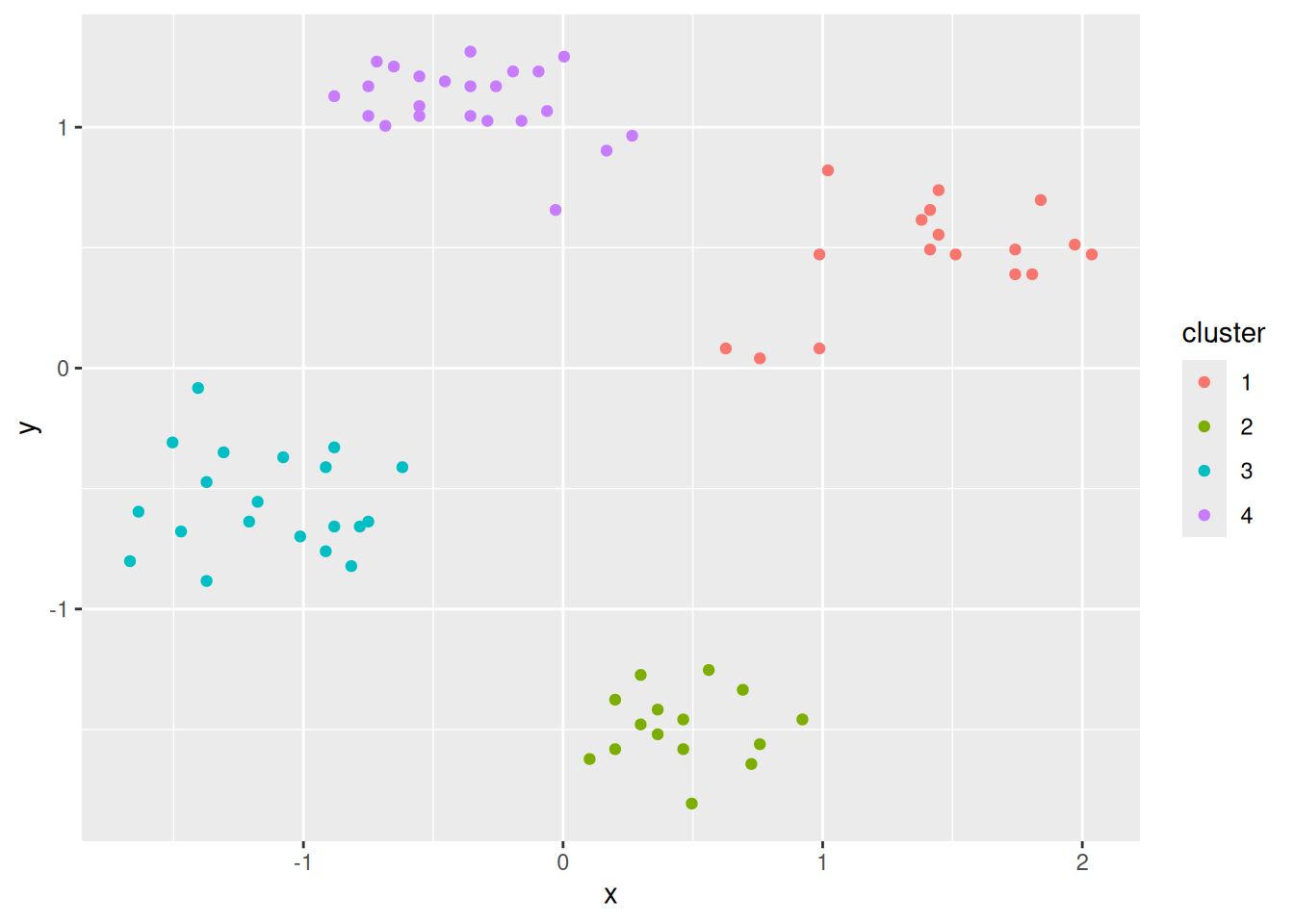
ggplot(ruspini_clustered, aes(x = x, y = y)) +
geom_point(aes(color = cluster))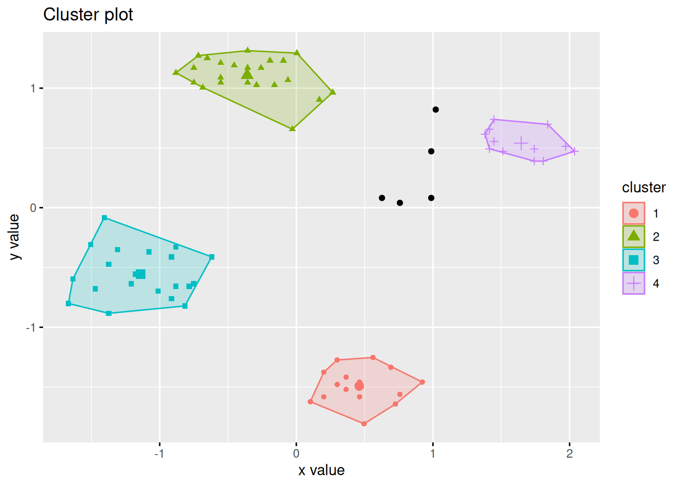
Add the centroids to the plot. The centroids are scaled, so we need to unscale them
to plot them over the original data. The second geom_points uses
not the original data but specifies the centroids as its dataset.
unscale <- function(x, original_data) {
  if (ncol(x) != ncol(original_data))
    stop("Function needs matching columns!")
  x * matrix(apply(original_data, MARGIN = 2, sd, na.rm = TRUE),
             byrow = TRUE, nrow = nrow(x), ncol = ncol(x)) +
    matrix(apply(original_data, MARGIN = 2, mean, na.rm = TRUE),
           byrow = TRUE, nrow = nrow(x), ncol = ncol(x))
}

centroids <- km$centers %>%
                unscale(original_data = ruspini) %>%
                as_tibble(rownames = "cluster")
centroids
## # A tibble: 4 × 3
##   cluster     x     y
##   <chr>   <dbl> <dbl>
## 1 1        20.2  65.0
## 2 2        43.9 146.
## 3 3        98.2 115.
## 4 4        68.9  19.4
ggplot(ruspini_clustered, aes(x = x, y = y)) +
  geom_point(aes(color = cluster)) +
  geom_point(data = centroids, aes(x = x, y = y, color = cluster),
             shape = 3, size = 10)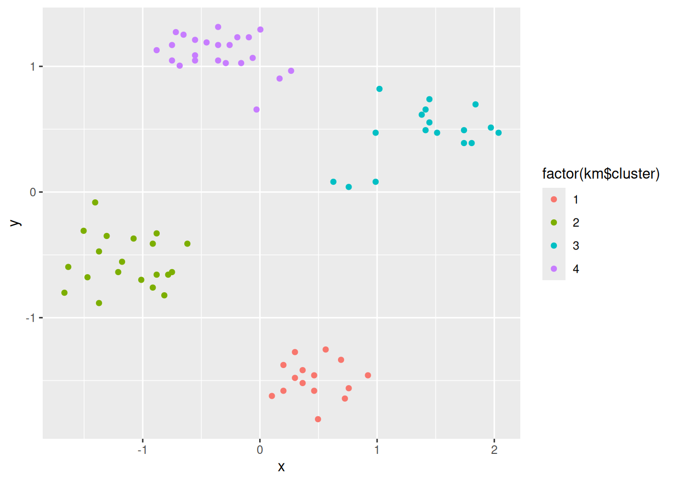
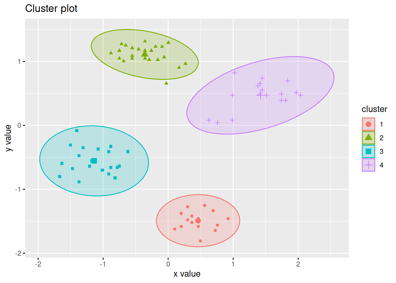
The factoextra package provides also a good visualization with object labels
and ellipses for clusters.
library(factoextra)
fviz_cluster(km, data = ruspini_scaled, centroids = TRUE,
             repel = TRUE, ellipse.type = "norm")
7.2.1 Inspect Clusters
We inspect the clusters created by the 4-cluster k-means solution. The following code can be adapted to be used for other clustering methods.
Inspect the centroids with horizontal bar charts organized by cluster. To group the plots by cluster, we have to change the data format to the “long”-format using a pivot operation. I use colors to match the clusters in the scatter plots.
ggplot(pivot_longer(centroids,
                    cols = c(x, y),
                    names_to = "feature"),
  #aes(x = feature, y = value, fill = cluster)) +
  aes(x = value, y = feature, fill = cluster)) +
  geom_bar(stat = "identity") +
  facet_grid(cols = vars(cluster))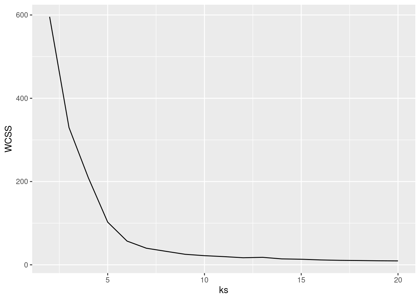
7.2.2 Extract a Single Cluster
You need is to filter the rows corresponding to the cluster index. The next example calculates summary statistics and then plots all data points of cluster 1.
cluster1 <- ruspini_clustered |>
  filter(cluster == 1)
cluster1
## # A tibble: 20 × 3
##        x     y cluster
##    <int> <int> <fct>
##  1    13    49 1
##  2     5    63 1
##  3    36    72 1
##  4    31    60 1
##  5    27    72 1
##  6     9    77 1
##  7    28    76 1
##  8    24    58 1
##  9    27    55 1
## 10    18    61 1
## 11    15    75 1
## 12    13    69 1
## 13    12    88 1
## 14    10    59 1
## 15    19    65 1
## 16    32    61 1
## 17    22    74 1
## 18     4    53 1
## 19    28    60 1
## 20    30    52 1
summary(cluster1)
##        x              y        cluster
##  Min.   : 4.0   Min.   :49.0   1:20
##  1st Qu.:12.8   1st Qu.:58.8   2: 0
##  Median :20.5   Median :62.0   3: 0
##  Mean   :20.1   Mean   :65.0   4: 0
##  3rd Qu.:28.0   3rd Qu.:72.5
##  Max.   :36.0   Max.   :88.0
ggplot(cluster1, aes(x = x, y = y)) + geom_point() +
  coord_cartesian(xlim = c(0, 120), ylim = c(0, 160))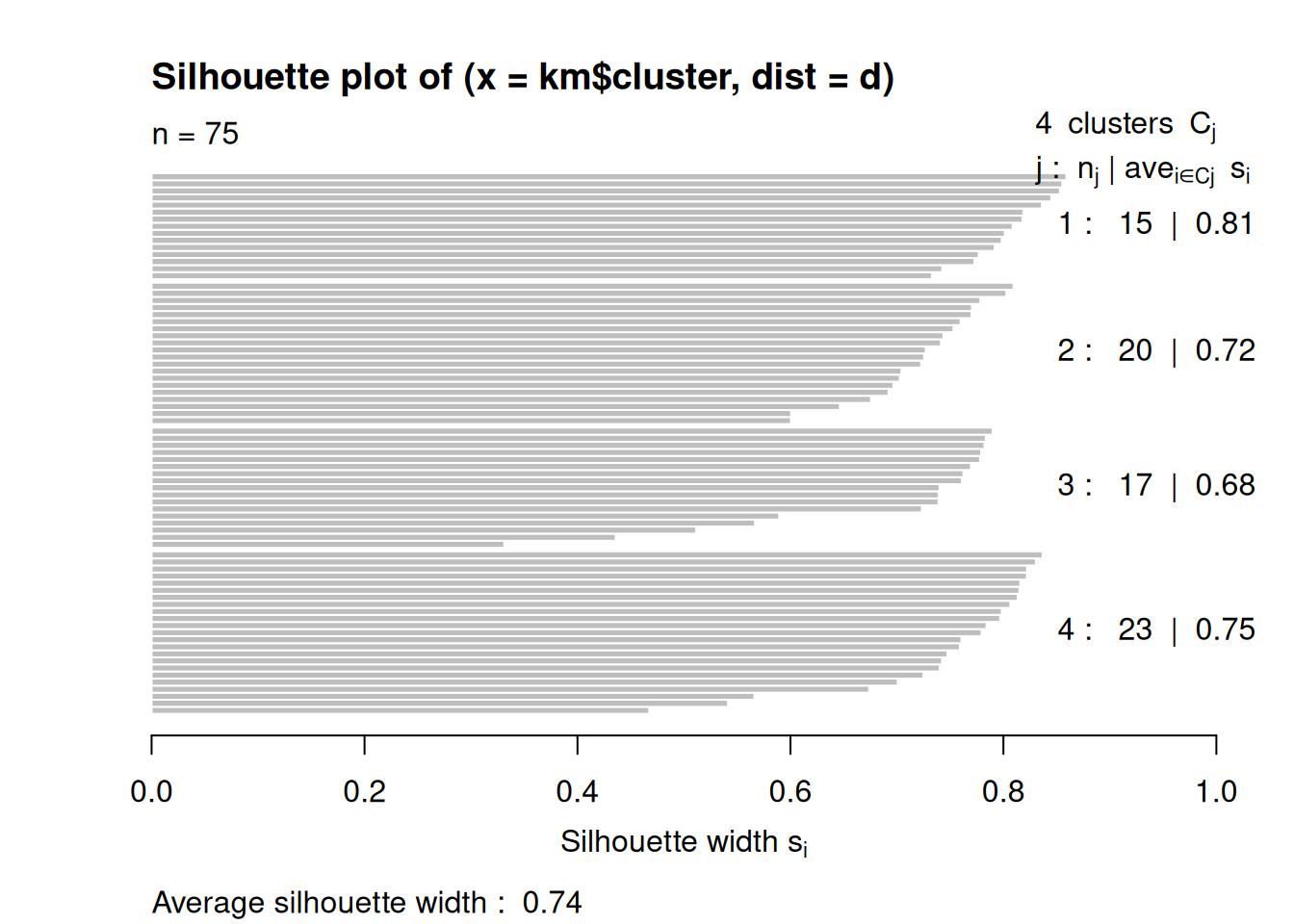
What happens if we try to cluster with 8 centers?
fviz_cluster(kmeans(ruspini_scaled, centers = 8), data = ruspini_scaled,
  centroids = TRUE,  geom = "point", ellipse.type = "norm")
## Too few points to calculate an ellipse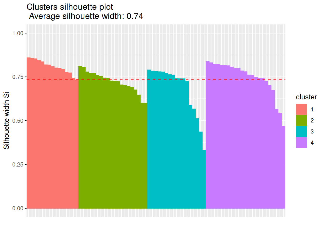
7.3 Agglomerative Hierarchical Clustering
Hierarchical clustering starts with a distance matrix. dist() defaults
to method = "euclidean".
Notes:
- Distance matrices become very large quickly (the space complexity is \(O(n^2)\) where \(n\) is the number if data points). It is only possible to calculate and store the matrix for small to medium data sets (maybe a few hundred thousand data points) in main memory. If your data is too large then you can use sampling to reduce the number of points to cluster.
- The data needs to be scaled since we compute distances.
7.3.1 Creating a Dendrogram
d <- dist(ruspini_scaled)hclust() implements agglomerative hierarchical
clustering.
The linkage function defines how the distance between two clusters (sets of points)
is calculated. We specify the complete-link method where the distance between two groups
is measured by the distance between the two farthest apart points in the two groups.
hc <- hclust(d, method = "complete")Hierarchical clustering does not return cluster assignments but a dendrogram object which shows how the objects on the x-axis are successively joined together when going up along the y-axis. The y-axis represents the distance at which groups of points are joined together. The standard plot function displays the dendrogram.
plot(hc)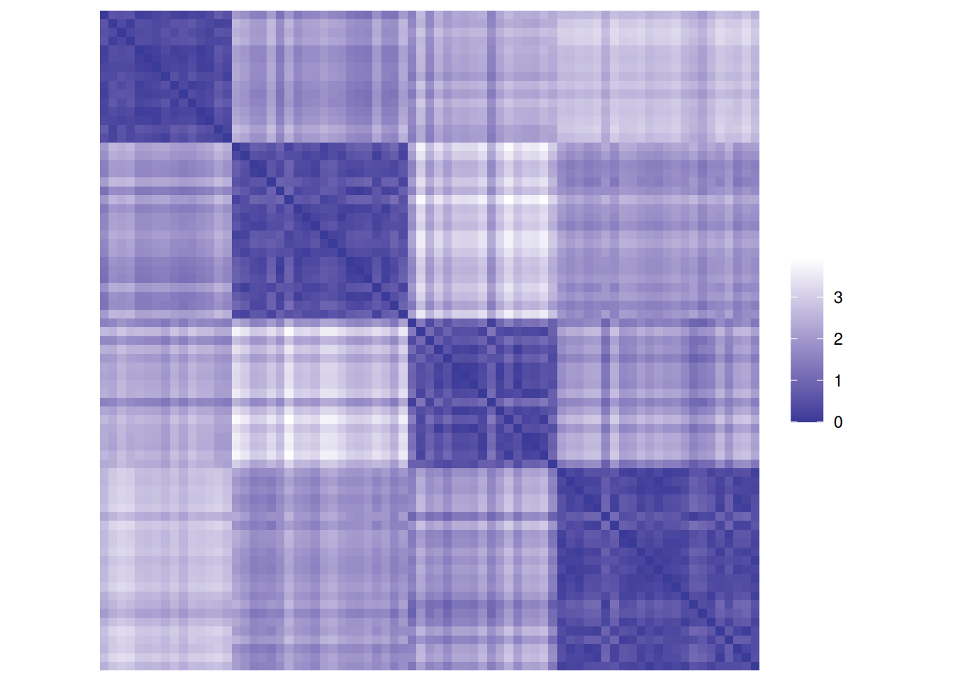
The package factoextra provides a ggplot function to plot dendrograms.
fviz_dend(hc)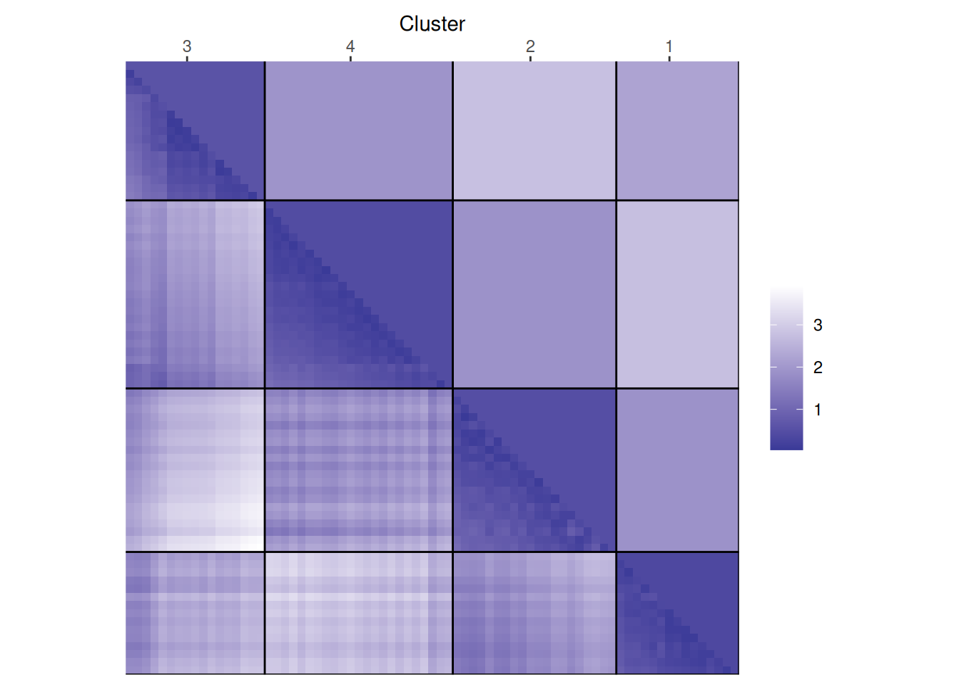
More plotting options for dendrograms, including plotting parts of large dendrograms can be found here.
7.3.2 Extracting a Partitional Clustering
Partitional clusterings with cluster assignments can be extracted from a dendrogram
by cutting the dendrogram horizontally using cutree(). Here we cut it into four parts
and add the cluster id to the data.
clusters <- cutree(hc, k = 4)
cluster_complete <- ruspini_scaled |>
  add_column(cluster = factor(clusters))
cluster_complete
## # A tibble: 75 × 3
##         x      y cluster
##     <dbl>  <dbl> <fct>
##  1 -0.357  1.17  1
##  2 -1.37  -0.883 2
##  3 -1.64  -0.596 2
##  4 -0.619 -0.411 2
##  5 -0.783 -0.658 2
##  6  0.365 -1.42  3
##  7 -0.685  1.01  1
##  8  1.38   0.615 4
##  9  1.02   0.821 4
## 10  1.51   0.472 4
## # ℹ 65 more rows
The 4 different clusters can be shown in the dendrogram using different colors.
fviz_dend(hc, k = 4)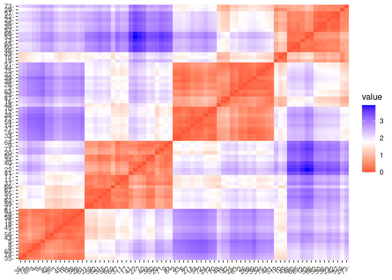
We can also color in the scatterplot.
ggplot(cluster_complete, aes(x, y, color = cluster)) +
  geom_point()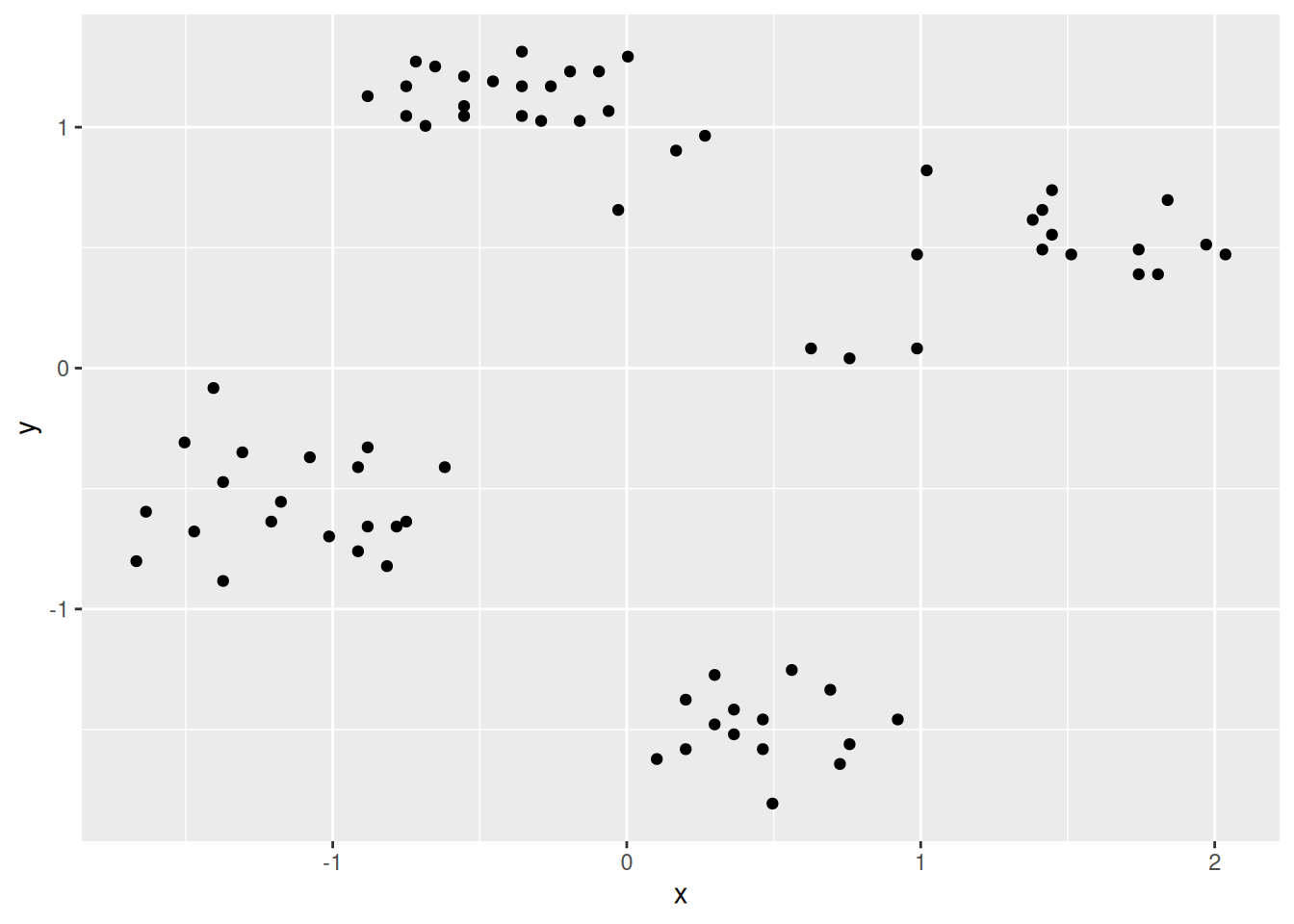
The package factoextra provides an alternative visualization. Since it needs
a partition object as the first argument, we create one as a simple list.
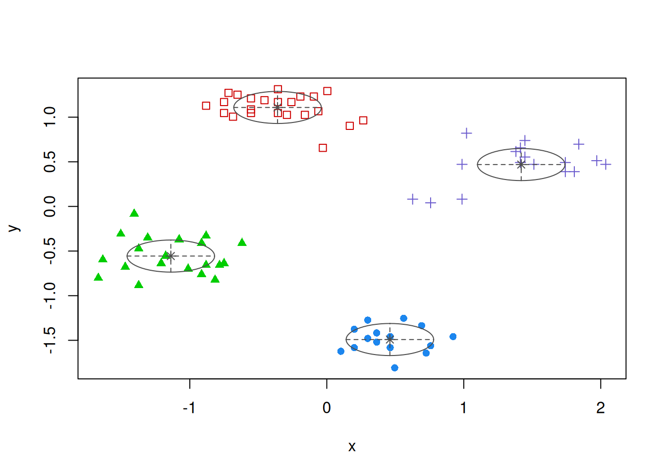
fviz_cluster(list(data = ruspini_scaled,
                  cluster = cutree(hc, k = 4)),
             geom = "point")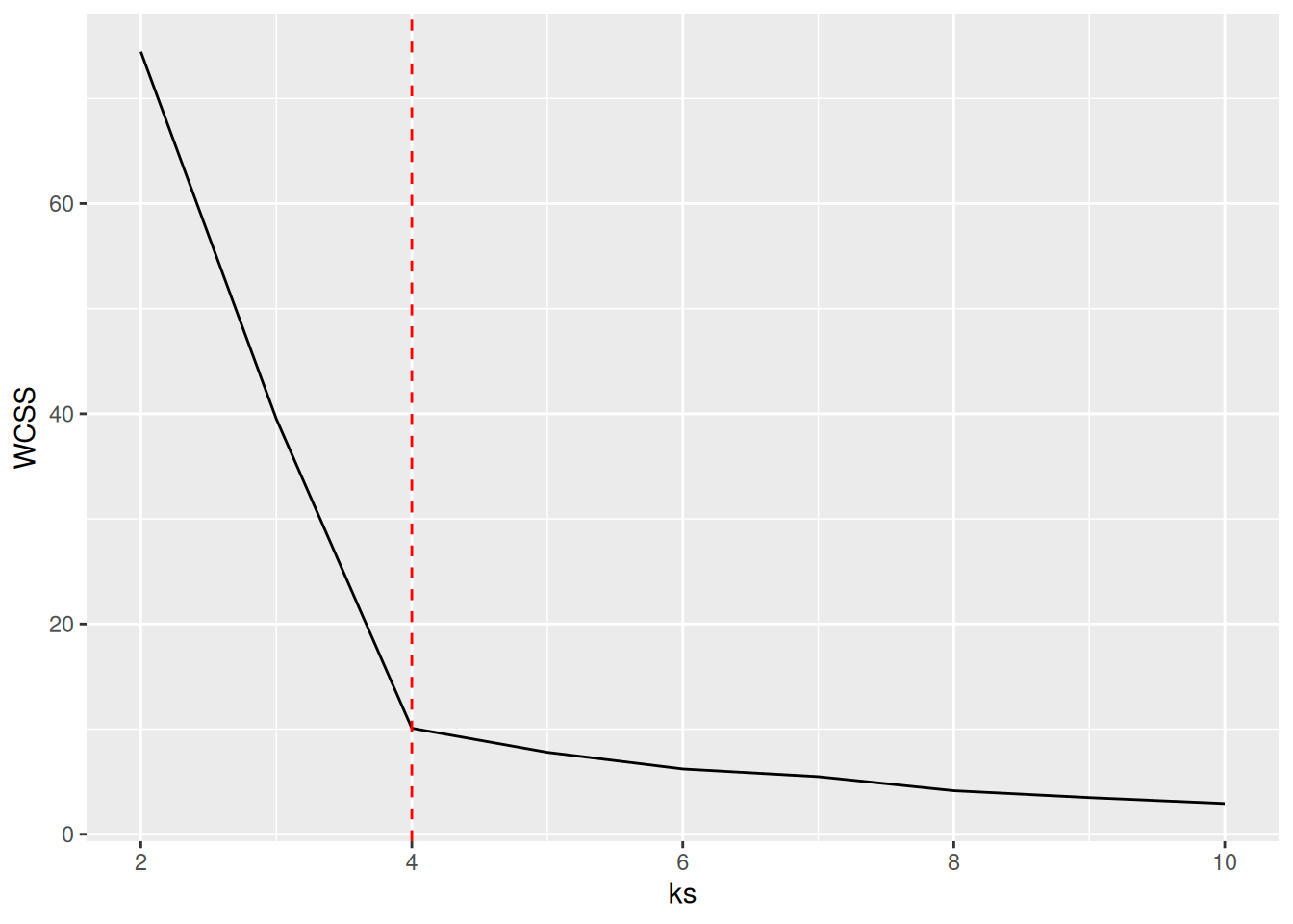
Here are the results if we use the single-link method to join clusters. Single-link measures the distance between two groups by the by the distance between the two closest points from the two groups.
fviz_cluster(list(data = ruspini_scaled,
                  cluster = cutree(hc_single, k = 4)),
             geom = "point")
The most important difference between complete-link and single-link is that complete-link prefers globular clusters and single-link shows chaining (see the staircase pattern in the dendrogram).
7.4 DBSCAN
DBSCAN stands for “Density-Based
Spatial Clustering of Applications with Noise.” It groups together
points that are closely packed together and treats points in low-density
regions as outliers. DBSCAN is implemented in package dbscan.
library(dbscan)
##
## Attaching package: 'dbscan'
## The following object is masked from 'package:stats':
##
##     as.dendrogram
7.4.1 DBSCAN Parameters
DBSCAN has two parameters that interact with each other. Changing one typically means that the other one also has to be adjusted.
minPts defines how many points are needed in the epsilon
neighborhood to make a point a core point for a cluster. It is often chosen
as a smoothing parameter, where larger values smooth the density estimation more
but also ignore smaller structures with less then minPts.
eps is the radius of the epsilon neighborhood around a point in which the
number of points is counted.
Users typically first select minPts. We use here minPts = 4.
To decide on epsilon, the knee in the kNN distance plot is often used.
All points are sorted by their kNN distance. The idea is that points with
a low kNN distance are located in a dense area which should become a cluster.
Points with a large kNN distance are in a low density area and most
likely represent outliers and noise.
kNNdistplot(ruspini_scaled, minPts = 4)
abline(h = .32, col = "red")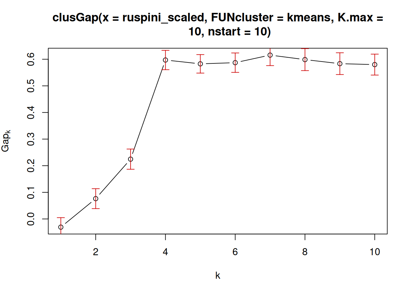
Note that minPts contains the point itself, while the k-nearest neighbor
distance calculation does not.
The plot uses therefor k = minPts - 1.
The knee is visible around eps = .32 (shown by the manually added red line).
The points to the left of the intersection of the
k-nearest neighbor distance line and the red line are the points that will be
core points during clustering at the specified parameters.
7.4.2 Cluster using DBSCAN
Clustering with dbscan() returns a dbscan object.
db <- dbscan(ruspini_scaled, eps = .32, minPts = 4)
db
## DBSCAN clustering for 75 objects.
## Parameters: eps = 0.32, minPts = 4
## Using euclidean distances and borderpoints = TRUE
## The clustering contains 4 cluster(s) and 5 noise points.
##
##  0  1  2  3  4
##  5 23 20 15 12
##
## Available fields: cluster, eps, minPts, metric,
##                   borderPoints
str(db)
## List of 5
##  $ cluster     : int [1:75] 1 2 2 2 2 3 1 4 0 4 ...
##  $ eps         : num 0.32
##  $ minPts      : num 4
##  $ metric      : chr "euclidean"
##  $ borderPoints: logi TRUE
##  - attr(*, "class")= chr [1:2] "dbscan_fast" "dbscan"
The cluster element is the cluster assignment with cluster labels. The
special cluster label 0 means that the point is noise and not assigned to a
cluster.
ggplot(ruspini_scaled |> add_column(cluster = factor(db$cluster)),
  aes(x, y, color = cluster)) + geom_point()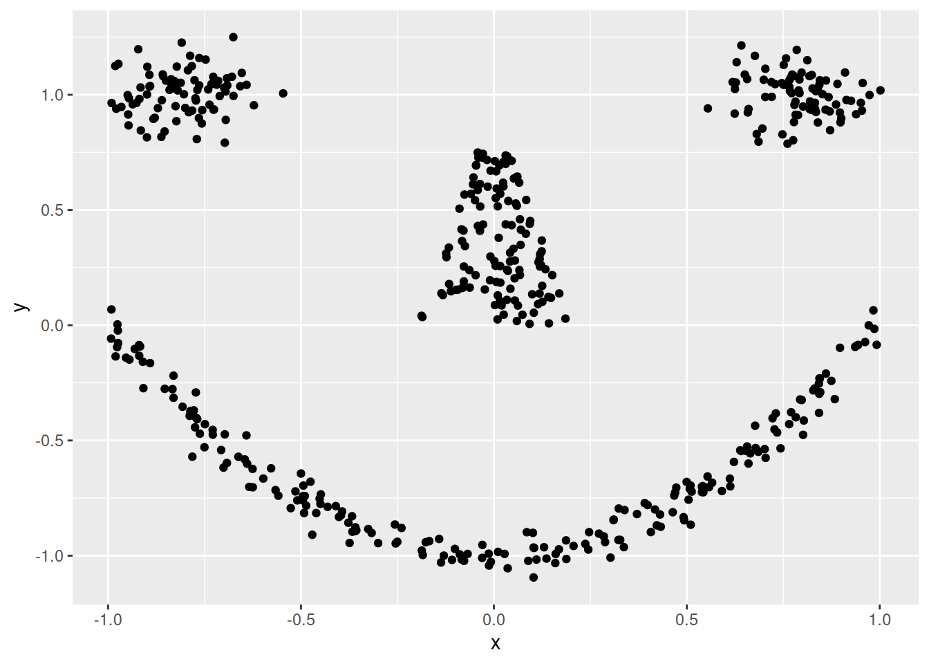
DBSCAN found 5 noise points. fviz_cluster() can be
used to create a ggplot visualization.
fviz_cluster(db, ruspini_scaled, geom = "point")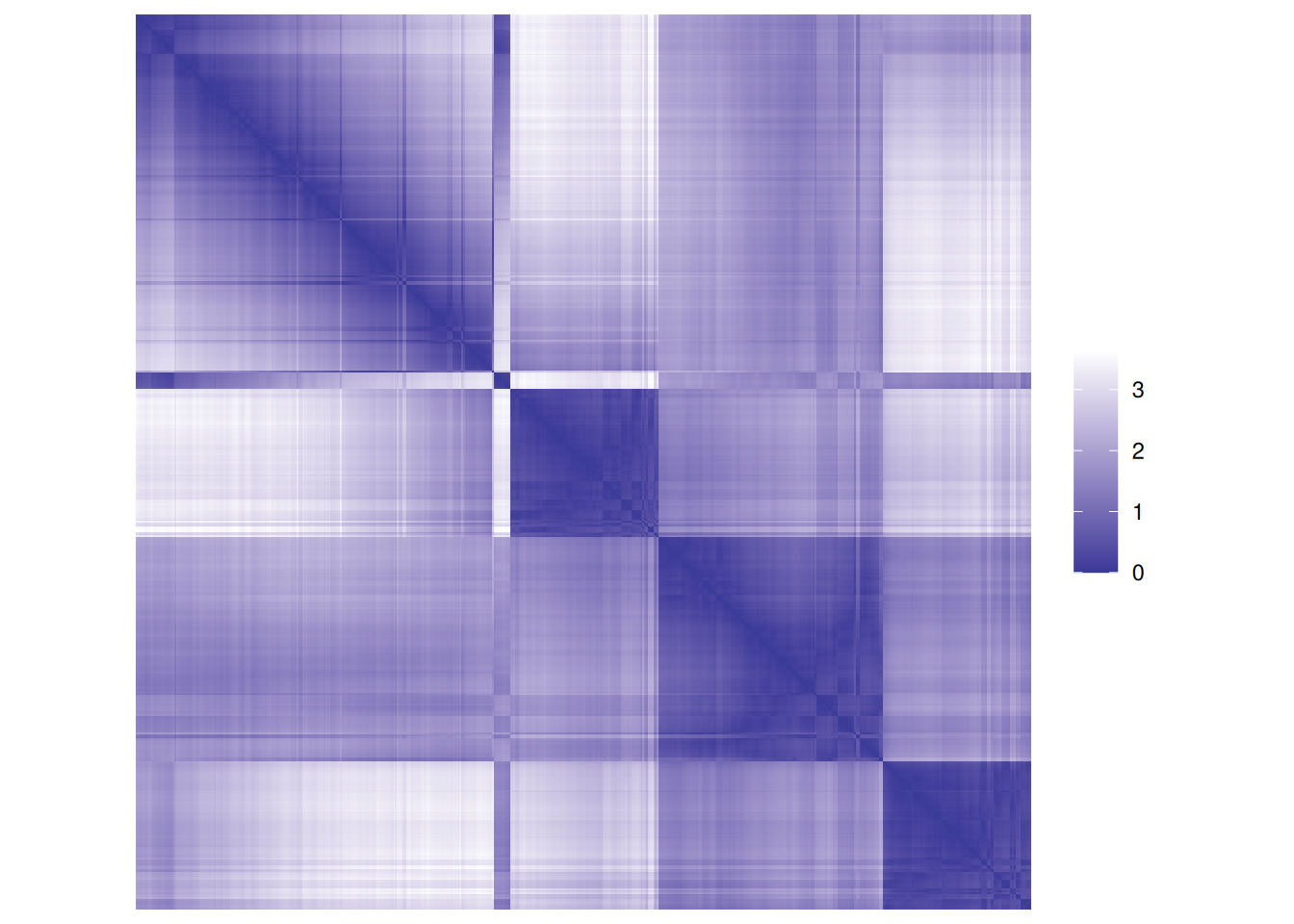
Different values for minPts and eps can lead to vastly different clusterings.
Often, a misspecification leads to all points being noise points or a single cluster.
Also, if the clusters are not well separated, then DBSCAN has a hard
time splitting them.
7.5 Cluster Evaluation
7.5.1 Unsupervised Cluster Evaluation
This is also often called internal cluster evaluation since it does not use extra external labels.
We will evaluate the k-means clustering from above.
7.5.1.1 Visual Methods
For data in 2 dimensions, a scatter plot will show if the clusters look right.
ggplot(ruspini_scaled,
aes(x, y, color = factor(km$cluster))) +
geom_point()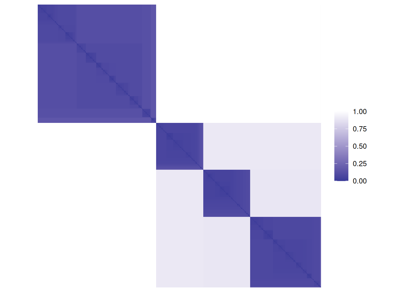 For data with more dimensions or with columns containing nominal/ordinal data,
we cannot look at the scatter plot. However, we can visualize a reordered similarity/dissimilarity
matrix.
For data with more dimensions or with columns containing nominal/ordinal data,
we cannot look at the scatter plot. However, we can visualize a reordered similarity/dissimilarity
matrix.First, we calculate a distance matrix and inspect the distance matrix between the first 5 objects.
d <- dist(ruspini_scaled)

as.matrix(d)[1:5, 1:5]
##       1      2      3      4      5
## 1 0.000 2.2910 2.1801 1.6026 1.8765
## 2 2.291 0.0000 0.3891 0.8897 0.6319
## 3 2.180 0.3891 0.0000 1.0330 0.8546
## 4 1.603 0.8897 1.0330 0.0000 0.2959
## 5 1.876 0.6319 0.8546 0.2959 0.0000
Matrix visualizations with reordering are provided in package seriation.
Matrix visualization creates
a false-color image where each value in the matrix as a pixel with the color representing the value.
library(seriation)
##
## Attaching package: 'seriation'
## The following object is masked from 'package:lattice':
##
##     panel.lines
pimage(d, main = "Unordered")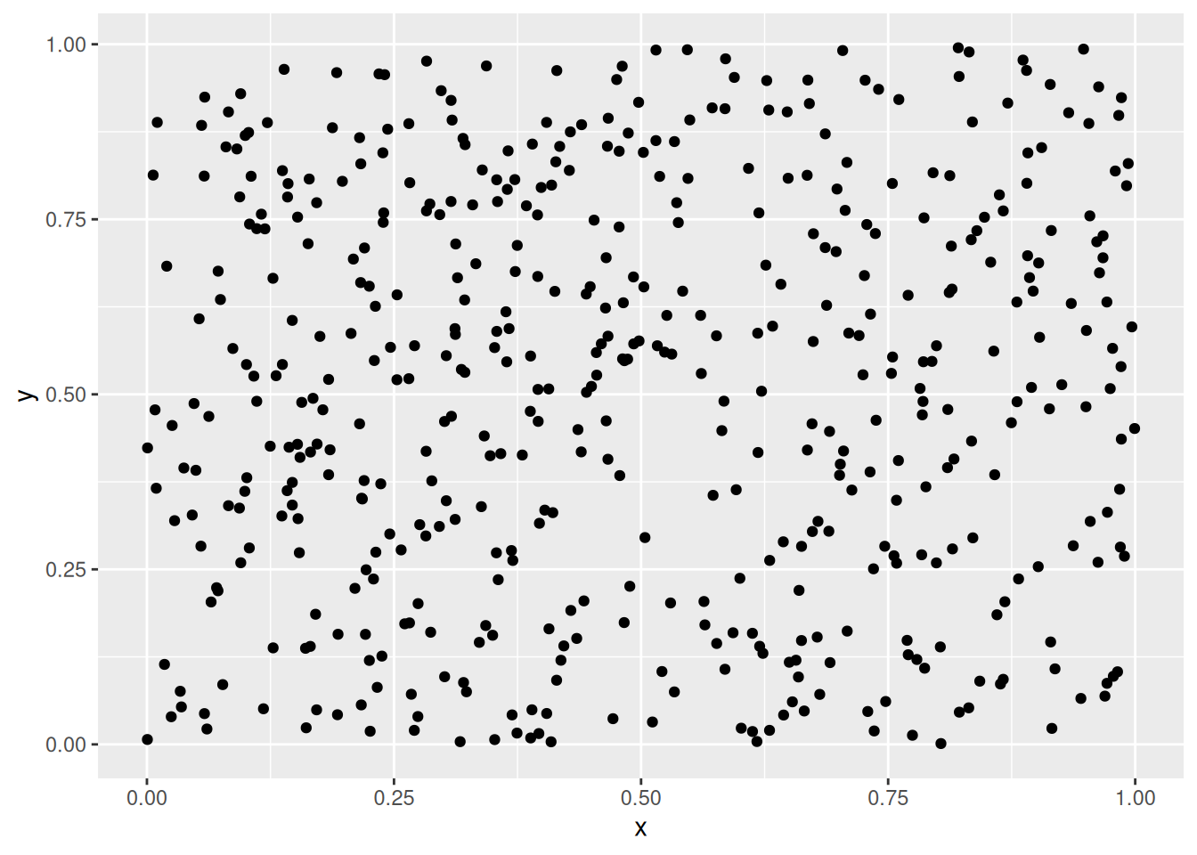
 Remember, the rows and columns in the matrix represent the objects (rows of the original
data).
The reordered distance matrix has the objects ordered by cluster (all points in cluster 1 followed
by all points in cluster 2, and so on).
The matrix visualization shows a clear block structure indicating that the points within
each cluster are close together (low distance), while the other clusters are farther away.
Remember, the rows and columns in the matrix represent the objects (rows of the original
data).
The reordered distance matrix has the objects ordered by cluster (all points in cluster 1 followed
by all points in cluster 2, and so on).
The matrix visualization shows a clear block structure indicating that the points within
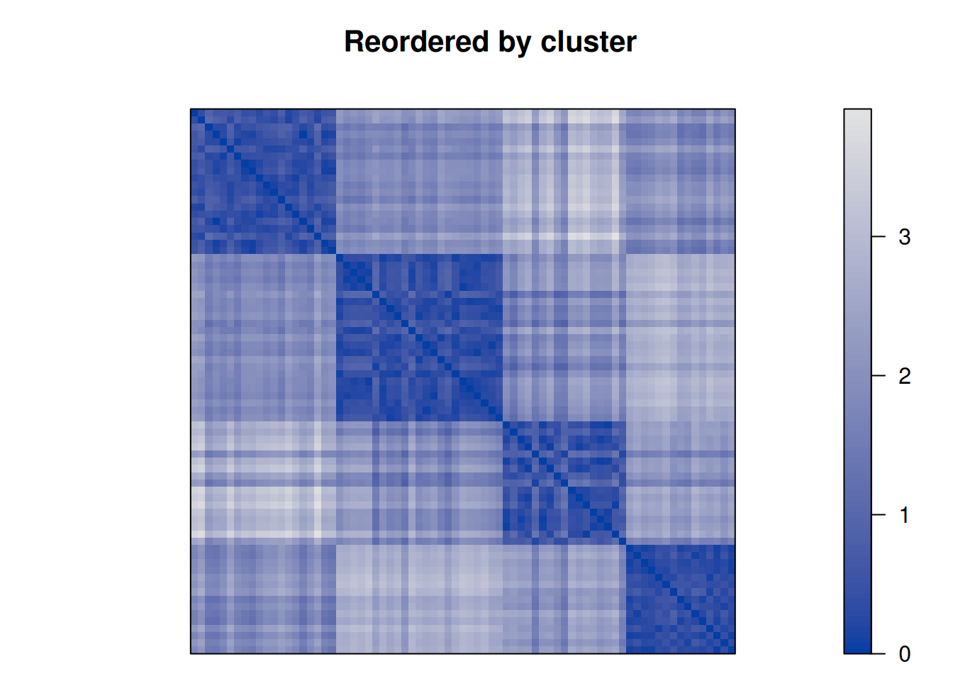
each cluster are close together (low distance), while the other clusters are farther away.An advanced version of this plot is called a dissimilarity plot. It reorders rows and columns based on cluster labels and adds lines for cluster borders. It also presents average distance values above the diagonal to make the structure between clusters easier to evaluate.
dissplot(d, km$cluster)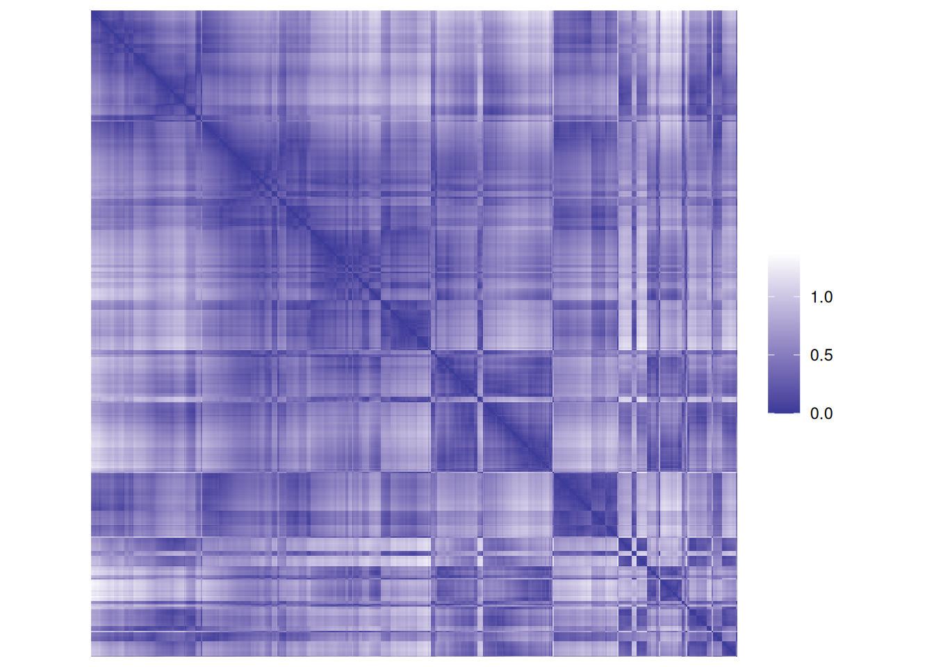
7.5.1.2 Evaluation Metrics
The two most popular quality metrics are the within-cluster sum of
squares (WCSS) used as the optimization objective by
\(k\)-means and the
average silhouette
width. Look at
within.cluster.ss and avg.silwidth below.
A comprehensive set of evaluation metric is calculated by cluster.stats() in
package fpc.
# library(fpc)
fpc::cluster.stats(d, as.integer(km$cluster))
## $n
## [1] 75
##
## $cluster.number
## [1] 4
##
## $cluster.size
## [1] 20 23 17 15
##
## $min.cluster.size
## [1] 15
##
## $noisen
## [1] 0
##
## $diameter
## [1] 1.1193 1.1591 1.4627 0.8359
##
## $average.distance
## [1] 0.4824 0.4286 0.5806 0.3564
##
## $median.distance
## [1] 0.4492 0.3934 0.5024 0.3380
##
## $separation
## [1] 1.1577 0.7676 0.7676 1.1577
##
## $average.toother
## [1] 2.157 2.149 2.293 2.308
##
## $separation.matrix
##       [,1]   [,2]   [,3]  [,4]
## [1,] 0.000 1.2199 1.3397 1.158
## [2,] 1.220 0.0000 0.7676 1.958
## [3,] 1.340 0.7676 0.0000 1.308
## [4,] 1.158 1.9577 1.3084 0.000
##
## $ave.between.matrix
##       [,1]  [,2]  [,3]  [,4]
## [1,] 0.000 1.887 2.772 1.874
## [2,] 1.887 0.000 1.925 2.750
## [3,] 2.772 1.925 0.000 2.220
## [4,] 1.874 2.750 2.220 0.000
##
## $average.between
## [1] 2.219
##
## $average.within
## [1] 0.463
##
## $n.between
## [1] 2091
##
## $n.within
## [1] 684
##
## $max.diameter
## [1] 1.463
##
## $min.separation
## [1] 0.7676
##
## $within.cluster.ss
## [1] 10.09
##
## $clus.avg.silwidths
##      1      2      3      4
## 0.7211 0.7455 0.6813 0.8074
##
## $avg.silwidth
## [1] 0.7368
##
## $g2
## NULL
##
## $g3
## NULL
##
## $pearsongamma
## [1] 0.8416
##
## $dunn
## [1] 0.5248
##
## $dunn2
## [1] 3.228
##
## $entropy
## [1] 1.373
##
## $wb.ratio
## [1] 0.2086
##
## $ch
## [1] 323.6
##
## $cwidegap
## [1] 0.2612 0.3153 0.4150 0.2352
##
## $widestgap
## [1] 0.415
##
## $sindex
## [1] 0.8583
##
## $corrected.rand
## NULL
##
## $vi
## NULL
Some notes about the code:
- I do not load the package
fpcusinglibrary()since it would mask thedbscan()function in packagedbscan. Instead I use the namespace operator::. - The clustering (second argument below) has to be supplied as a vector
of integers (cluster IDs) and cannot be a factor (to make sure, we can use
as.integer()).
Most metrics are easy to identify by their name. Some important metrics are:
-
cluster.size: vector of cluster sizes -
within.cluster.ss: within clusters sum of squares (k-means objective function). -
avg.silwidth: average silhouette width -
pearsongamma: correlation between the distances and a 0-1-vector cluster incidence matrix.
Some numbers are NULL. These are measures only available for supervised evaluation.
Read the man page for cluster.stats() for an explanation of all the available indices.
We can compare different clusterings.
sapply(
  list(
    km_4 = km$cluster,
    hc_compl_4 = cutree(hc, k = 4),
    hc_compl_5 = cutree(hc, k = 5),
    hc_single_5 = cutree(hc_single, k = 5)
  ),
  FUN = function(x)
    fpc::cluster.stats(d, x))[c("within.cluster.ss",
                                "avg.silwidth",
                                "pearsongamma",
                                "dunn"), ]
##                   km_4   hc_compl_4 hc_compl_5 hc_single_5
## within.cluster.ss 10.09  10.09      8.314      7.791
## avg.silwidth      0.7368 0.7368     0.6642     0.6886
## pearsongamma      0.8416 0.8416     0.8042     0.816
## dunn              0.5248 0.5248     0.1988     0.358
With 4 clusters, k-means and hierarchical clustering produce exactly the same clustering. While the two different hierarchical methods with 5 clusters produce a smaller WCSS, they are actually worse given all three other measures.
Next, we look at the silhouette using a silhouette plot.
library(cluster)
##
## Attaching package: 'cluster'
## The following object is masked _by_ '.GlobalEnv':
##
##     ruspini
plot(silhouette(km$cluster, d))
Note: The silhouette plot does not show correctly in R Studio if you
have too many objects (bars are missing). I will work when you open a
new plotting device with windows(), x11() or quartz().
ggplot visualization using factoextra
fviz_silhouette(silhouette(km$cluster, d))
##   cluster size ave.sil.width
## 1       1   20          0.72
## 2       2   23          0.75
## 3       3   17          0.68
## 4       4   15          0.81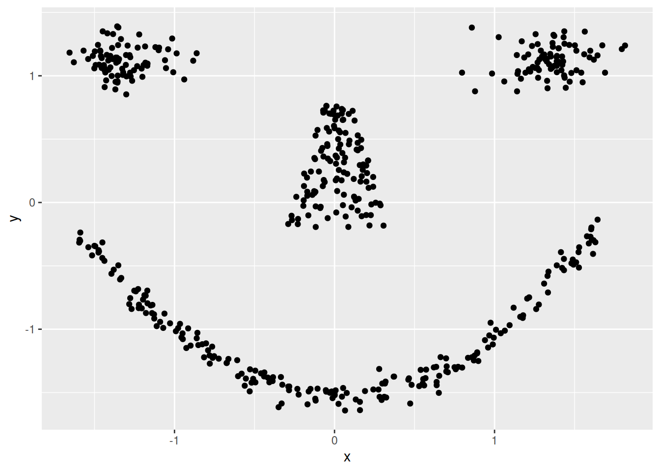
7.5.2 Determining the Correct Number of Clusters
The user needs to specify the number of clusters for most clustering algorithms. Determining the number of clusters in a data set is therefor an important task before we can cluster data. We will apply different methods to the scaled Ruspini data set.
ggplot(ruspini_scaled, aes(x, y)) + geom_point()
## We will use different methods and try 1-10 clusters.
set.seed(1234)
ks <- 2:10
7.5.2.1 Elbow Method: Within-Cluster Sum of Squares
A method often used for k-means is to calculate the within-cluster sum of squares for different numbers of
clusters and look for the knee or
elbow in the
plot. We use nstart = 5 to restart k-means 5 times and return the best
solution.
WCSS <- sapply(ks, FUN = function(k) {
  kmeans(ruspini_scaled, centers = k, nstart = 5)$tot.withinss
  })

ggplot(tibble(ks, WCSS), aes(ks, WCSS)) +
  geom_line() +
  geom_vline(xintercept = 4, color = "red", linetype = 2)
7.5.2.2 Average Silhouette Width
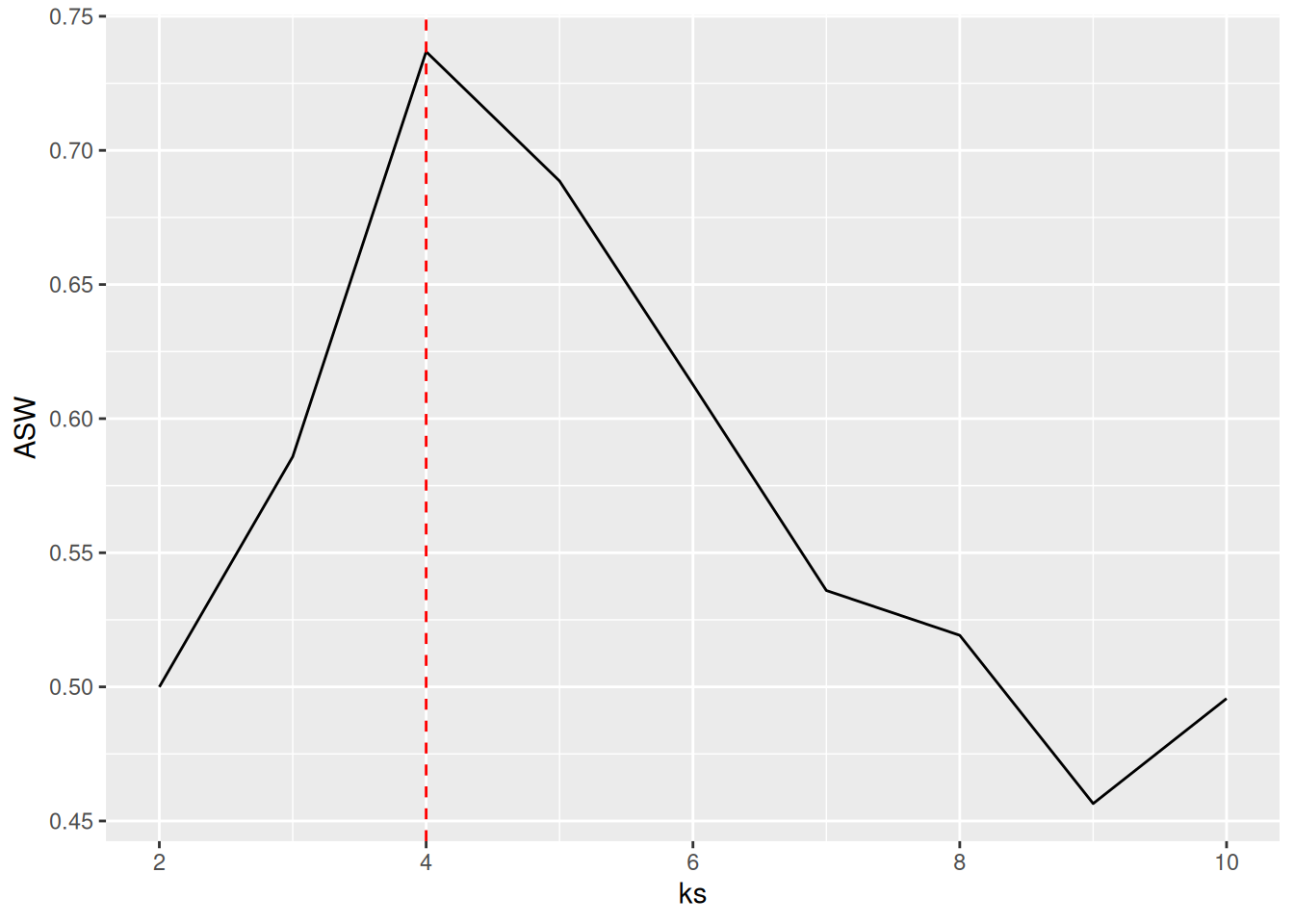
Another popular method (often preferred for clustering methods starting with a distance matrix) is to plot the average silhouette width for different numbers of clusters and look for the maximum in the plot.
ASW <- sapply(ks, FUN=function(k) {
  fpc::cluster.stats(d,
                     kmeans(ruspini_scaled,
                            centers = k,
                            nstart = 5)$cluster)$avg.silwidth
  })

best_k <- ks[which.max(ASW)]
best_k
## [1] 4
ggplot(tibble(ks, ASW), aes(ks, ASW)) +
  geom_line() +
  geom_vline(xintercept = best_k, color = "red", linetype = 2)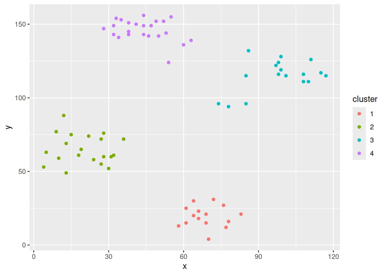
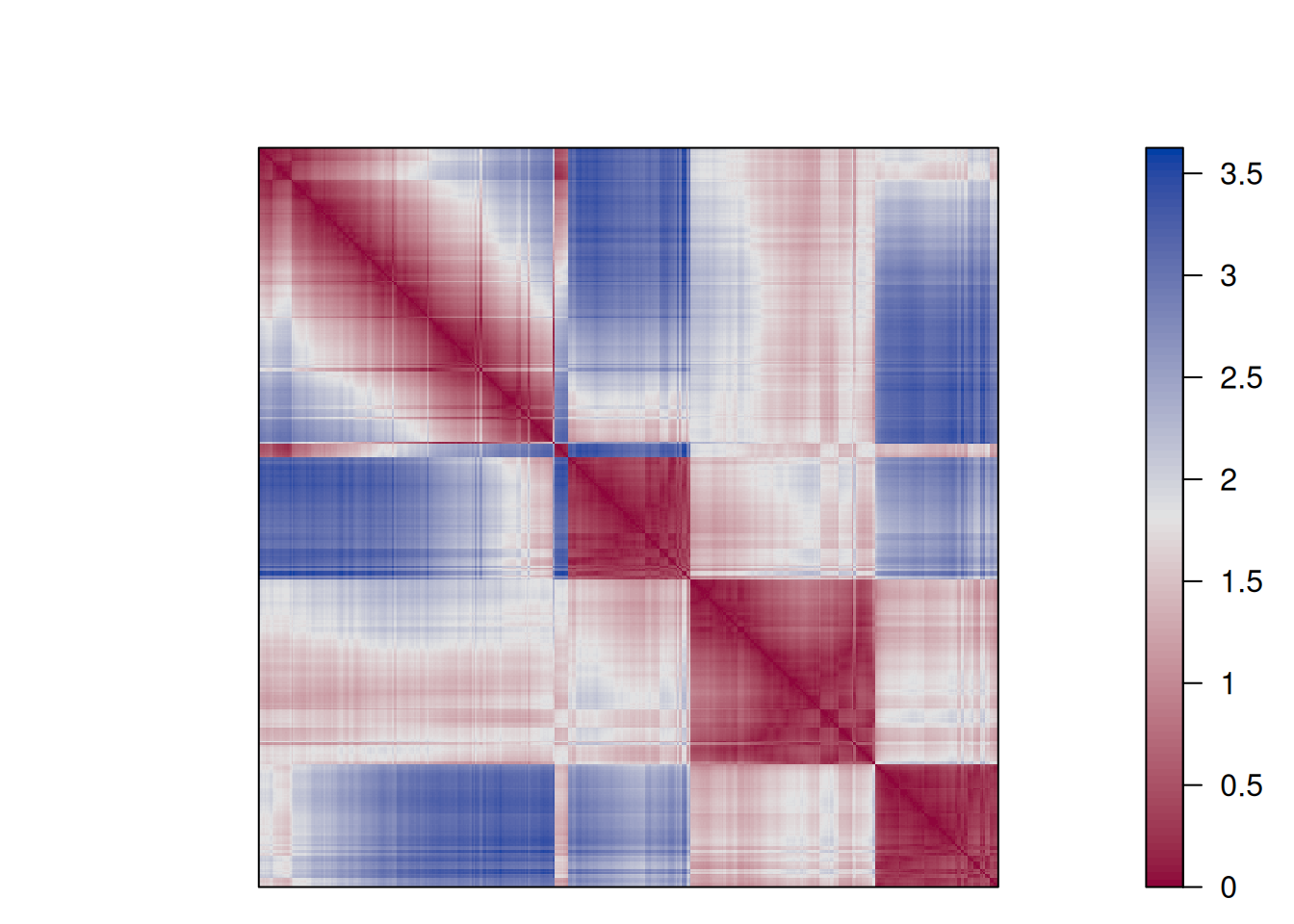
7.5.2.3 Similarity Matrix Visualization
We can visualize a similarity matrix reordered by cluster labels to visually determine if the number of clusters is
a good fit for the data.
Package seriation provides a dissimilarity plot to make this easy.
ggdissplot(d, labels = km$cluster,
         options = list(main = "k-means with k=4"))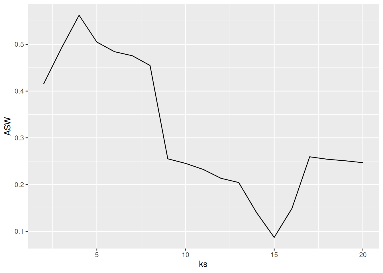
The plot reorders rows and columns based on cluster labels and adds lines for cluster borders. It also presents average distance values above the diagonal to make the structure between clusters easier to evaluate. Above, we see a clear structure with the four clusters.
Next, we look at two examples wherethe number of clusters was misspecified.
ggdissplot(d,
         labels = kmeans(ruspini_scaled, centers = 3, nstart = 5)$cluster)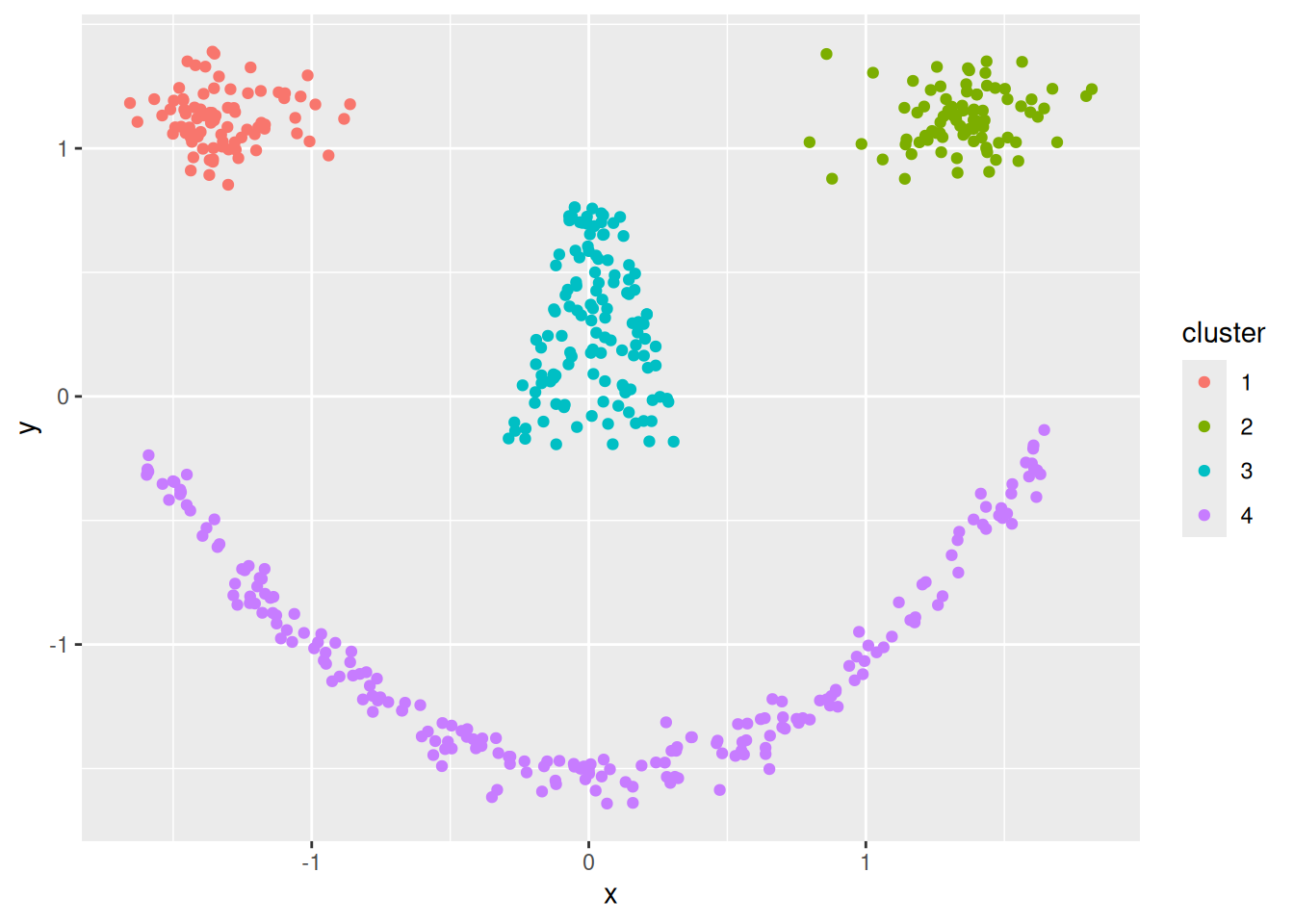
ggdissplot(d,
labels = kmeans(ruspini_scaled, centers = 9, nstart = 5)$cluster)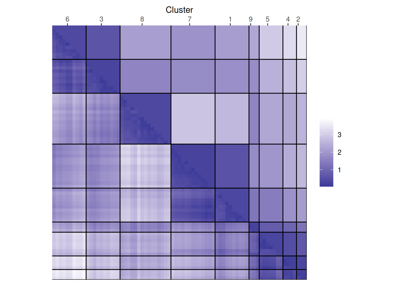 In the example with 3 clusters, we see that the plot
shows two separated triangles for the largest cluster
indicating that it contains two separate structures which should be their own clusters. For the example with
9 clusters, the plot tries to rearrange the clusters into
four larger blocks indicating that the number of clusters
shoulsd be 4.
In the example with 3 clusters, we see that the plot
shows two separated triangles for the largest cluster
indicating that it contains two separate structures which should be their own clusters. For the example with
9 clusters, the plot tries to rearrange the clusters into
four larger blocks indicating that the number of clusters
shoulsd be 4.7.5.2.4 Dunn Index
The Dunn index is another internal measure given by the smallest separation between clusters scaled by the largest cluster diameter.
DI <- sapply(ks, FUN = function(k) {
  fpc::cluster.stats(d,
                     kmeans(ruspini_scaled, centers = k,
                            nstart = 5)$cluster)$dunn
})

best_k <- ks[which.max(DI)]
ggplot(tibble(ks, DI), aes(ks, DI)) +
  geom_line() +
  geom_vline(xintercept = best_k, color = "red", linetype = 2)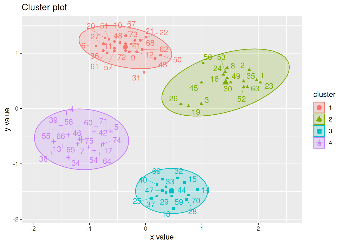
7.5.2.5 Gap Statistic
The Gap statisticCompares the change in within-cluster dispersion with that expected from
a null model (see clusGap()). The default method is to choose the
smallest k such that its value Gap(k) is not more than 1 standard error
away from the first local maximum.
library(cluster)
k <- clusGap(ruspini_scaled,
             FUN = kmeans,
             nstart = 10,
             K.max = 10)
k
## Clustering Gap statistic ["clusGap"] from call:
## clusGap(x = ruspini_scaled, FUNcluster = kmeans, K.max = 10, nstart = 10)
## B=100 simulated reference sets, k = 1..10; spaceH0="scaledPCA"
##  --> Number of clusters (method 'firstSEmax', SE.factor=1): 4
##        logW E.logW      gap  SE.sim
##  [1,] 3.498  3.464 -0.03387 0.03824
##  [2,] 3.074  3.151  0.07724 0.03605
##  [3,] 2.678  2.903  0.22549 0.03861
##  [4,] 2.106  2.712  0.60533 0.03793
##  [5,] 1.987  2.574  0.58708 0.03599
##  [6,] 1.864  2.456  0.59181 0.03442
##  [7,] 1.732  2.352  0.61966 0.03577
##  [8,] 1.660  2.257  0.59679 0.03758
##  [9,] 1.612  2.168  0.55592 0.04024
## [10,] 1.563  2.090  0.52667 0.04291
plot(k)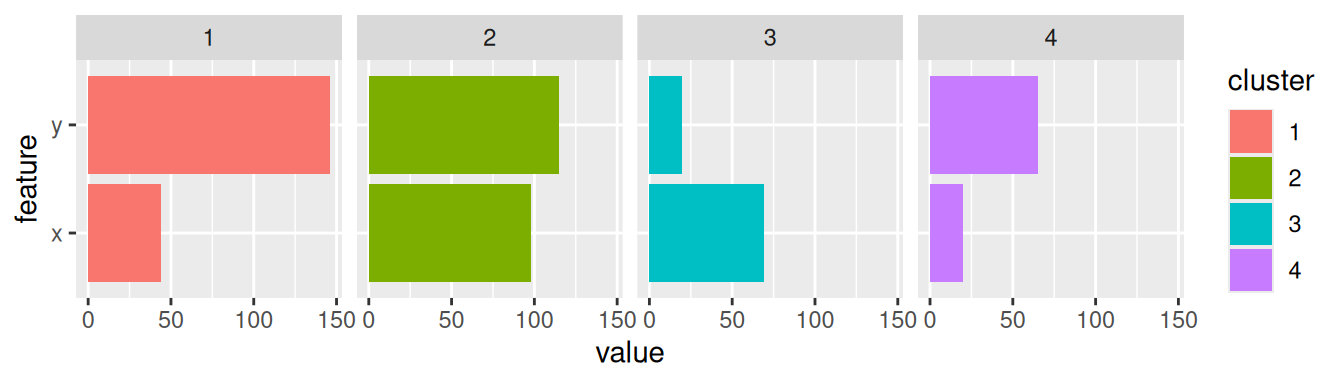
There have been many other methods and indices proposed to determine the number of clusters. See, e.g., package NbClust.
7.5.3 Clustering Tendency
Most clustering algorithms will always produce a clustering, even if the data does not contain a cluster structure. It is typically good to check cluster tendency before attempting to cluster the data.
We use again the smiley data.
library(mlbench)
shapes <- mlbench.smiley(n = 500, sd1 = 0.1, sd2 = 0.05)$x
colnames(shapes) <- c("x", "y")
shapes <- as_tibble(shapes)
7.5.3.1 Scatter plots
The first step is visual inspection using scatter plots.
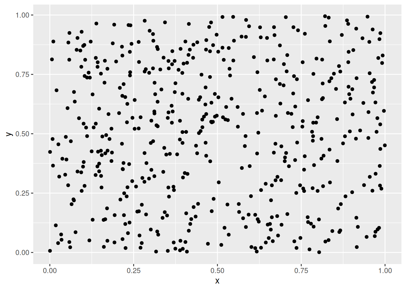
ggplot(shapes, aes(x = x, y = y)) + geom_point()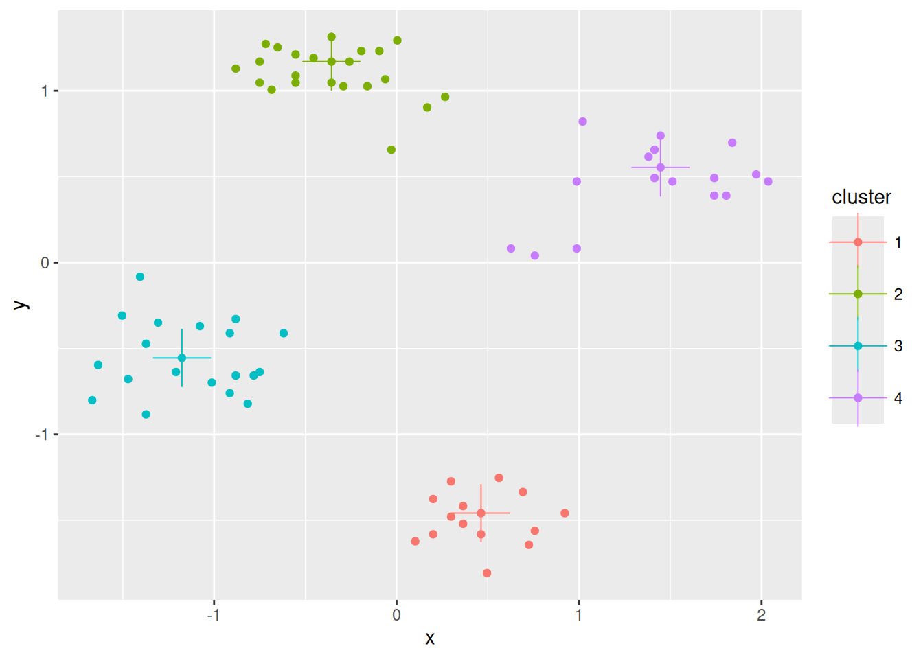
Cluster tendency is typically indicated by several separated point clouds. Often an appropriate number of clusters can also be visually obtained by counting the number of point clouds. We see four clusters, but the mouth is not convex/spherical and thus will pose a problems to algorithms like k-means.
If the data has more than two features then you can use a pairs plot (scatterplot matrix) or look at a scatterplot of the first two principal components using PCA.
7.5.3.2 Visual Analysis for Cluster Tendency Assessment (VAT)
VAT reorders the objects to show potential clustering tendency as a block structure (dark blocks along the main diagonal). We scale the data before using Euclidean distance.
iVAT uses the largest distances for all possible paths between two objects instead of the direct distances to make the block structure better visible.
ggiVAT(d_shapes)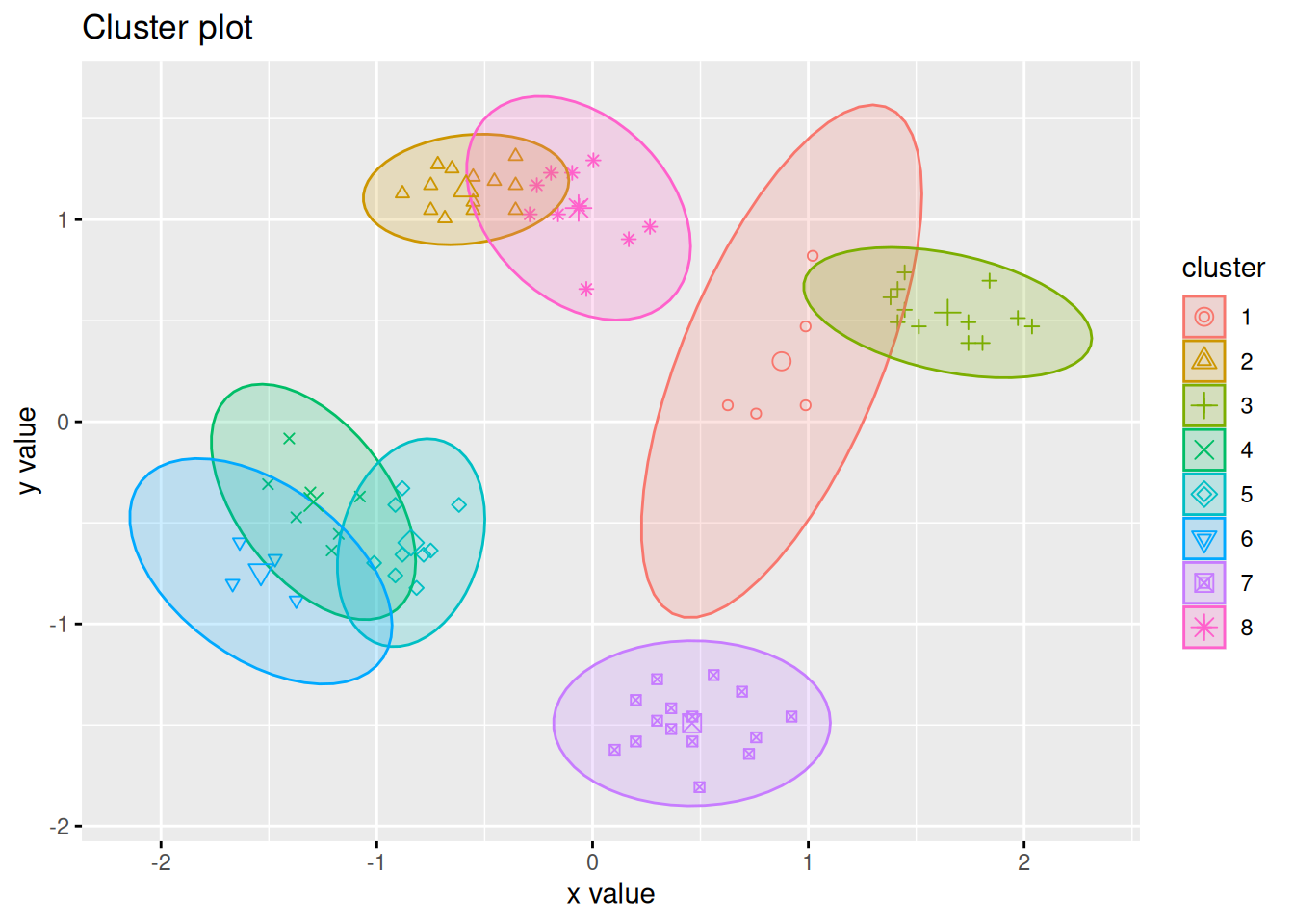
7.5.3.3 Hopkins statistic
factoextra can also create a VAT plot and calculate the Hopkins
statistic to assess
clustering tendency. For the Hopkins statistic, a sample of size \(n\) is
drawn from the data and then compares the nearest neighbor distribution
with a simulated dataset drawn from a random uniform distribution (see
detailed
explanation).
A values >.5 indicates usually a clustering tendency.
get_clust_tendency(shapes, n = 10)
## $hopkins_stat
## [1] 0.9498
##
## $plot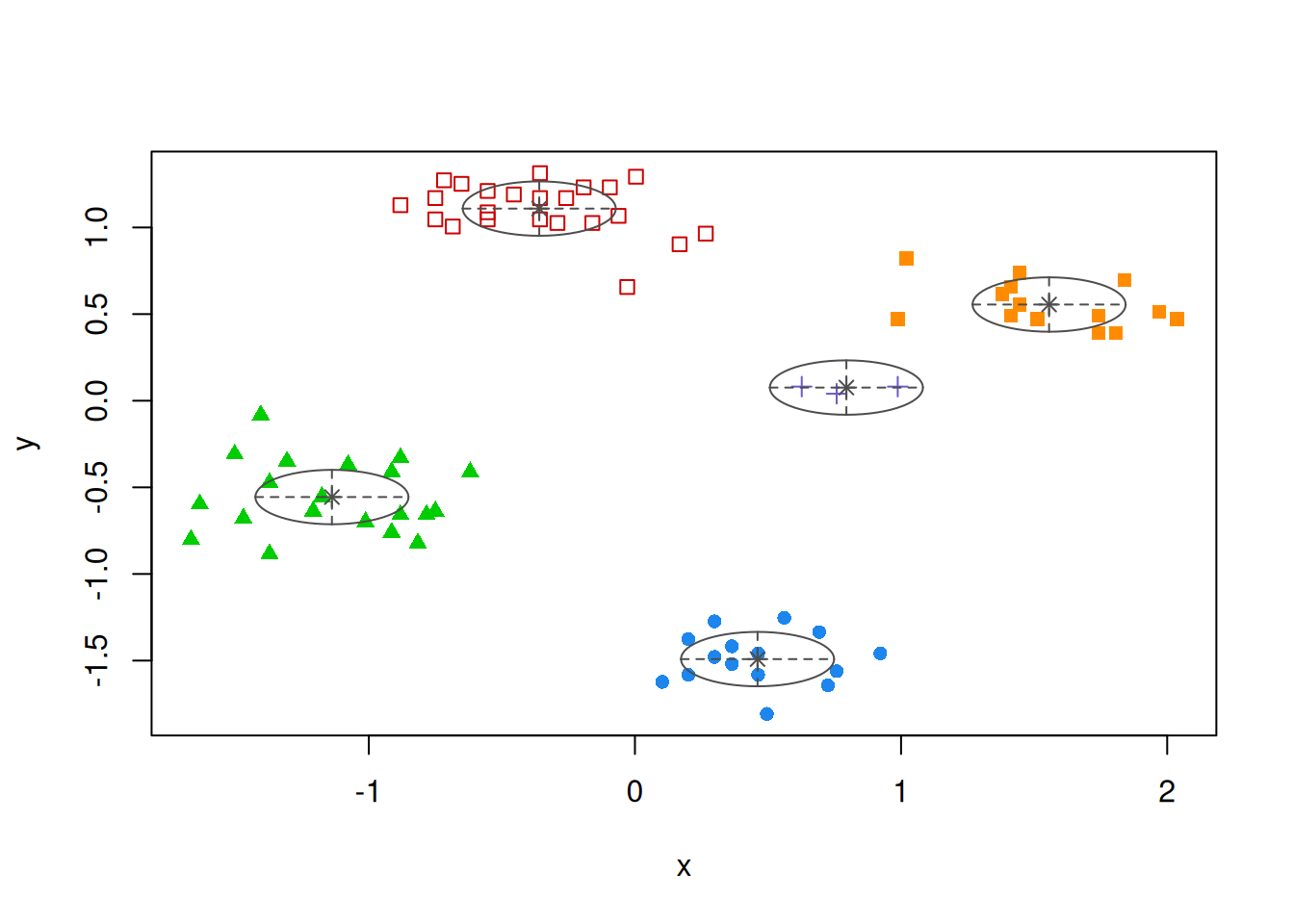
Both plots show a strong cluster structure with 4 clusters.
7.5.3.4 Data Without Clustering Tendency
No point clouds are visible, just noise.
ggiVAT(d_random)
get_clust_tendency(data_random, n = 10, graph = FALSE)
## $hopkins_stat
## [1] 0.4642
##
## $plot
## NULL
There is very little clustering structure visible indicating low clustering tendency and clustering should not be performed on this data. However, k-means can be used to partition the data into \(k\) regions of roughly equivalent size. This can be used as a data-driven discretization of the space.
7.5.3.5 k-means on Data Without Clustering Tendency
What happens if we perform k-means on data that has no inherent clustering structure?
km <- kmeans(data_random, centers = 4)

random_clustered<- data_random |>
  add_column(cluster = factor(km$cluster))
ggplot(random_clustered, aes(x = x, y = y, color = cluster)) +
  geom_point()
k-means discretizes the space into similarly sized regions.
7.5.4 Supervised Cluster Evaluation
Also called external cluster validation since it uses ground truth information. That is, the user has an idea how the data should be grouped. This could be a known class label not provided to the clustering algorithm.
We use an artificial data set with known groups.
library(mlbench)
set.seed(1234)
shapes <- mlbench.smiley(n = 500, sd1 = 0.1, sd2 = 0.05)
plot(shapes)
First, we prepare the data and hide the known class label which we will used for evaluation after clustering.
truth <- as.integer(shapes$class)
shapes <- shapes$x
colnames(shapes) <- c("x", "y")

shapes <- shapes |> scale() |> as_tibble()

ggplot(shapes, aes(x, y)) + geom_point()
Find optimal number of Clusters for k-means
ks <- 2:20Use within sum of squares (look for the knee)
WCSS <- sapply(ks, FUN = function(k) {
  kmeans(shapes, centers = k, nstart = 10)$tot.withinss
})

ggplot(tibble(ks, WCSS), aes(ks, WCSS)) + geom_line()
Looks like it could be 7 clusters?
km <- kmeans(shapes, centers = 7, nstart = 10)

ggplot(shapes |> add_column(cluster = factor(km$cluster)),
       aes(x, y, color = cluster)) +
  geom_point()
The mouth is an issue for k-means. We could use hierarchical clustering with single-linkage because of the mouth is non-convex and chaining may help.
Find optimal number of clusters
ASW <- sapply(ks, FUN = function(k) {
  fpc::cluster.stats(d, cutree(hc, k))$avg.silwidth
})

ggplot(tibble(ks, ASW), aes(ks, ASW)) + geom_line()
The maximum is clearly at 4 clusters.
hc_4 <- cutree(hc, 4)

ggplot(shapes |> add_column(cluster = factor(hc_4)),
       aes(x, y, color = cluster)) +
  geom_point()
Compare with ground truth with the adjusted Rand index (ARI, also corrected Rand index), the variation of information (VI) index, mutual information (MI), entropy and purity.
cluster_stats() computes ARI and VI as comparative measures. I define
functions for the purity and the entropy of a clustering given the ground truth here:
purity <- function(cluster, truth, show_table = FALSE) {
  if (length(cluster) != length(truth))
    stop("Cluster vector and ground truth vectors are not of the same length!")

  # tabulate
  tbl <- table(cluster, truth)
  if(show_table)
    print(tbl)

  # find majority class
  majority <- apply(tbl, 1, max)
  sum(majority) / length(cluster)
}

entropy <- function(cluster, truth, show_table = FALSE) {
  if (length(cluster) != length(truth))
    stop("Cluster vector and ground truth vectors are not of the same length!")

  # calculate membership probability of cluster to class
  tbl <- table(cluster, truth)
  p <- sweep(tbl, 2, colSums(tbl), "/")

  if(show_table)
    print(p)

  # calculate cluster entropy
  e <- -p * log(p, 2)
  e <- rowSums(e, na.rm = TRUE)

  # weighted sum over clusters
  w <- table(cluster) / length(cluster)
  sum(w * e)
}
We calculate the measures and add for comparison two random “clusterings” with 4 and 6 clusters.
random_4 <- sample(1:4, nrow(shapes), replace = TRUE)
random_6 <- sample(1:6, nrow(shapes), replace = TRUE)

r <- rbind(
  truth = c(
    unlist(fpc::cluster.stats(d, truth,
                              truth, compareonly = TRUE)),
    purity = purity(truth, truth),
    entropy = entropy(truth, truth)
  ),

  kmeans_7 = c(
    unlist(fpc::cluster.stats(d, km$cluster,
                              truth, compareonly = TRUE)),
    purity = purity(km$cluster, truth),
    entropy = entropy(km$cluster, truth)
    ),
  hc_4 = c(
    unlist(fpc::cluster.stats(d, hc_4,
                              truth, compareonly = TRUE)),
    purity = purity(hc_4, truth),
    entropy = entropy(hc_4, truth)
    ),
  random_4 = c(
    unlist(fpc::cluster.stats(d, random_4,
                              truth, compareonly = TRUE)),
    purity = purity(random_4, truth),
    entropy = entropy(random_4, truth)
    ),
  random_6 = c(
    unlist(fpc::cluster.stats(d, random_6,
                              truth, compareonly = TRUE)),
    purity = purity(random_6, truth),
    entropy = entropy(random_6, truth)
    )
  )
r
##          corrected.rand     vi purity entropy
## truth          1.000000 0.0000  1.000  0.0000
## kmeans_7       0.638229 0.5709  1.000  0.2088
## hc_4           1.000000 0.0000  1.000  0.0000
## random_4      -0.003235 2.6832  0.418  1.9895
## random_6      -0.002125 3.0763  0.418  1.7129
Notes:
- Comparing the ground truth to itself produces perfect scores.
- Hierarchical clustering found the perfect clustering.
- Entropy and purity are heavily impacted by the number of clusters (more clusters improve the metric) and the fact that the mouth has 41.8% of all the data points becoming automatically the majority class for purity.
- The adjusted rand index shows clearly that the random clusterings have no relationship with the ground truth (very close to 0). This is a very helpful property and explains why the ARI is the most popular measure.
Read the manual page for fpc::cluster.stats() for an explanation of all the available indices.
7.6 More Clustering Algorithms*
Note: Some of these methods are covered in Chapter 8 of the textbook.
7.6.1 Partitioning Around Medoids (PAM)
PAM tries to solve the \(k\)-medoids problem. The problem is similar to \(k\)-means, but uses medoids instead of centroids to represent clusters. Like hierarchical clustering, it typically works with a precomputed distance matrix. An advantage is that you can use any distance metric not just Euclidean distances. Note: The medoid is the most central data point in the middle of the cluster. PAM is a lot more computationally expensive compared to k-means.
library(cluster)

d <- dist(ruspini_scaled)
str(d)
##  'dist' num [1:2775] 2.29 2.18 1.6 1.88 2.69 ...
##  - attr(*, "Size")= int 75
##  - attr(*, "Diag")= logi FALSE
##  - attr(*, "Upper")= logi FALSE
##  - attr(*, "method")= chr "Euclidean"
##  - attr(*, "call")= language dist(x = ruspini_scaled)
p <- pam(d, k = 4)
p
## Medoids:
##      ID
## [1,]  1  1
## [2,] 55 55
## [3,] 22 22
## [4,] 19 19
## Clustering vector:
##  [1] 1 2 2 2 2 3 1 4 4 4 4 3 1 4 1 1 2 2 4 4 2 3 2 3 1 3 4 4
## [29] 3 3 4 1 1 2 2 1 2 1 1 2 4 1 3 3 1 4 1 1 3 1 2 4 2 4 2 1
## [57] 4 4 2 2 3 3 1 2 3 1 1 2 1 1 2 3 4 3 1
## Objective function:
##  build   swap
## 0.4423 0.3187
##
## Available components:
## [1] "medoids"    "id.med"     "clustering" "objective"
## [5] "isolation"  "clusinfo"   "silinfo"    "diss"
## [9] "call"
Extract the clustering and medoids for visualization.
ruspini_clustered <- ruspini_scaled |>
  add_column(cluster = factor(p$cluster))

medoids <- as_tibble(ruspini_scaled[p$medoids, ],
                     rownames = "cluster")
medoids
## # A tibble: 4 × 3
##   cluster      x      y
##   <chr>    <dbl>  <dbl>
## 1 1       -0.357  1.17
## 2 2       -1.18  -0.555
## 3 3        0.463 -1.46
## 4 4        1.45   0.554
ggplot(ruspini_clustered, aes(x = x, y = y, color = cluster)) +
  geom_point() +
  geom_point(data = medoids, aes(x = x, y = y, color = cluster),
             shape = 3, size = 10)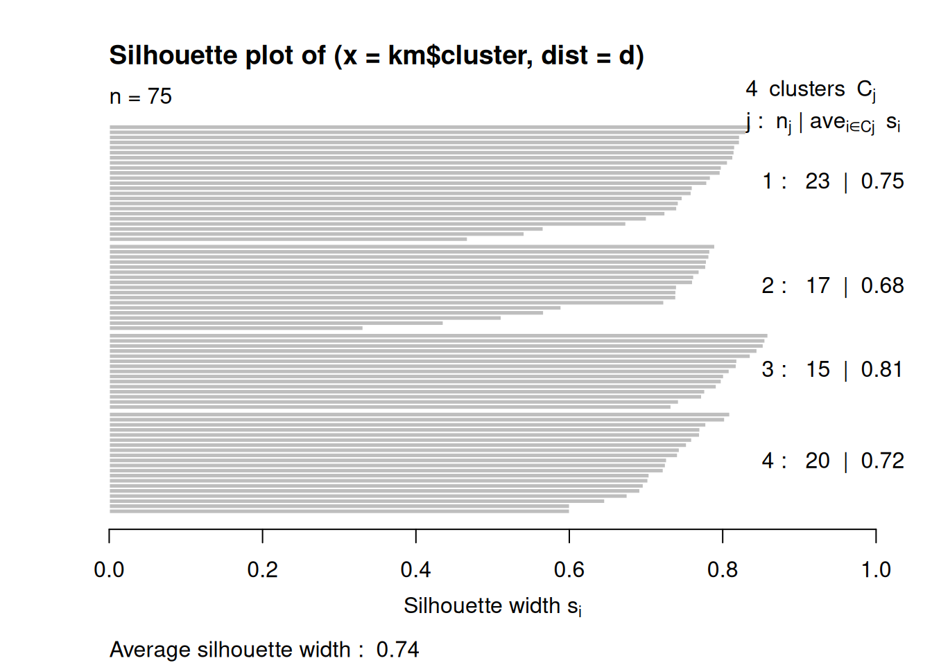
Alternative visualization using fviz_cluster().
## __Note:__ `fviz_cluster` needs the original data.
fviz_cluster(c(p, list(data = ruspini_scaled)),
             geom = "point",
             ellipse.type = "norm")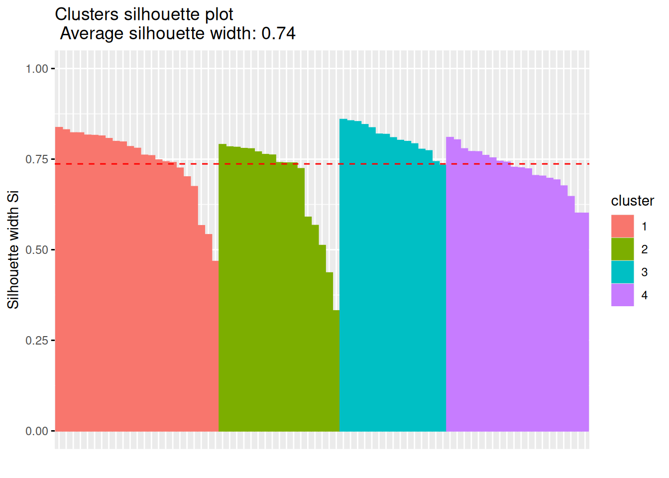
7.6.2 Gaussian Mixture Models
library(mclust)
## Package 'mclust' version 6.1.1
## Type 'citation("mclust")' for citing this R package in publications.
##
## Attaching package: 'mclust'
## The following object is masked from 'package:purrr':
##
##     map
Gaussian mixture
models
assume that the data set is the result of drawing data from a set of
Gaussian distributions where each distribution represents a cluster.
Estimation algorithms try to identify the location parameters of the
distributions and thus can be used to find clusters. Mclust() uses
Bayesian Information Criterion (BIC) to find the number of clusters
(model selection). BIC uses the likelihood and a penalty term to guard
against overfitting.
m <- Mclust(ruspini_scaled)
summary(m)
## ----------------------------------------------------
## Gaussian finite mixture model fitted by EM algorithm
## ----------------------------------------------------
##
## Mclust EEI (diagonal, equal volume and shape) model with 5
## components:
##
##  log-likelihood  n df    BIC    ICL
##          -91.26 75 16 -251.6 -251.7
##
## Clustering table:
##  1  2  3  4  5
## 23 20 15 14  3
plot(m, what = "classification")
Rerun with a fixed number of 4 clusters
m <- Mclust(ruspini_scaled, G=4)
summary(m)
## ----------------------------------------------------
## Gaussian finite mixture model fitted by EM algorithm
## ----------------------------------------------------
##
## Mclust EEI (diagonal, equal volume and shape) model with 4
## components:
##
##  log-likelihood  n df    BIC    ICL
##          -101.6 75 13 -259.3 -259.3
##
## Clustering table:
##  1  2  3  4
## 23 20 15 17
plot(m, what = "classification")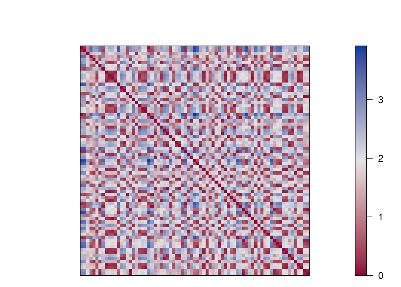
7.6.3 Spectral Clustering
Spectral clustering works by embedding the data points of the partitioning problem into the subspace of the k largest eigenvectors of a normalized affinity/kernel matrix. Then uses a simple clustering method like k-means.
library("kernlab")
##
## Attaching package: 'kernlab'
## The following object is masked from 'package:arulesSequences':
##
##     size
## The following object is masked from 'package:scales':
##
##     alpha
## The following object is masked from 'package:arules':
##
##     size
## The following object is masked from 'package:purrr':
##
##     cross
## The following object is masked from 'package:ggplot2':
##
##     alpha
cluster_spec <- specc(as.matrix(ruspini_scaled), centers = 4)
cluster_spec
## Spectral Clustering object of class "specc"
##
##  Cluster memberships:
##
## 4 3 3 3 3 2 4 1 1 1 1 2 4 1 4 4 3 3 1 1 3 2 3 2 4 2 1 1 2 2 1 4 4 3 3 4 3 4 4 3 1 4 2 2 4 1 4 4 2 4 3 1 3 1 3 4 1 1 3 3 2 2 4 3 2 4 4 3 4 4 3 2 1 2 4
##
## Gaussian Radial Basis kernel function.
##  Hyperparameter : sigma =  20.8835033729148
##
## Centers:
##         [,1]    [,2]
## [1,]  1.4194  0.4693
## [2,]  0.4607 -1.4912
## [3,] -1.1386 -0.5560
## [4,] -0.3595  1.1091
##
## Cluster size:
## [1] 17 15 20 23
##
## Within-cluster sum of squares:
## [1] 18.93 54.85 11.34 45.48
ggplot(ruspini_scaled |>
         add_column(cluster = factor(cluster_spec)),
       aes(x, y, color = cluster)) +
  geom_point()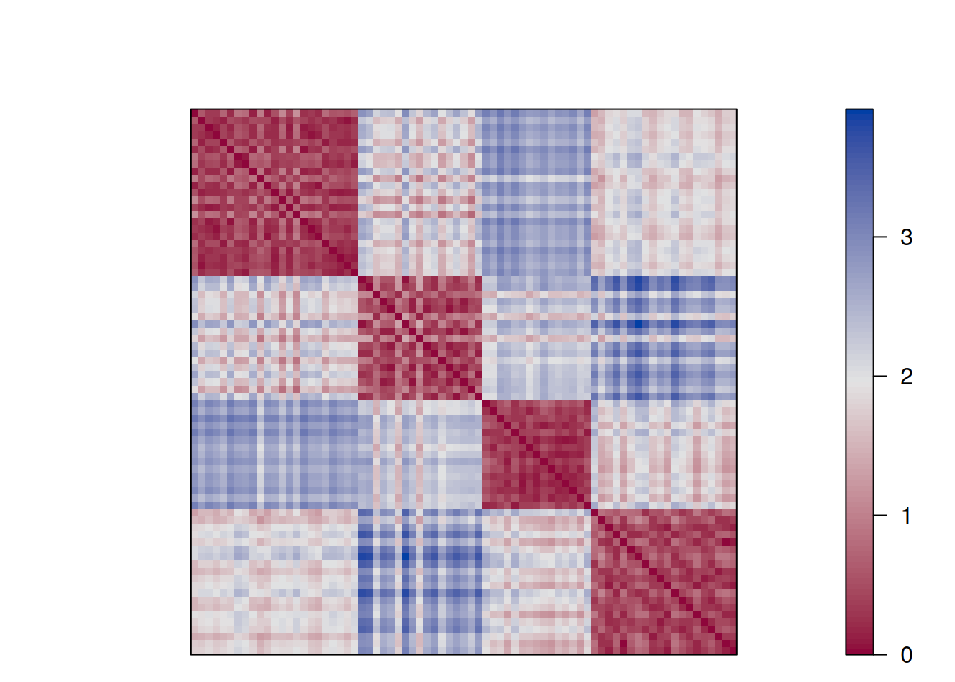
7.6.4 Deep Clustering Methods
Deep clustering is often used for high-dimensional data. It uses a deep autoencoder to learn a cluster-friendly representation of the data before applying a standard clustering algorithm (e.g., k-means) on the embedded data. The autoencoder is typically implemented using keras and the autoencoder’s loss function is modified to include the clustering loss which will make the embedding more clusterable.
7.6.5 Fuzzy C-Means Clustering
The fuzzy clustering version of the k-means clustering problem. Each data point has a degree of membership to for each cluster.
library("e1071")
##
## Attaching package: 'e1071'
## The following object is masked from 'package:ggplot2':
##
##     element
cluster_cmeans <- cmeans(as.matrix(ruspini_scaled), centers = 4)
cluster_cmeans
## Fuzzy c-means clustering with 4 clusters
##
## Cluster centers:
##         x       y
## 1 -1.1371 -0.5550
## 2 -0.3763  1.1143
## 3  0.4552 -1.4760
## 4  1.5048  0.5161
##
## Memberships:
##               1         2         3         4
##  [1,] 0.0009643 9.977e-01 0.0004512 8.879e-04
##  [2,] 0.9148680 3.002e-02 0.0405062 1.461e-02
##  [3,] 0.8877281 4.917e-02 0.0431101 1.999e-02
##  [4,] 0.7683893 9.312e-02 0.0971203 4.137e-02
##  [5,] 0.8900960 3.663e-02 0.0549604 1.831e-02
##  [6,] 0.0038612 1.664e-03 0.9921767 2.298e-03
##  [7,] 0.0376056 9.294e-01 0.0133136 1.973e-02
##  [8,] 0.0032212 7.444e-03 0.0047479 9.846e-01
##  [9,] 0.0394179 1.267e-01 0.0461290 7.877e-01
## [10,] 0.0002500 5.072e-04 0.0004110 9.988e-01
## [11,] 0.0075741 1.388e-02 0.0135387 9.650e-01
## [12,] 0.0254632 9.526e-03 0.9531429 1.187e-02
## [13,] 0.0419832 9.187e-01 0.0155189 2.380e-02
## [14,] 0.1075095 1.739e-01 0.1773899 5.412e-01
## [15,] 0.0483850 9.103e-01 0.0168055 2.448e-02
## [16,] 0.0371539 9.245e-01 0.0146294 2.371e-02
## [17,] 0.9426524 2.538e-02 0.0220711 9.896e-03
## [18,] 0.8953110 5.308e-02 0.0336348 1.798e-02
## [19,] 0.0006092 1.324e-03 0.0009436 9.971e-01
## [20,] 0.0106794 1.929e-02 0.0192355 9.508e-01
## [21,] 0.9045073 4.507e-02 0.0339770 1.645e-02
## [22,] 0.0001096 5.052e-05 0.9997656 7.424e-05
## [23,] 0.9731699 9.545e-03 0.0127747 4.511e-03
## [24,] 0.0030791 1.396e-03 0.9934965 2.029e-03
## [25,] 0.0713882 7.016e-01 0.0509709 1.760e-01
## [26,] 0.0205931 1.087e-02 0.9503616 1.818e-02
## [27,] 0.0392620 9.618e-02 0.0536215 8.109e-01
## [28,] 0.1283082 2.177e-01 0.1837576 4.703e-01
## [29,] 0.0249349 1.136e-02 0.9472520 1.646e-02
## [30,] 0.0384838 2.343e-02 0.8921802 4.591e-02
## [31,] 0.0130801 2.683e-02 0.0205434 9.395e-01
## [32,] 0.0033849 9.924e-01 0.0014973 2.767e-03
## [33,] 0.0151633 9.597e-01 0.0078901 1.728e-02
## [34,] 0.9302684 2.248e-02 0.0358179 1.143e-02
## [35,] 0.9920941 3.143e-03 0.0034030 1.360e-03
## [36,] 0.0112519 9.693e-01 0.0059278 1.354e-02
## [37,] 0.9540725 2.256e-02 0.0155206 7.844e-03
## [38,] 0.0920675 7.514e-01 0.0519053 1.047e-01
## [39,] 0.0758512 8.622e-01 0.0256682 3.625e-02
## [40,] 0.9626044 1.710e-02 0.0138101 6.486e-03
## [41,] 0.0058692 1.130e-02 0.0099614 9.729e-01
## [42,] 0.0204611 9.395e-01 0.0114699 2.852e-02
## [43,] 0.0241504 1.011e-02 0.9523623 1.337e-02
## [44,] 0.0173389 9.017e-03 0.9591007 1.454e-02
## [45,] 0.0015600 9.964e-01 0.0007051 1.322e-03
## [46,] 0.0184319 3.390e-02 0.0318375 9.158e-01
## [47,] 0.0120649 9.754e-01 0.0047499 7.761e-03
## [48,] 0.0333622 8.915e-01 0.0199935 5.510e-02
## [49,] 0.0498123 1.727e-02 0.9125422 2.038e-02
## [50,] 0.0672233 7.551e-01 0.0448213 1.329e-01
## [51,] 0.8288352 9.817e-02 0.0452768 2.771e-02
## [52,] 0.0061528 1.483e-02 0.0087249 9.703e-01
## [53,] 0.9343415 2.687e-02 0.0272619 1.153e-02
## [54,] 0.0011602 2.456e-03 0.0018406 9.945e-01
## [55,] 0.9989320 4.474e-04 0.0004367 1.839e-04
## [56,] 0.0044839 9.885e-01 0.0022374 4.752e-03
## [57,] 0.0034560 8.073e-03 0.0050417 9.834e-01
## [58,] 0.0229230 4.091e-02 0.0405213 8.956e-01
## [59,] 0.8727657 4.260e-02 0.0633412 2.130e-02
## [60,] 0.9712833 1.357e-02 0.0102381 4.907e-03
## [61,] 0.0287389 1.083e-02 0.9470184 1.341e-02
## [62,] 0.0203875 1.111e-02 0.9492342 1.926e-02
## [63,] 0.0256390 9.467e-01 0.0103553 1.729e-02
## [64,] 0.8604239 5.522e-02 0.0593849 2.497e-02
## [65,] 0.0082410 3.347e-03 0.9839900 4.423e-03
## [66,] 0.0114703 9.753e-01 0.0048169 8.408e-03
## [67,] 0.0103266 9.787e-01 0.0041349 6.878e-03
## [68,] 0.9397726 2.104e-02 0.0290836 1.010e-02
## [69,] 0.0095409 9.763e-01 0.0046348 9.540e-03
## [70,] 0.0046268 9.889e-01 0.0021822 4.269e-03
## [71,] 0.8665154 3.837e-02 0.0740308 2.108e-02
## [72,] 0.0183428 1.016e-02 0.9537438 1.775e-02
## [73,] 0.0654674 1.100e-01 0.1188607 7.056e-01
## [74,] 0.0031669 1.347e-03 0.9936326 1.853e-03
## [75,] 0.0247839 9.272e-01 0.0139396 3.405e-02
##
## Closest hard clustering:
##  [1] 2 1 1 1 1 3 2 4 4 4 4 3 2 4 2 2 1 1 4 4 1 3 1 3 2 3 4 4
## [29] 3 3 4 2 2 1 1 2 1 2 2 1 4 2 3 3 2 4 2 2 3 2 1 4 1 4 1 2
## [57] 4 4 1 1 3 3 2 1 3 2 2 1 2 2 1 3 4 3 2
##
## Available components:
## [1] "centers"     "size"        "cluster"     "membership"
## [5] "iter"        "withinerror" "call"
Plot membership (shown as small pie charts)
library("scatterpie")
## scatterpie v0.2.6 Learn more at https://yulab-smu.top/
ggplot()  +
  geom_scatterpie(
    data = cbind(ruspini_scaled, cluster_cmeans$membership),
    aes(x = x, y = y),
    cols = colnames(cluster_cmeans$membership),
    legend_name = "Membership") +
  coord_equal()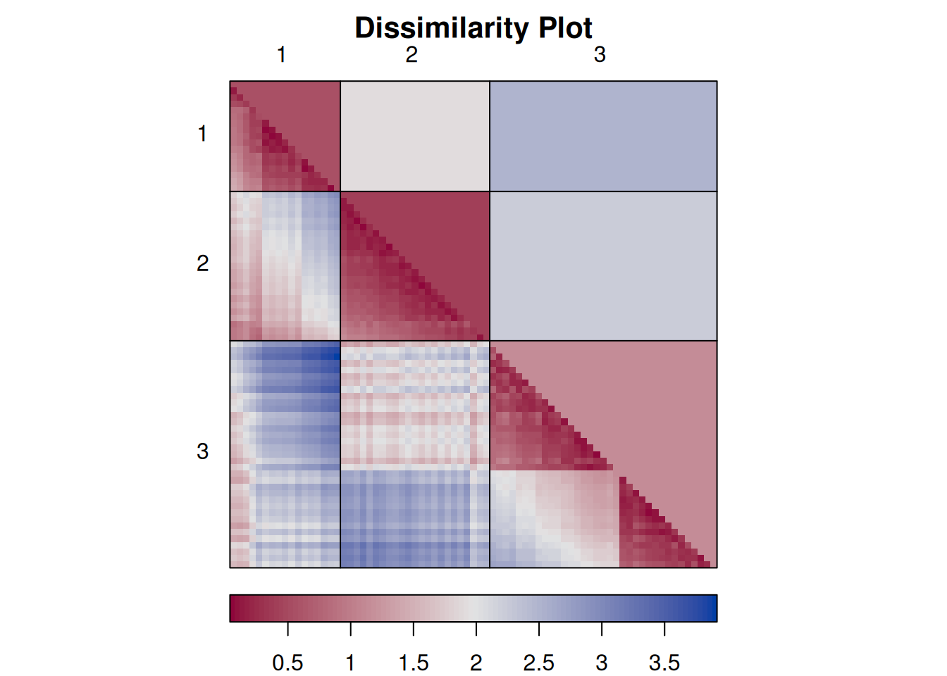
7.7 Scale Issues in Clustering*
To demonstrate this issue, I will use the unscaled Ruspini dataset and assume that we measure x in millimeters and y in meters. I do this by multiplying x by 1000.
ruspini_scale_issue <- ruspini |> mutate(x = x * 1000)
summary(ruspini_scale_issue)
##        x                y
##  Min.   :  4000   Min.   :  4.0
##  1st Qu.: 31500   1st Qu.: 56.5
##  Median : 52000   Median : 96.0
##  Mean   : 54880   Mean   : 92.0
##  3rd Qu.: 76500   3rd Qu.:141.5
##  Max.   :117000   Max.   :156.0
If we cluster the data now, then the algorithm fails!
km <- kmeans(ruspini_scale_issue, centers = 4)
ruspini_clustered <- ruspini_scale_issue |>
  add_column(cluster = factor(km$cluster))

ggplot(ruspini_clustered, aes(x = x, y = y)) +
  geom_point(aes(color = cluster))
The clusters form vertical bands across the whole plot. The reason is that the large numeric differences for the x-axis overpower the relatively small differences in the y-axis when distances are calculated. This issue can be avoided by scaling all variables first.
7.8 Outliers in Clustering*
Most clustering algorithms perform complete assignment (i.e., all data points need to be assigned to a cluster). Outliers will affect the clustering.
To show this effect, we add a clear outlier with a very large \(x\) value to the Ruspini dataset.
ruspini_outlier <- ruspini |> add_case(x=10000, y=100)
ggplot(ruspini_outlier, aes(x = x, y = y)) +
  geom_point()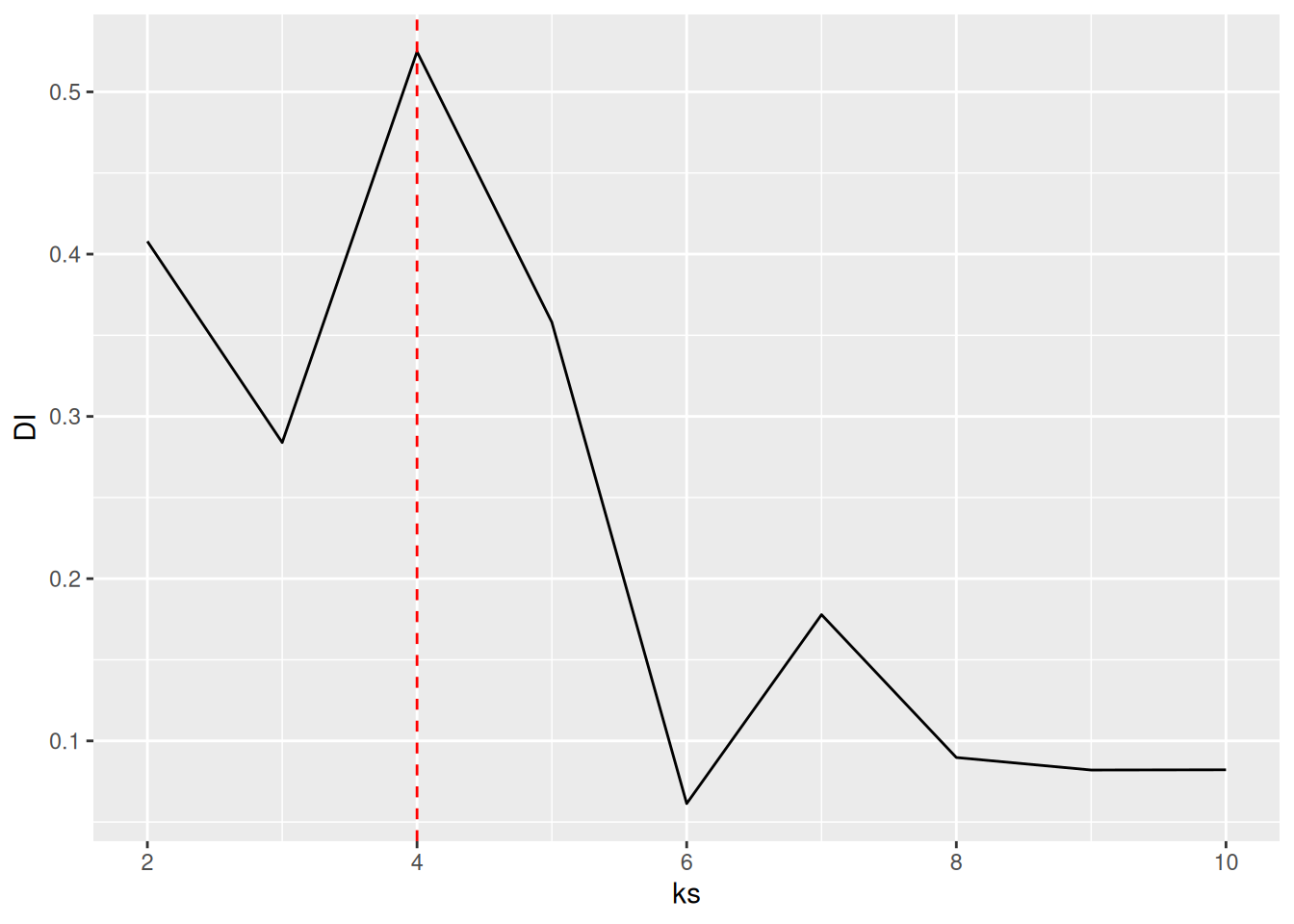
The outlier presents a problem for k-means, even if we scale the data. Scaling data with an outlier will make the direction of the outlier (in this case \(x\)) the most important.
ruspini_scaled_outlier <- ruspini_outlier |> scale_numeric()

km <- kmeans(ruspini_scaled_outlier, centers = 4, nstart = 10)
ruspini_scaled_outlier_km <- ruspini_scaled_outlier|>
  add_column(cluster = factor(km$cluster))
centroids <- as_tibble(km$centers, rownames = "cluster")

ggplot(ruspini_scaled_outlier_km, aes(x = x, y = y, color = cluster)) +
  geom_point() +
  geom_point(data = centroids,
             aes(x = x, y = y, color = cluster),
             shape = 3, size = 10)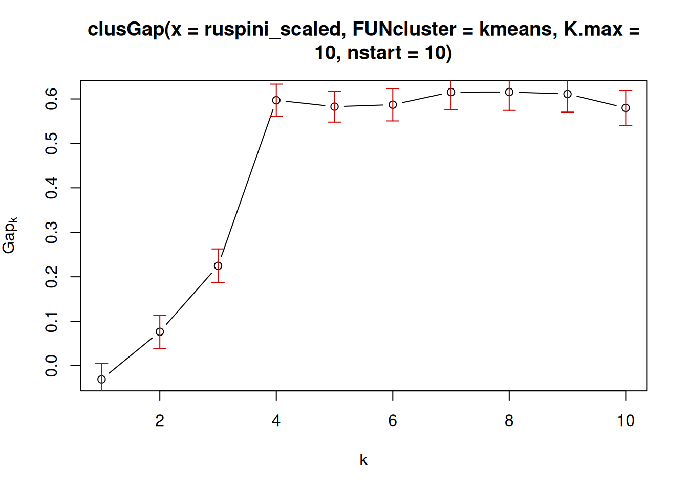
Often, outliers become their own clusters. It is tempting to deal with this issue by adding additional clusters, one per outlier. But this does not work!
Here is the result with one additional cluster.
km <- kmeans(ruspini_scaled_outlier, centers = 5, nstart = 10)
ruspini_scaled_outlier_km <- ruspini_scaled_outlier|>
  add_column(cluster = factor(km$cluster))
centroids <- as_tibble(km$centers, rownames = "cluster")

ggplot(ruspini_scaled_outlier_km, aes(x = x, y = y, color = cluster)) +
  geom_point() +
  geom_point(data = centroids,
             aes(x = x, y = y, color = cluster),
             shape = 3, size = 10)
Here it seems to work, but this only happens because the clusters in the Ruspini dataset are nicely spread out over the \(y\) axis. The outlier suppresses the effect of variability in the \(x\) direction. The top two clusters in the following plot of the clustering without the outlier point shows that the clustering just uses the \(y\) axis to cut the data and completely ignors \(x\).
ggplot(ruspini_scaled_outlier_km |> filter(row_number() <= n()-1), aes(x = x, y = y, color = cluster)) +
  geom_point()
So this does not work! You need to identify and remove outliers before scaling the data. Methods to identify outliers are summary statistics, visual inspection, and outlier scores like the Local Outlier Factor (LOF) discussed in the following sections.
7.8.1 Visual Identification of Outliers
Outliers can be identified using summary statistics, histograms,
scatterplots (pairs plots), and boxplots, etc. We use here a pairs plot
(the diagonal contains smoothed histograms). The outlier is visible as
the single separate point in the scatter plot and as the long tail of
the smoothed histogram for x. Remember, in scaled data, we expect most observations to
fall in the range \([-3,3]\).
The tope left panel in the plot shows that therw is an outlier in the x axis. The x value of regular points is way less then 2500 and we can use this information to identify outliers. We can find the row number by
which(ruspini_outlier$x > 2500)
## [1] 76
and then manually remove it before scaling the data.
7.8.2 Local Outlier Factor
The Local Outlier Factor (LOF) is related to concepts of DBSCAN can help to identify potential outliers. LOF compares the density of a data point to its neighboring data points. If a data point has a much lower density than its neighbors, it has a high LOF score and is considered an outlier.
It is useful to identify outliers and remove strong outliers prior to clustering. A density based method to identify outlier is LOF (Local Outlier Factor). It is related to dbscan and compares the density around a point with the densities around its neighbors (you have to specify the neighborhood size \(k\)). The LOF value for a regular data point is 1. The larger the LOF value gets, the more likely the point is an outlier.
To calculate the LOF, a local neighborhood size (MinPts in DBSCAN) for density estimation needs to be chosen. I use 10 here since I expect my clusters to have each more than 10 points. Note that LOF uses distances, so we need to scale the data first.
ruspini_outlier_scaled <- ruspini_outlier |> scale_numeric()

lof <- lof(ruspini_outlier_scaled, minPts= 10)
lof
##  [1]  0.9286  1.3222  0.9521  1.1313  0.9664  1.0068  1.0342
##  [8]  0.9541  1.3508  0.9915  1.0356  0.9313  0.9289  1.5467
## [15]  1.0078  1.0820  1.1303  1.1708  0.9082  1.0356  1.1593
## [22]  0.9838  1.0139  0.9313  1.0623  1.1230  0.9915  1.8401
## [29]  1.6549  0.9828  1.1291  0.9570  1.0128  1.0483  0.9200
## [36]  1.0299  1.1362  1.0523  0.9999  1.1179  1.0078  1.0289
## [43]  1.2959  1.3537  1.0122  1.0080  1.0097  1.1418  1.0781
## [50]  1.3697  1.2170  1.2333  0.9845  1.0081  1.0028  0.9289
## [57]  1.0423  0.9915  0.9200  1.1800  1.0938  0.9468  1.0533
## [64]  1.0159  0.9451  0.9567  1.0003  0.9667  1.2781  1.0128
## [71]  1.0785  1.1230  1.8383  0.9626  0.9935 55.3714
ruspini_outlier_scaled  <- ruspini_outlier_scaled  |> add_column(lof = lof)

ggplot(ruspini_outlier_scaled,
       aes(x, y, color = lof)) +
  geom_point() +
  scale_color_gradient(low = "gray", high = "red")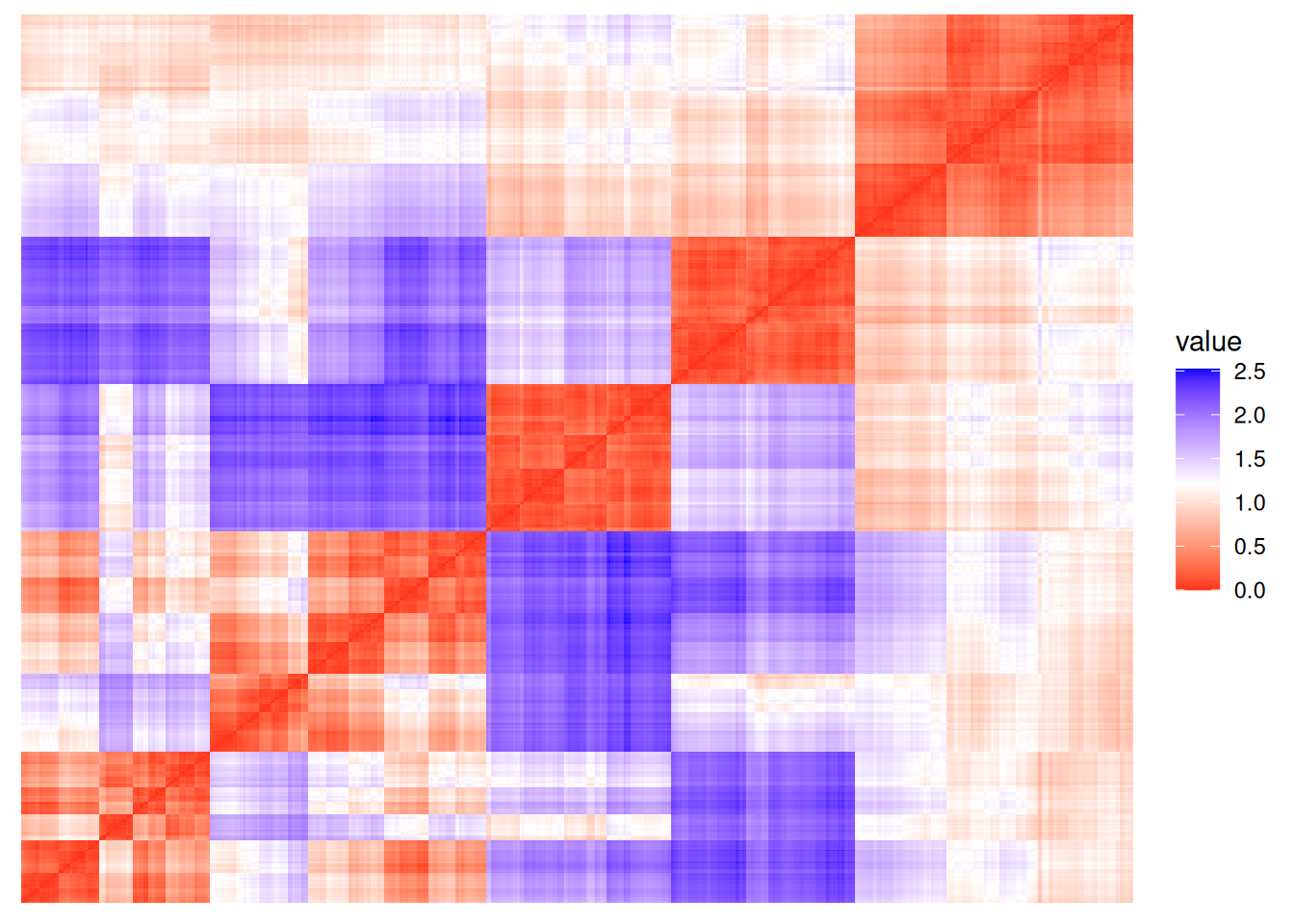
Plot the points sorted by increasing LOF and look for a knee.
We choose here a threshold above 2.
ggplot(ruspini_outlier_scaled |> add_column(outlier = lof >= 2),
       aes(x, y, color = outlier)) +
  geom_point()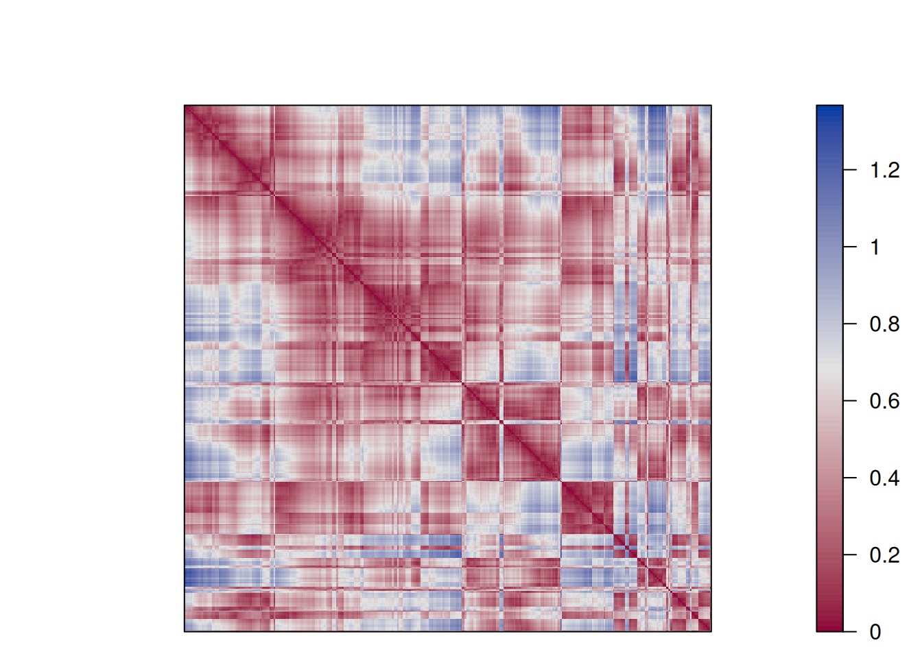
You should analyze the found outliers. They are often interesting and important data points.
To model the regular data, perform clustering on the regular data points without outliers. Note that the data needs to be rescaled after the outlier is removed. This will remove the scaling issues caused by the outlier.
ruspini_scaled_clean <- ruspini_outlier_scaled |>
  filter(lof < 2) |>
  select(x, y) |>
  scale_numeric()

km <- kmeans(ruspini_scaled_clean, centers = 4, nstart = 10)
ruspini_scaled_clean_km <- ruspini_scaled_clean|>
  add_column(cluster = factor(km$cluster))
centroids <- as_tibble(km$centers, rownames = "cluster")

ggplot(ruspini_scaled_clean_km, aes(x = x, y = y, color = cluster)) +
  geom_point() +
  geom_point(data = centroids,
             aes(x = x, y = y, color = cluster),
             shape = 3, size = 10)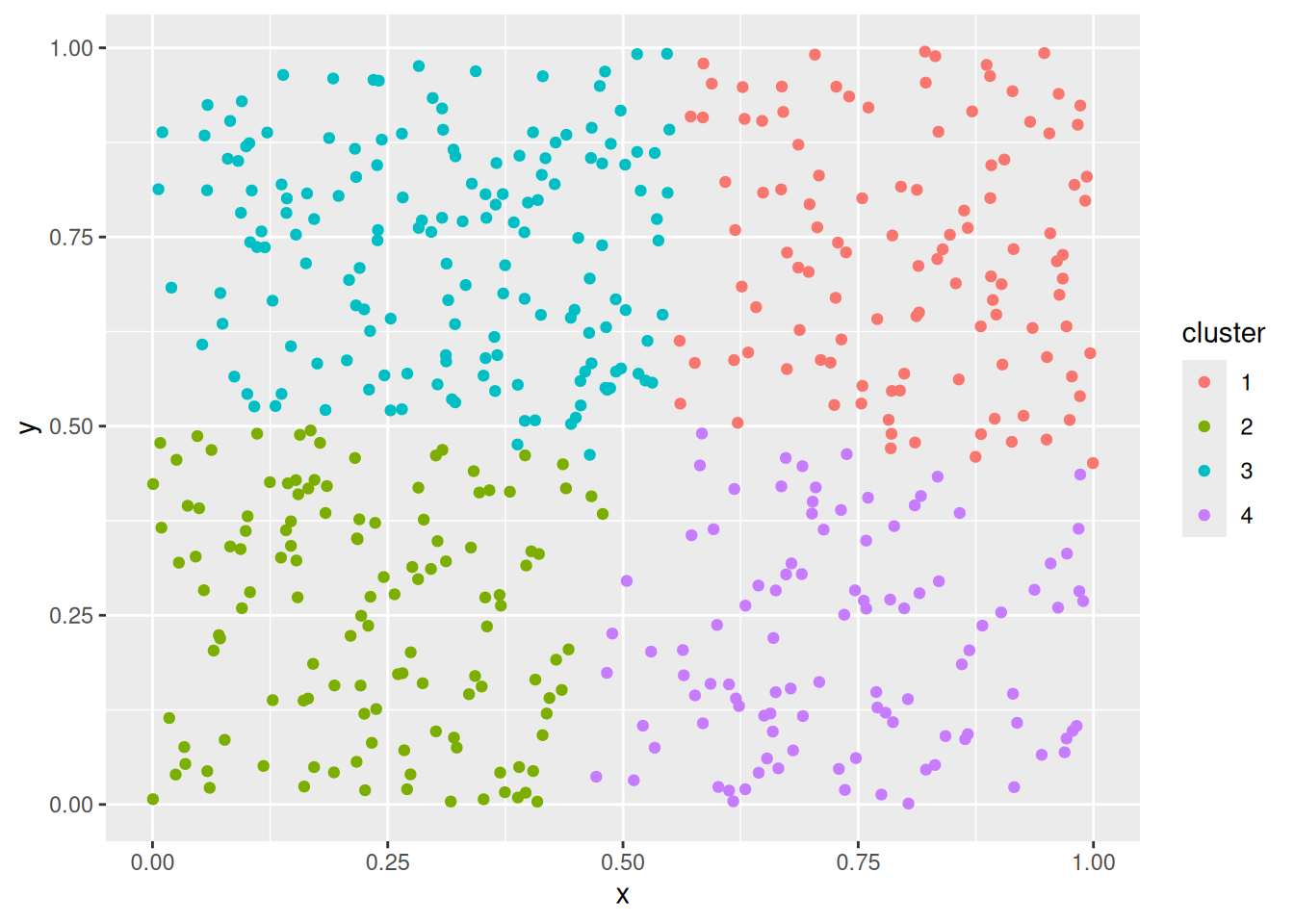
You may have to repeat the identification, removal and rescaling steps several times to find outliers of different scale.
There are many other outlier removal strategies available. See, e.g., package outliers.
7.9 Exercises*
We will again use the Palmer penguin data for the exercises.
library(palmerpenguins)
head(penguins)
## # A tibble: 6 × 8
##   species island    bill_length_mm bill_depth_mm
##   <chr>   <chr>              <dbl>         <dbl>
## 1 Adelie  Torgersen           39.1          18.7
## 2 Adelie  Torgersen           39.5          17.4
## 3 Adelie  Torgersen           40.3          18
## 4 Adelie  Torgersen           NA            NA
## 5 Adelie  Torgersen           36.7          19.3
## 6 Adelie  Torgersen           39.3          20.6
## # ℹ 4 more variables: flipper_length_mm <dbl>,
## #   body_mass_g <dbl>, sex <chr>, year <dbl>
Create a R markdown file with the code and discussion for the following below.
- What features do you use for clustering? What about missing values? Discuss your answers. Do you need to scale the data before clustering? Why?
- What distance measure do you use to reflect similarities between penguins? See Measures of Similarity and Dissimilarity in Chapter 2.
- Apply k-means clustering. Use an appropriate method to determine the number of clusters. Compare the clustering using unscaled data and scaled data. What is the difference? Visualize and describe the results.
- Apply hierarchical clustering. Create a dendrogram and discuss what it means.
- Apply DBSCAN. How do you choose the parameters? How well does it work?