A Data Exploration and Visualization
The following code covers the important part of data exploration. For space reasons, this chapter was moved from the printed textbook to this Data Exploration Web Chapter.
Packages Used in this Chapter
pkgs <- c("arules", "GGally",
          "ggcorrplot", "hexbin", "palmerpenguins", "plotly", "seriation", "tidyverse")

pkgs_install <- pkgs[!(pkgs %in% installed.packages()[,"Package"])]
if(length(pkgs_install)) install.packages(pkgs_install)
The packages used for this chapter are:
- arules (Hahsler et al. 2025)
- GGally (Schloerke et al. 2025)
- ggcorrplot (Kassambara 2023)
- hexbin (Carr et al. 2024)
- palmerpenguins (Horst, Hill, and Gorman 2022)
- plotly (Sievert et al. 2025)
- seriation (Hahsler, Buchta, and Hornik 2025)
- tidyverse (Wickham 2023b)
We will use again the iris dataset.
library(tidyverse)
data(iris)
iris <- as_tibble(iris)
iris
## # A tibble: 150 × 5
##    Sepal.Length Sepal.Width Petal.Length Petal.Width Species
##           <dbl>       <dbl>        <dbl>       <dbl> <fct>
##  1          5.1         3.5          1.4         0.2 setosa
##  2          4.9         3            1.4         0.2 setosa
##  3          4.7         3.2          1.3         0.2 setosa
##  4          4.6         3.1          1.5         0.2 setosa
##  5          5           3.6          1.4         0.2 setosa
##  6          5.4         3.9          1.7         0.4 setosa
##  7          4.6         3.4          1.4         0.3 setosa
##  8          5           3.4          1.5         0.2 setosa
##  9          4.4         2.9          1.4         0.2 setosa
## 10          4.9         3.1          1.5         0.1 setosa
## # ℹ 140 more rows
A.1 Exploring Data
A.1.1 Basic statistics
Get summary statistics (using base R)
summary(iris)
##   Sepal.Length   Sepal.Width    Petal.Length   Petal.Width
##  Min.   :4.30   Min.   :2.00   Min.   :1.00   Min.   :0.1
##  1st Qu.:5.10   1st Qu.:2.80   1st Qu.:1.60   1st Qu.:0.3
##  Median :5.80   Median :3.00   Median :4.35   Median :1.3
##  Mean   :5.84   Mean   :3.06   Mean   :3.76   Mean   :1.2
##  3rd Qu.:6.40   3rd Qu.:3.30   3rd Qu.:5.10   3rd Qu.:1.8
##  Max.   :7.90   Max.   :4.40   Max.   :6.90   Max.   :2.5
##        Species
##  setosa    :50
##  versicolor:50
##  virginica :50
##
##
##
Get mean and standard deviation for sepal length.
iris |>
  summarize(avg_Sepal.Length = mean(Sepal.Length),
            sd_Sepal.Length = sd(Sepal.Length))
## # A tibble: 1 × 2
##   avg_Sepal.Length sd_Sepal.Length
##              <dbl>           <dbl>
## 1             5.84           0.828
Data with missing values will result in statistics of NA. Adding the
parameter na.rm = TRUE can be used in most statistics functions to
ignore missing values.
Outliers are typically the smallest or the largest values of a feature. To make the mean more robust against outliers, we can trim 10% of observations from each end of the distribution.
iris |>
  summarize(
    avg_Sepal.Length = mean(Sepal.Length),
    trimmed_avg_Sepal.Length = mean(Sepal.Length, trim = .1)
  )
## # A tibble: 1 × 2
##   avg_Sepal.Length trimmed_avg_Sepal.Length
##              <dbl>                    <dbl>
## 1             5.84                     5.81
Sepal length does not have outliers, so the trimmed mean is almost identical.
To calculate a summary for a set of features (e.g., all numeric
features), tidyverse provides across(where(is.numeric), fun).
iris |> summarize(across(where(is.numeric), mean))
## # A tibble: 1 × 4
##   Sepal.Length Sepal.Width Petal.Length Petal.Width
##          <dbl>       <dbl>        <dbl>       <dbl>
## 1         5.84        3.06         3.76        1.20
iris |> summarize(across(where(is.numeric), sd))
## # A tibble: 1 × 4
##   Sepal.Length Sepal.Width Petal.Length Petal.Width
##          <dbl>       <dbl>        <dbl>       <dbl>
## 1        0.828       0.436         1.77       0.762
iris |> summarize(across(where(is.numeric),
            list(min = min,
                 median = median,
                 max = max)))
## # A tibble: 1 × 12
##   Sepal.Length_min Sepal.Length_median Sepal.Length_max
##              <dbl>               <dbl>            <dbl>
## 1              4.3                 5.8              7.9
## # ℹ 9 more variables: Sepal.Width_min <dbl>,
## #   Sepal.Width_median <dbl>, Sepal.Width_max <dbl>,
## #   Petal.Length_min <dbl>, Petal.Length_median <dbl>,
## #   Petal.Length_max <dbl>, Petal.Width_min <dbl>,
## #   Petal.Width_median <dbl>, Petal.Width_max <dbl>
The median absolute deviation (MAD) is another measure of dispersion.
A.1.2 Grouped Operations and Calculations
We can use the nominal feature to form groups and then calculate group-wise statistics for the continuous features. We often use group-wise averages to see if they differ between groups.
iris |>
  group_by(Species) |>
  summarize(across(Sepal.Length, mean))
## # A tibble: 3 × 2
##   Species    Sepal.Length
##   <fct>             <dbl>
## 1 setosa             5.01
## 2 versicolor         5.94
## 3 virginica          6.59
iris |>
  group_by(Species) |>
  summarize(across(where(is.numeric), mean))
## # A tibble: 3 × 5
##   Species  Sepal.Length Sepal.Width Petal.Length Petal.Width
##   <fct>           <dbl>       <dbl>        <dbl>       <dbl>
## 1 setosa           5.01        3.43         1.46       0.246
## 2 versico…         5.94        2.77         4.26       1.33
## 3 virgini…         6.59        2.97         5.55       2.03
We see that the species Virginica has the highest average for all, but Sepal.Width.
The statistical difference between the groups can be tested using ANOVA (analysis of variance).
res.aov <- aov(Sepal.Length ~ Species, data = iris)
summary(res.aov)
##              Df Sum Sq Mean Sq F value Pr(>F)
## Species       2   63.2   31.61     119 <2e-16 ***
## Residuals   147   39.0    0.27
## ---
## Signif. codes:
## 0 '***' 0.001 '**' 0.01 '*' 0.05 '.' 0.1 ' ' 1
TukeyHSD(res.aov)
##   Tukey multiple comparisons of means
##     95% family-wise confidence level
##
## Fit: aov(formula = Sepal.Length ~ Species, data = iris)
##
## $Species
##                       diff    lwr    upr p adj
## versicolor-setosa    0.930 0.6862 1.1738     0
## virginica-setosa     1.582 1.3382 1.8258     0
## virginica-versicolor 0.652 0.4082 0.8958     0
The summary shows that there is a significant difference for
Sepal.Length between the groups. TukeyHDS evaluates differences
between pairs of groups. In this case, all are significantly different.
If the data only contains two groups, the t.test can be used.
A.1.3 Tabulate data
We can count the number of flowers for each species.
iris |>
  group_by(Species) |>
  summarize(n())
## # A tibble: 3 × 2
##   Species    `n()`
##   <fct>      <int>
## 1 setosa        50
## 2 versicolor    50
## 3 virginica     50
In base R, this can be also done using count(iris$Species).
For the following examples, we discretize the data using cut.
iris_ord <- iris |>
  mutate(across(where(is.numeric),
    function(x) cut(x, 3, labels = c("short", "medium", "long"),
                    ordered = TRUE)))

iris_ord
## # A tibble: 150 × 5
##    Sepal.Length Sepal.Width Petal.Length Petal.Width Species
##    <ord>        <ord>       <ord>        <ord>       <fct>
##  1 short        medium      short        short       setosa
##  2 short        medium      short        short       setosa
##  3 short        medium      short        short       setosa
##  4 short        medium      short        short       setosa
##  5 short        medium      short        short       setosa
##  6 short        long        short        short       setosa
##  7 short        medium      short        short       setosa
##  8 short        medium      short        short       setosa
##  9 short        medium      short        short       setosa
## 10 short        medium      short        short       setosa
## # ℹ 140 more rows
summary(iris_ord)
##  Sepal.Length Sepal.Width Petal.Length Petal.Width
##  short :59    short :47   short :50    short :50
##  medium:71    medium:88   medium:54    medium:54
##  long  :20    long  :15   long  :46    long  :46
##        Species
##  setosa    :50
##  versicolor:50
##  virginica :50
Cross tabulation is used to find out if two discrete features are related.
tbl <- iris_ord |>
  select(Sepal.Length, Species) |>
  table()
tbl
##             Species
## Sepal.Length setosa versicolor virginica
##       short      47         11         1
##       medium      3         36        32
##       long        0          3        17
The table contains the number of rows that contain the combination of values (e.g., the number of flowers with a short Sepal.Length and species Setosa is 47). If a few cells have very large counts and most others have very low counts, then there might be a relationship. For the iris data, we see that species Setosa has mostly a short Sepal.Length, while Versicolor and Virginica have longer sepals.
Creating a cross table with tidyverse is a little more involved and uses pivot operations and grouping.
iris_ord |>
  select(Species, Sepal.Length) |>
### Relationship Between Nominal and Ordinal Features
  pivot_longer(cols = Sepal.Length) |>
  group_by(Species, value) |>
  count() |>
  ungroup() |>
  pivot_wider(names_from = Species, values_from = n)
## # A tibble: 3 × 4
##   value  setosa versicolor virginica
##   <ord>   <int>      <int>     <int>
## 1 short      47         11         1
## 2 medium      3         36        32
## 3 long       NA          3        17
We can use a statistical test to determine if there is a significant relationship between the two features. Pearson’s chi-squared test for independence is performed with the null hypothesis that the joint distribution of the cell counts in a 2-dimensional contingency table is the product of the row and column marginals. The null hypothesis h0 is independence between rows and columns.
tbl |>
  chisq.test()
##
##  Pearson's Chi-squared test
##
## data:  tbl
## X-squared = 112, df = 4, p-value <2e-16
The small p-value indicates that the null hypothesis of independence needs to be rejected. For small counts (cells with counts <5), Fisher’s exact test is better.
fisher.test(tbl)
##
##  Fisher's Exact Test for Count Data
##
## data:  tbl
## p-value <2e-16
## alternative hypothesis: two.sided
A.1.4 Percentiles (Quantiles)
Quantiles are cutting points dividing the range of a probability distribution into continuous intervals with equal probability. For example, the median is the empirical 50% quantile dividing the observations into 50% of the observations being smaller than the median and the other 50% being larger than the median.
By default quartiles are calculated. 25% is typically called Q1, 50% is called Q2 or the median and 75% is called Q3.
The interquartile range is a measure for variability that is robust against outliers. It is defined the length Q3 - Q2 which covers the 50% of the data in the middle.
A.1.5 Correlation
A.1.5.1 Pearson Correlation
Correlation can be used for ratio/interval scaled features. We typically think of the Pearson correlation coefficient between features (columns).
cc <- iris |>
  select(-Species) |>
  cor()
cc
##              Sepal.Length Sepal.Width Petal.Length
## Sepal.Length       1.0000     -0.1176       0.8718
## Sepal.Width       -0.1176      1.0000      -0.4284
## Petal.Length       0.8718     -0.4284       1.0000
## Petal.Width        0.8179     -0.3661       0.9629
##              Petal.Width
## Sepal.Length      0.8179
## Sepal.Width      -0.3661
## Petal.Length      0.9629
## Petal.Width       1.0000
cor calculates a correlation matrix with pairwise correlations between
features. Correlation matrices are symmetric, but different to
distances, the whole matrix is stored.
The correlation between Petal.Length and Petal.Width can be visualized using a scatter plot.
ggplot(iris, aes(Petal.Length, Petal.Width)) +
  geom_point() +
  geom_smooth(method = "lm")
## `geom_smooth()` using formula = 'y ~ x'
geom_smooth adds a regression line by fitting a linear model (lm).
Most points are close to this line indicating strong linear dependence
(i.e., high correlation).
We can calculate individual correlations by specifying two vectors.
Note: with lets you use columns using just their names and
with(iris, cor(Petal.Length, Petal.Width)) is the same as
cor(iris$Petal.Length, iris$Petal.Width).
Finally, we can test if a correlation is significantly different from zero.
with(iris, cor.test(Petal.Length, Petal.Width))
##
##  Pearson's product-moment correlation
##
## data:  Petal.Length and Petal.Width
## t = 43, df = 148, p-value <2e-16
## alternative hypothesis: true correlation is not equal to 0
## 95 percent confidence interval:
##  0.9491 0.9730
## sample estimates:
##    cor
## 0.9629
A small p-value (less than 0.05) indicates that the observed correlation is significantly different from zero. This can also be seen by the fact that the 95% confidence interval does not span zero.
Sepal.Length and Sepal.Width show little correlation:
ggplot(iris, aes(Sepal.Length, Sepal.Width)) +
  geom_point() +
  geom_smooth(method = "lm")
## `geom_smooth()` using formula = 'y ~ x'
with(iris, cor(Sepal.Length, Sepal.Width))
## [1] -0.1176
with(iris, cor.test(Sepal.Length, Sepal.Width))
##
##  Pearson's product-moment correlation
##
## data:  Sepal.Length and Sepal.Width
## t = -1.4, df = 148, p-value = 0.2
## alternative hypothesis: true correlation is not equal to 0
## 95 percent confidence interval:
##  -0.27269  0.04351
## sample estimates:
##     cor
## -0.1176
A.1.5.2 Rank Correlation
Rank correlation is used for ordinal features or if the correlation is
not linear. To show this, we first convert the continuous features in
the Iris dataset into ordered factors (ordinal) with three levels using
the function cut.
iris_ord <- iris |>
  mutate(across(where(is.numeric),
    function(x) cut(x, 3,
                    labels = c("short", "medium", "long"),
                    ordered = TRUE)))

iris_ord
## # A tibble: 150 × 5
##    Sepal.Length Sepal.Width Petal.Length Petal.Width Species
##    <ord>        <ord>       <ord>        <ord>       <fct>
##  1 short        medium      short        short       setosa
##  2 short        medium      short        short       setosa
##  3 short        medium      short        short       setosa
##  4 short        medium      short        short       setosa
##  5 short        medium      short        short       setosa
##  6 short        long        short        short       setosa
##  7 short        medium      short        short       setosa
##  8 short        medium      short        short       setosa
##  9 short        medium      short        short       setosa
## 10 short        medium      short        short       setosa
## # ℹ 140 more rows
summary(iris_ord)
##  Sepal.Length Sepal.Width Petal.Length Petal.Width
##  short :59    short :47   short :50    short :50
##  medium:71    medium:88   medium:54    medium:54
##  long  :20    long  :15   long  :46    long  :46
##        Species
##  setosa    :50
##  versicolor:50
##  virginica :50
iris_ord |>
  pull(Sepal.Length)
##   [1] short  short  short  short  short  short  short
##   [8] short  short  short  short  short  short  short
##  [15] medium medium short  short  medium short  short
##  [22] short  short  short  short  short  short  short
##  [29] short  short  short  short  short  short  short
##  [36] short  short  short  short  short  short  short
##  [43] short  short  short  short  short  short  short
##  [50] short  long   medium long   short  medium medium
##  [57] medium short  medium short  short  medium medium
##  [64] medium medium medium medium medium medium medium
##  [71] medium medium medium medium medium medium long
##  [78] medium medium medium short  short  medium medium
##  [85] short  medium medium medium medium short  short
##  [92] medium medium short  medium medium medium medium
##  [99] short  medium medium medium long   medium medium
## [106] long   short  long   medium long   medium medium
## [113] long   medium medium medium medium long   long
## [120] medium long   medium long   medium medium long
## [127] medium medium medium long   long   long   medium
## [134] medium medium long   medium medium medium long
## [141] medium long   medium long   medium medium medium
## [148] medium medium medium
## Levels: short < medium < long
Two measures for rank correlation are Kendall’s Tau and Spearman’s Rho.
Kendall’s Tau Rank Correlation Coefficient measures the agreement between two rankings (i.e., ordinal features).
iris_ord |>
  select(-Species) |>
  sapply(xtfrm) |>
  cor(method = "kendall")
##              Sepal.Length Sepal.Width Petal.Length
## Sepal.Length       1.0000     -0.1438       0.7419
## Sepal.Width       -0.1438      1.0000      -0.3299
## Petal.Length       0.7419     -0.3299       1.0000
## Petal.Width        0.7295     -0.3154       0.9198
##              Petal.Width
## Sepal.Length      0.7295
## Sepal.Width      -0.3154
## Petal.Length      0.9198
## Petal.Width       1.0000
Note: We have to use xtfrm to transform the ordered factors into
ranks, i.e., numbers representing the order.
Spearman’s Rho is equal to the Pearson correlation between the rank values of those two features.
iris_ord |>
  select(-Species) |>
  sapply(xtfrm) |>
  cor(method = "spearman")
##              Sepal.Length Sepal.Width Petal.Length
## Sepal.Length       1.0000     -0.1570       0.7938
## Sepal.Width       -0.1570      1.0000      -0.3663
## Petal.Length       0.7938     -0.3663       1.0000
## Petal.Width        0.7843     -0.3517       0.9399
##              Petal.Width
## Sepal.Length      0.7843
## Sepal.Width      -0.3517
## Petal.Length      0.9399
## Petal.Width       1.0000
Spearman’s Rho is much faster to compute on large datasets then Kendall’s Tau.
Comparing the rank correlation results with the Pearson correlation on the original data shows that they are very similar. This indicates that discretizing data does not result in the loss of too much information.
iris |>
  select(-Species) |>
  cor()
##              Sepal.Length Sepal.Width Petal.Length
## Sepal.Length       1.0000     -0.1176       0.8718
## Sepal.Width       -0.1176      1.0000      -0.4284
## Petal.Length       0.8718     -0.4284       1.0000
## Petal.Width        0.8179     -0.3661       0.9629
##              Petal.Width
## Sepal.Length      0.8179
## Sepal.Width      -0.3661
## Petal.Length      0.9629
## Petal.Width       1.0000
A.1.6 Density
Density estimation estimate the probability density function (distribution) of a continuous variable from observed data.
Just plotting the data using points is not very helpful for a single feature.
ggplot(iris, aes(x = Petal.Length, y = 0)) + geom_point()
A.1.6.1 Histograms
A histograms shows more about
the distribution by counting how many values fall within a bin and
visualizing the counts as a bar chart. We use geom_rug to place marks
for the original data points at the bottom of the histogram.
ggplot(iris, aes(x = Petal.Length)) +
  geom_histogram() +
  geom_rug(alpha = 1/2)
## `stat_bin()` using `bins = 30`. Pick better value
## `binwidth`.
Two-dimensional distributions can be visualized using 2-d binning or hexagonal bins.
ggplot(iris, aes(Sepal.Length, Sepal.Width)) +
  geom_bin2d(bins = 10) +
  geom_jitter(color = "red")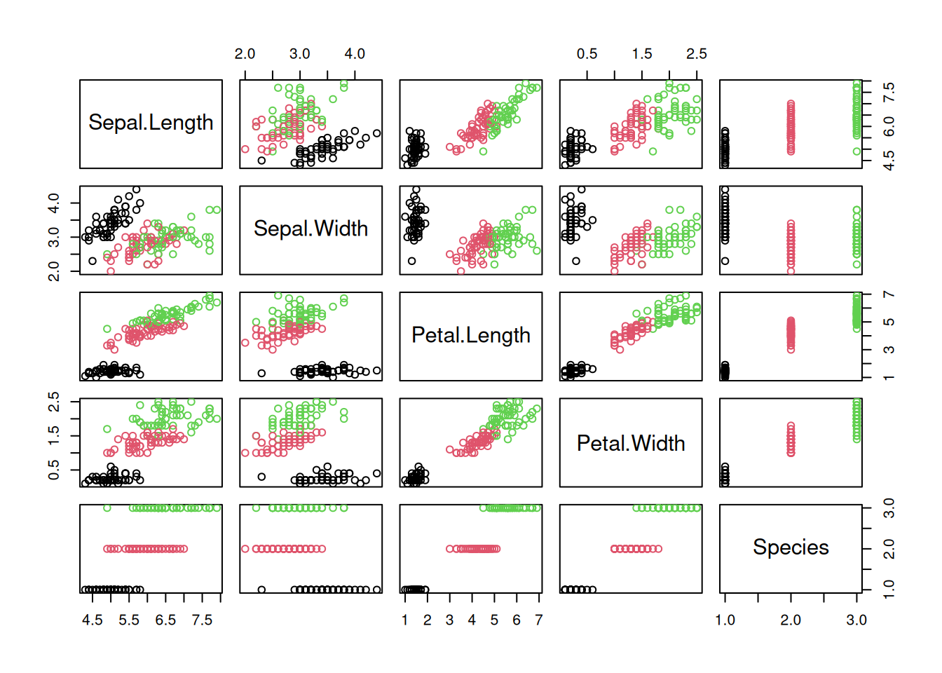
ggplot(iris, aes(Sepal.Length, Sepal.Width)) +
  geom_hex(bins = 10) +
  geom_jitter(color = "red")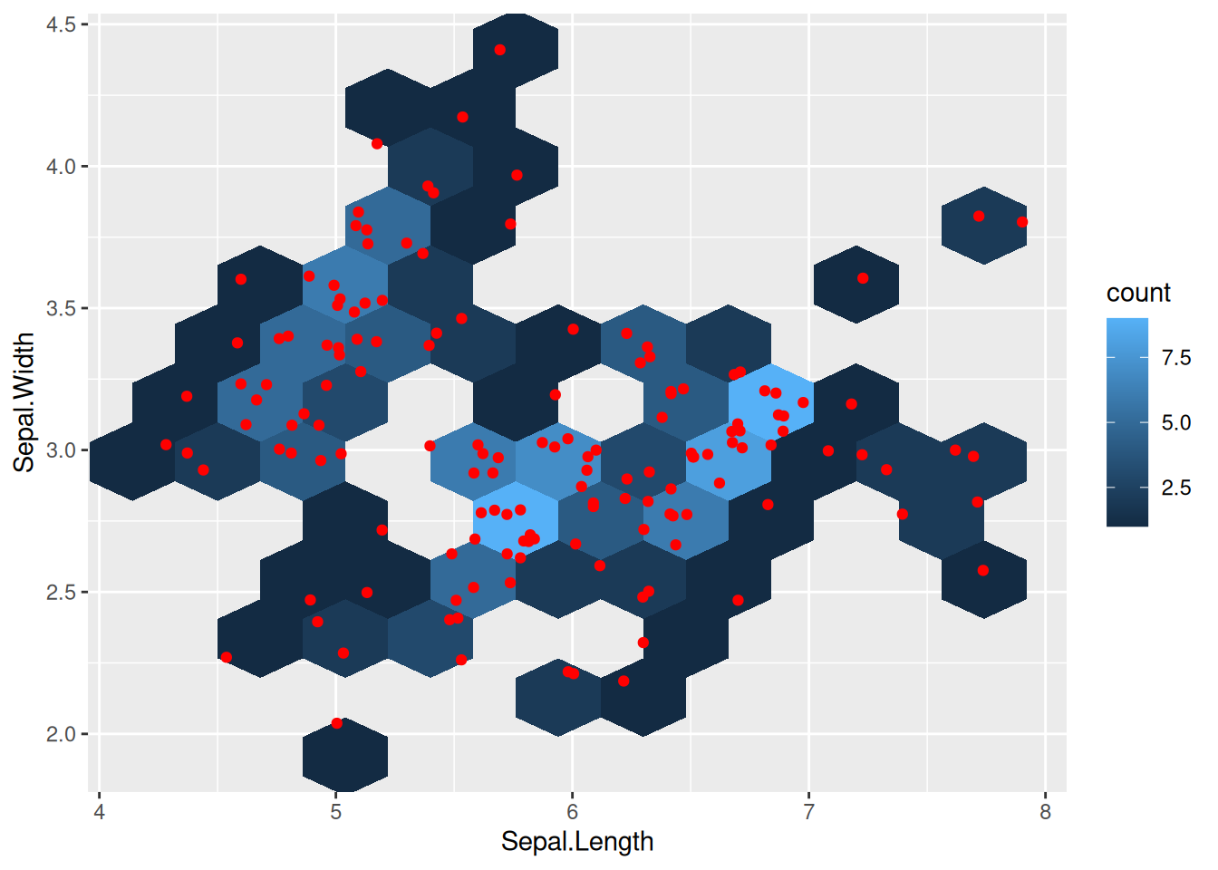
A.1.6.2 Kernel Density Estimate (KDE)
Kernel density
estimation is
used to estimate the probability density function (distribution) of a
feature. It works by replacing each value with a kernel function (often
a Gaussian) and then adding them up. The result is an estimated
probability density function that looks like a smoothed version of the
histogram. The bandwidth (bw) of the kernel controls the amount of
smoothing.
ggplot(iris, aes(Petal.Length)) +
  geom_density(bw = .2) +
  geom_rug(alpha = 1/2)
Kernel density estimates can also be done in two dimensions.
ggplot(iris, aes(Sepal.Length, Sepal.Width)) +
  geom_density_2d_filled() +
  geom_jitter()
A.2 Visualization
Visualization uses several components to convey information:
- Symbols: Circles, dots, lines, bars, …
- Position: Axes (labels and units) and the origin (0/0) are important.
- Length, Size and Area: Should only be used if it faithfully represents information.
- Color: A color should not overpower another. Limit to 3 or 4 colors.
- Angle: Human eyes are not good at comparing angles!
All components of the plot need to convey information. E.g., do not use color just to make it more colorful. All good visualizations show the important patterns clearly.
For space reasons, the chapter on data exploration and visualization was moved from the printed textbook and can now be found in the Data Exploration Web Chapter.
The most important R-base plot functions are plot(), barplot(), hist(), and pairs().
Here, we will use mainly the more flexible ggplot2 library. The gg in ggplot2
stands for Grammar of Graphics introduced by Wilkinson (2005). The
main idea is that every graph is built from the same basic components:
- the data,
- a coordinate system, and
- visual marks representing the data (geoms).
In ggplot2, the components are combined using the + operator.
ggplot(data, mapping = aes(x = ..., y = ..., color = ...)) +
  geom_point()
Since we typically use a Cartesian coordinate system, ggplot uses that
by default. Each geom_ function uses a stat_ function to calculate
what is visualizes. For example, geom_bar uses stat_count to create
a bar chart by counting how often each value appears in the data (see
? geom_bar). geom_point just uses the stat "identity" to display
the points using the coordinates as they are.
Additional components like the main title, axis labels, and different scales can be also added. A great introduction can be found in the Section on Data Visualization (Wickham, Çetinkaya-Rundel, and Grolemund 2023), and very useful is RStudio’s Data Visualization Cheatsheet.
Next, we go through the basic visualizations used when working with data.
A.2.1 Histogram
Histograms show the distribution of a single continuous feature. The x-axis cuts the variable into discrete buckets and the y-axis shows how many observations fall into each bucket. This plot should be used to inspect each continuous variable to:
- Detect outliers (i.e., single observation that is very far to the right in the plot) or recording mistakes (e.g., a too large frequency at 0 may indicate that missing values were by mistake converted to 0).
- Understand the distribution. Do we have a single normal distribution or are there several peaks which can indicate that there multiple groups in the data.
hist(iris$Petal.Width)
The ggplot equivalent uses the histogram geometry.
ggplot(iris, aes(Petal.Width)) + geom_histogram(bins = 20)
The plot shows not just a single normal distribution, but at least two peaks indicating that the data may be a mixture of two or three different groups.
We know that the Iris data set contains three groups (types of iris) and we have a variable indicating the group. This group information can be easily added as an aesthetic to the histogram.
ggplot(iris, aes(Petal.Width)) +
         geom_histogram(bins = 20, aes(fill = Species))
The bars appear stacked with a green blocks on top pf blue blocks.
To display the three distributions behind each other, we change position
for placement and make the bars slightly translucent using alpha.
ggplot(iris, aes(Petal.Width)) +
         geom_histogram(bins = 20, aes(fill = Species), alpha = .5, position = 'identity')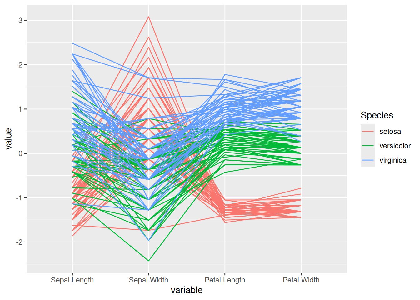
A.2.2 Boxplot
Boxplots are used to compare the distribution of a feature between different groups. The horizontal line in the middle of the boxes are the group-wise medians, the boxes span the interquartile range. The whiskers (vertical lines) span typically 1.4 times the interquartile range. Points that fall outside that range are typically outliers shown as dots.
ggplot(iris, aes(Species, Sepal.Length)) +
  geom_boxplot()
The Iris data has very few outliers and only the group Virginica shows a single dot. We can also see that the box for Setosa is much lower then the other two, indicating that this group has a much smaller sepal length.
The group-wise medians can also be calculated directly.
iris |> group_by(Species) |>
  summarize(across(where(is.numeric), median))
## # A tibble: 3 × 5
##   Species  Sepal.Length Sepal.Width Petal.Length Petal.Width
##   <fct>           <dbl>       <dbl>        <dbl>       <dbl>
## 1 setosa            5           3.4         1.5          0.2
## 2 versico…          5.9         2.8         4.35         1.3
## 3 virgini…          6.5         3           5.55         2
To compare the distribution of the four features using a ggplot boxplot, we first have to transform the data into long format (i.e., all feature values are combined into a single column).
library(tidyr)
iris_long <- iris |>
  mutate(id = row_number()) |>
  pivot_longer(1:4)

ggplot(iris_long, aes(name, value)) +
  geom_boxplot() +
  labs(y = "Original value")
This visualization is only useful if all features have roughly the same range. The data can be scaled first to compare the distributions.
library(tidyr)


scale_numeric <- function(x)
  x |>
  mutate(across(where(is.numeric),
                function(y) (y - mean(y, na.rm = TRUE)) / sd(y, na.rm = TRUE)))

iris_long_scaled <- iris |>
  scale_numeric() |>
  mutate(id = row_number()) |> pivot_longer(1:4)

ggplot(iris_long_scaled, aes(name, value)) +
  geom_boxplot() +
  labs(y = "Scaled value")
A.2.3 Scatter plot
Scatter plots show the relationship between two continuous features.
plot(iris$Petal.Length, iris$Sepal.Length, col = iris$Species)
ggplot uses the point geometry.
ggplot(iris, aes(x = Petal.Length, y = Sepal.Length)) +
  geom_point(aes(color = Species))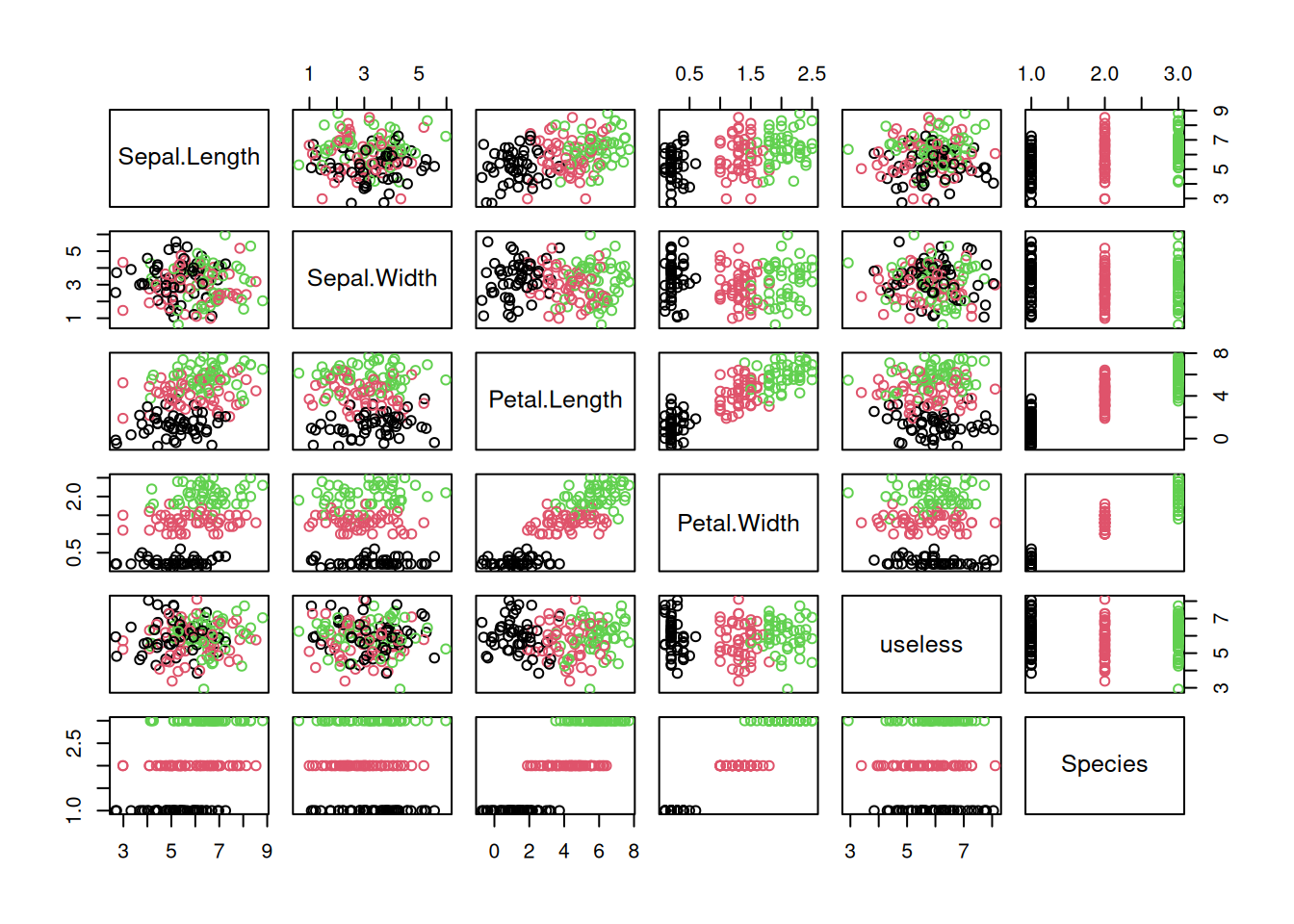
We see that Setosa flowers are well separated from the other two flowers. It would be easy to identify them by a simple threshold of 2.5 cm on petal length. The other two species are closer to each other and mix somewhat together. Outliers would be single points that are far from other points. This data set does not contain outliers.
We can also identify correlation between the variables using this plot. Here,
we see that Sepal length tends to increase when petal length increases
indicating a positive linear correlation between the variables.
This relationship can be visualized by adding a regression line using geom_smooth with the
linear model method (“lm”). A confidence interval
for the regression is also shown.
This can be suppressed using se = FALSE.
ggplot(iris, aes(x = Petal.Length, y = Sepal.Length)) +
  geom_point(aes(color = Species)) +
  geom_smooth(method = "lm")
## `geom_smooth()` using formula = 'y ~ x'
We can also perform group-wise linear regression by adding the color
aesthetic also to geom_smooth.
ggplot(iris, aes(x = Petal.Length, y = Sepal.Length)) +
  geom_point(aes(color = Species)) +
  geom_smooth(method = "lm", aes(color = Species))
## `geom_smooth()` using formula = 'y ~ x'
We see that within the groups Versicolor and Virginica there is a much stronger linear relationship then for the group Setosa.
The same can be achieved by using the color aesthetic in the ggplot call,
then it applies to all geoms.
A.2.4 Scatter Plot Matrix
A scatter plot matrix show the relationship between all pairs of features by arranging panels in a matrix. First, lets look at a regular R-base plot.
pairs(iris, col = iris$Species)
The package GGally provides a way more sophisticated visualization.
library("GGally")
ggpairs(iris,  aes(color = Species), progress = FALSE)
## `stat_bin()` using `bins = 30`. Pick better value
## `binwidth`.
## `stat_bin()` using `bins = 30`. Pick better value
## `binwidth`.
## `stat_bin()` using `bins = 30`. Pick better value
## `binwidth`.
## `stat_bin()` using `bins = 30`. Pick better value
## `binwidth`.
Additional plots (histograms, density estimates and box plots) and correlation coefficients are shown in different panels. See the Data Quality section for a description of how to interpret the different panels.
A.2.5 Matrix Visualization
Matrix visualization shows the values in the matrix using a color scale.
We need the long format for tidyverse.
iris_long <- as_tibble(iris_matrix) |>
  mutate(id = row_number()) |>
  pivot_longer(1:4)

head(iris_long)
## # A tibble: 6 × 3
##      id name         value
##   <int> <chr>        <dbl>
## 1     1 Sepal.Length   5.1
## 2     1 Sepal.Width    3.5
## 3     1 Petal.Length   1.4
## 4     1 Petal.Width    0.2
## 5     2 Sepal.Length   4.9
## 6     2 Sepal.Width    3
ggplot(iris_long, aes(x = name, y = id)) +
  geom_tile(aes(fill = value))
Smaller values are darker. Package seriation provides a simpler
plotting function.

We can scale the features to z-scores to make them better comparable.
This reveals red and blue blocks. Each row is a flower and the flowers in the Iris dataset are sorted by species. The blue blocks for the top 50 flowers show that these flowers are smaller than average for all but Sepal.Width and the red blocks show that the bottom 50 flowers are larger for most features.
Often, reordering data matrices help with visualization. A reordering technique is called seriation. Ir reorders rows and columns to place more similar points closer together.

We see that the rows (flowers) are organized from very blue to very red and the features are reordered to move Sepal.Width all the way to the right because it is very different from the other features.
A.2.6 Correlation Matrix
A correlation matrix contains the correlation between features.
cm1 <- iris |>
  select(-Species) |>
  as.matrix() |>
  cor()
cm1
##              Sepal.Length Sepal.Width Petal.Length
## Sepal.Length       1.0000     -0.1176       0.8718
## Sepal.Width       -0.1176      1.0000      -0.4284
## Petal.Length       0.8718     -0.4284       1.0000
## Petal.Width        0.8179     -0.3661       0.9629
##              Petal.Width
## Sepal.Length      0.8179
## Sepal.Width      -0.3661
## Petal.Length      0.9629
## Petal.Width       1.0000
Package ggcorrplot provides a ggplot-based visualization for correlation matrices.
library(ggcorrplot)
ggcorrplot(cm1)
Package seriation provides a method to reorder the variables in the
correlation matrix so groups of highly correlated variables become
easier to see.
cm1 |> permute(order = "AOE") |> ggcorrplot()
We would assume that as flowers grow, all measurements increase. The visualization shows that sepal length, petal length, and petal width are highly correlated with each other. Interestingly, sepal width has a negative correlation to the other variables which seems to contradict the initial assumption. However, calculating correlation matrices for each group independently show that this is just an artifact resulting from group Setosa having a very large sepal width.
iris_by_group <- split(iris, f = iris$Species)
lapply(iris_by_group, FUN = function(x) x |>
         select(-Species) |>
         as.matrix() |>
         cor() |>
         permute(order = "AOE") |>
         ggcorrplot()
)
## $setosa
##
## $versicolor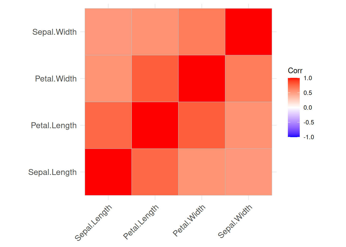
##
## $virginica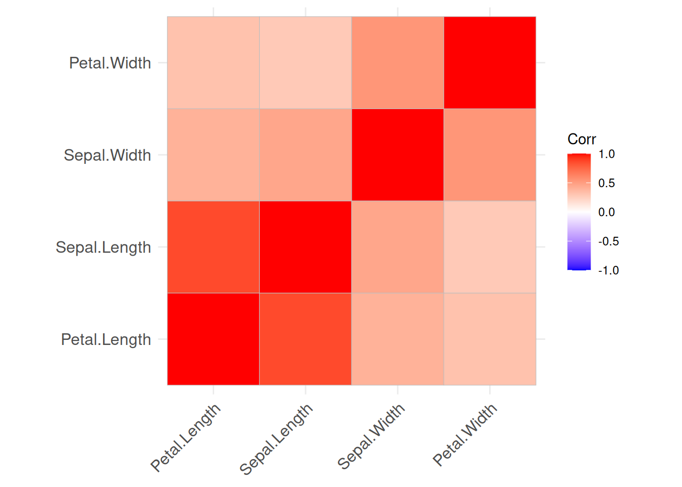
Correlations can also be calculates between objects by transposing the data matrix.
cm2 <- iris |>
  select(-Species) |>
  as.matrix() |>
  t() |>
  cor()

ggcorrplot(cm2)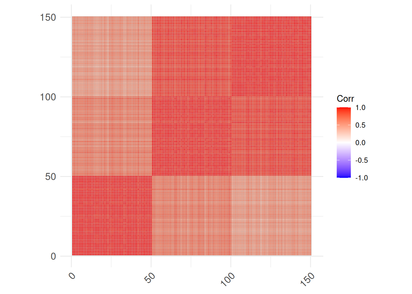
Object-to-object correlations can be used as a measure of similarity. The dark red blocks indicate different species.
A.2.7 Parallel Coordinates Plot
Parallel coordinate plots can visualize several features in a single plot. Lines connect the values for each object (flower).
library(GGally)
ggparcoord(iris, columns = 1:4, groupColumn = 5)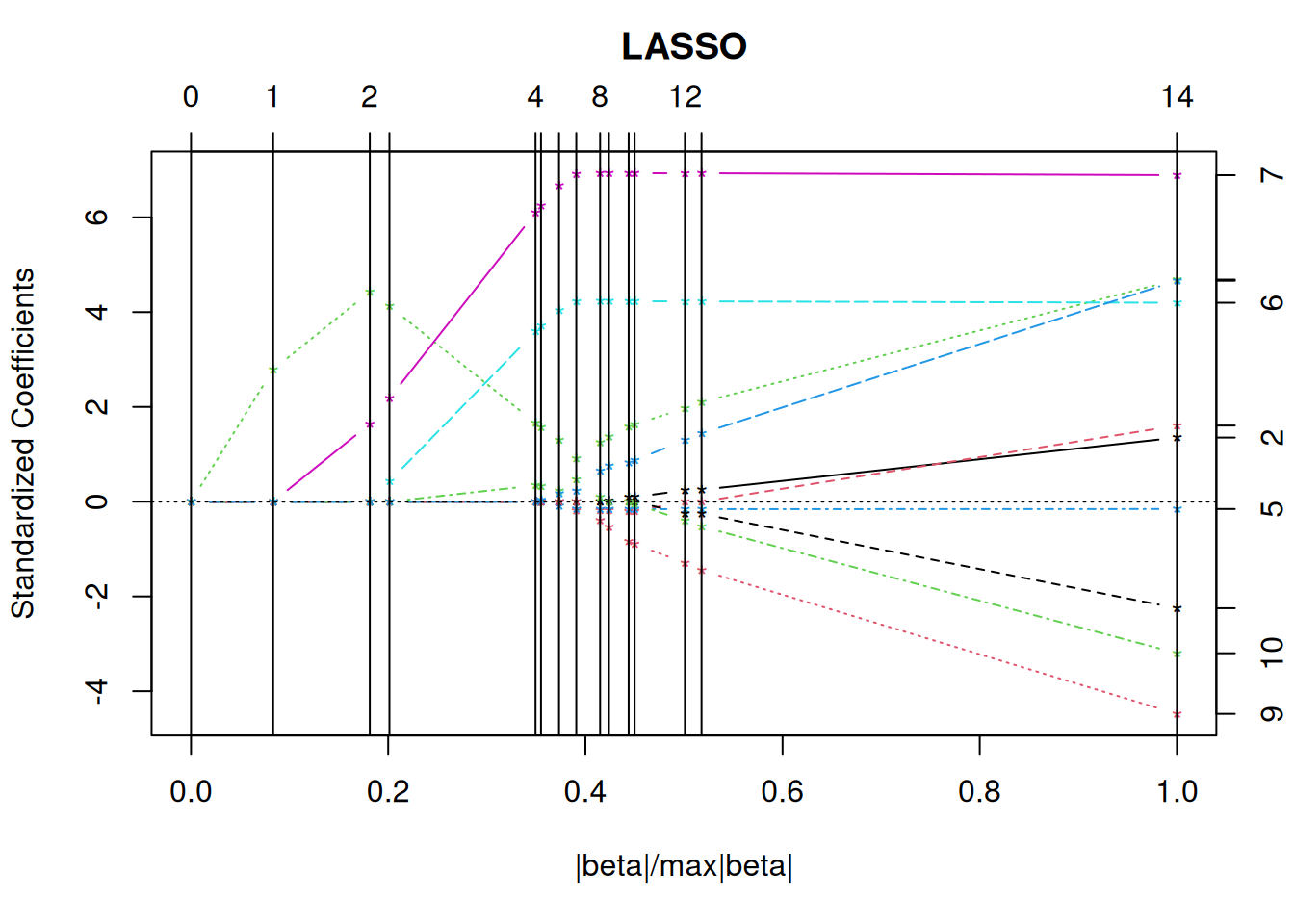
The plot can be improved by reordering the variables to place correlated features next to each other.
o <- seriate(as.dist(1-cor(iris[,1:4])), method = "BBURCG")
get_order(o)
## Petal.Length  Petal.Width Sepal.Length  Sepal.Width
##            3            4            1            2
ggparcoord(iris,
           columns = as.integer(get_order(o)),
           groupColumn = 5)
A.2.8 Star Plot
Star plots are a type of radar chart to visualize three or more quantitative variables represented on axes starting from the plot’s origin. R-base offers a simple star plot. We plot the first 5 flowers of each species.
flowers_5 <- iris[c(1:5, 51:55, 101:105), ]
flowers_5
## # A tibble: 15 × 5
##    Sepal.Length Sepal.Width Petal.Length Petal.Width Species
##           <dbl>       <dbl>        <dbl>       <dbl> <fct>
##  1          5.1         3.5          1.4         0.2 setosa
##  2          4.9         3            1.4         0.2 setosa
##  3          4.7         3.2          1.3         0.2 setosa
##  4          4.6         3.1          1.5         0.2 setosa
##  5          5           3.6          1.4         0.2 setosa
##  6          7           3.2          4.7         1.4 versic…
##  7          6.4         3.2          4.5         1.5 versic…
##  8          6.9         3.1          4.9         1.5 versic…
##  9          5.5         2.3          4           1.3 versic…
## 10          6.5         2.8          4.6         1.5 versic…
## 11          6.3         3.3          6           2.5 virgin…
## 12          5.8         2.7          5.1         1.9 virgin…
## 13          7.1         3            5.9         2.1 virgin…
## 14          6.3         2.9          5.6         1.8 virgin…
## 15          6.5         3            5.8         2.2 virgin…
stars(flowers_5[, 1:4], ncol = 5)
A.2.9 More Visualizations
A well organized collection of visualizations with code can be found at The R Graph Gallery.
A.3 Exercises*
The R package palmerpenguins contains measurements for penguin of different species from the Palmer Archipelago, Antarctica. Install the package. It provides a CSV file which can be read in the following way:
library("palmerpenguins")
penguins <- read_csv(path_to_file("penguins.csv"))
## Rows: 344 Columns: 8
## ── Column specification ────────────────────────────────────
## Delimiter: ","
## chr (3): species, island, sex
## dbl (5): bill_length_mm, bill_depth_mm, flipper_length_m...
##
## ℹ Use `spec()` to retrieve the full column specification for this data.
## ℹ Specify the column types or set `show_col_types = FALSE` to quiet this message.
head(penguins)
## # A tibble: 6 × 8
##   species island    bill_length_mm bill_depth_mm
##   <chr>   <chr>              <dbl>         <dbl>
## 1 Adelie  Torgersen           39.1          18.7
## 2 Adelie  Torgersen           39.5          17.4
## 3 Adelie  Torgersen           40.3          18
## 4 Adelie  Torgersen           NA            NA
## 5 Adelie  Torgersen           36.7          19.3
## 6 Adelie  Torgersen           39.3          20.6
## # ℹ 4 more variables: flipper_length_mm <dbl>,
## #   body_mass_g <dbl>, sex <chr>, year <dbl>
Create in RStudio a new R Markdown document. Apply the code in the sections of this chapter to the data set to answer the following questions.
- Group the penguins by species, island or sex. What can you find out?
- Create histograms and boxplots for each continuous variable. Interpret the distributions.
- Create scatterplots and a scatterplot matrix. Can you identify correlations?
- Create a reordered correlation matrix visualization. What does the visualizations show?
Make sure your markdown document contains now a well formatted report.
Use the Knit button to create a HTML document.