1 Introduction
Data mining has the goal of finding patterns in large data sets. The popular data mining textbook Introduction to Data Mining (Tan et al. 2017) covers many important aspects of data mining. This companion contains annotated R code examples to complement the textbook. To make following along easier, we follow the chapters in data mining textbook which is organized by the main data mining tasks:
Data covers types of data. We also include data preparation and exploratory data analysis in Appendix A Data Exploration and Visualization.
Classification: Basic Concepts introduces the purpose of classification, basic classifiers using decision trees, and model training and evaluation.
Classification: Alternative Techniques introduces and compares methods including rule-based classifiers, nearest neighbor classifiers, naive Bayes classifier, logistic regression and artificial neural networks.
Association Analysis: Basic Concepts covers algorithms for frequent itemset and association rule generation and analysis including visualization.
Association Analysis: Advanced Concepts covers categorical and continuous attributes, concept hierarchies, and frequent sequence pattern mining.
Cluster Analysis discusses clustering approaches including k-means, hierarchical clustering, DBSCAN and how to evaluate clustering results.
For completeness, we have added sections on Regression and on Logistic Regression to the Appendix.
Sections with names followed by an asterisk contain code examples for methods that are not included in the data mining textbook.
This book assumes that you are familiar with the basics of R, how to run R code, and install packages. The rest of this chapter will provide an overview and point you to where you can learn more about R and the used packages.
1.1 Used Software
To use this book, you need to have the current version of R and RStudio Desktop installed.
Each book chapter will use a set of packages that must be installed. The installation code can be found at the beginning of each chapter. Here is the code to install the packages used in this chapter:
pkgs <- c('tidyverse')

pkgs_install <- pkgs[!(pkgs %in% installed.packages()[,"Package"])]
if(length(pkgs_install)) install.packages(pkgs_install)
The code examples in this book use the R package collection tidyverse
(Wickham 2023b) to manipulate data. Tidyverse also includes the package
ggplot2 (Wickham et al. 2025) for visualization. Tidyverse packages make
working with data in R very convenient. Data analysis and data mining
reports are typically done by creating
R Markdown documents. Everything in R is built on top of the
core R programming language and the packages that are automatically
installed with R. This is referred to as Base-R.
1.2 Base-R
Base-R is covered in detail in An Introduction to R. The most important differences between R and many other programming languages like Python are:
- R is a functional programming language (with some extensions).
- R only uses vectors and operations are vectorized. You rarely will see loops.
- R starts indexing into vectors with 1 not 0.
- R uses
<-for assignment. Do not use=for assignment.
1.2.1 Vectors
The basic data structure in R is a vector of real numbers called numeric.
Scalars do not exist, they are just vectors of length 1.
We can combine values into a vector using the combine function c().
Special values for infinity (Inf) and missing values (NA) can be used.
x <- c(10.4, 5.6, Inf, NA, 21.7)
x
## [1] 10.4  5.6  Inf   NA 21.7
We often use sequences. A simple sequence of integers can be produced using
the colon operator in the form from:to.
3:10
## [1]  3  4  5  6  7  8  9 10
More complicated sequences can be created using seq().
y <- seq(from = 0, to = 1, length.out = 5)
y
## [1] 0.00 0.25 0.50 0.75 1.00
1.2.2 Vectorized Operations
Operations are vectorized and applied to each element, so loops are typically not necessary in R.
x + 1
## [1] 11.4  6.6  Inf   NA 22.7
Comparisons are also vectorized and are performed element-wise. They
return a logical vector (R’s name for the datatype Boolean).
x > y
## [1] TRUE TRUE TRUE   NA TRUE
1.2.3 Subsetting
We can select vector elements using the [ operator like in other
programming languages but the index always starts at 1.
We can select elements 1 through 3 using an index sequence.
x[1:3]
## [1] 10.4  5.6  Inf
Negative indices remove elements. We can select all but the first element.
x[-1]
## [1]  5.6  Inf   NA 21.7
We can use any function that creates a logical vector for subsetting.
Here we select all non-missing values using the function is.na().
is.na(x)
## [1] FALSE FALSE FALSE  TRUE FALSE
x[!is.na(x)] # select all non-missing values
## [1] 10.4  5.6  Inf 21.7
We can also assign values to a selection. For example, this code gets rid of infinite values.
x[!is.finite(x)] <- NA
x
## [1] 10.4  5.6   NA   NA 21.7
1.2.4 Names
Another useful thing is that vectors and many other data structures in R support names. For example, we can store the count of cars with different colors in the following way.
counts <- c(12, 5, 18, 13)
names(counts) <- c("black", "red", "white", "silver")

counts
##  black    red  white silver
##     12      5     18     13
Names can then be used for subsetting and we do not have to remember what entry is associated with what color.
counts[c("red", "silver")]
##    red silver
##      5     13
1.2.5 Lists
Lists can store a sequence of elements of different datatypes.
lst <- list(name = "Fred", spouse = "Mary", no.children = 3,
  child.ages = c(4, 7, 9))
lst
## $name
## [1] "Fred"
##
## $spouse
## [1] "Mary"
##
## $no.children
## [1] 3
##
## $child.ages
## [1] 4 7 9
Elements can be accessed by index or name.
lst[[2]]
## [1] "Mary"
lst$child.ages
## [1] 4 7 9
Many functions in R return a list.
1.2.6 Data Frames
A data frame looks like a spread sheet and represents a matrix-like structure with rows and columns where different columns can contain different data types.
df <-  data.frame(name = c("Michael", "Mark", "Maggie"),
                  children = c(2, 0, 2), age = c(40, 30, 50))
df
##      name children age
## 1 Michael        2  40
## 2    Mark        0  30
## 3  Maggie        2  50
Data frames are stored as a list of columns. We can access elements using matrix subsetting (missing indices mean the whole row or column) or list subsetting. Here are some examples
df[1,1]
## [1] "Michael"
df[, 2]
## [1] 2 0 2
df$name
## [1] "Michael" "Mark"    "Maggie"
Data frames are the most important way to represent data for data mining.
1.2.7 Matrices
A matrix is similar to a data frame but it only contains values of the same data type.
Some data mining algorithms require a numeric matrix as the input. The numeric part of
Data frames can be coerced into a matrix. In the following example we cast the last two columns
of df into a matrix. Column names are taken from the data frame and we add manually row names.
x <- as.matrix(df[, -1])
rownames(x) <- df[, 1]
x
##         children age
## Michael        2  40
## Mark           0  30
## Maggie         2  50
Data type coercion functions in R start with as.. Examples as as.logical(),
as.data.frame(), as.list(), etc.
1.2.8 Strings
R uses character vectors where the datatype character represents a string
and not like in other programming language just a single character.
R accepts double or single quotation marks to delimit strings.
string <- c("Hello", "Goodbye")
string
## [1] "Hello"   "Goodbye"
Strings can be combined using paste().
paste(string, "World!")
## [1] "Hello World!"   "Goodbye World!"
Note that paste is vectorized and the string "World!" is used twice to
match the length of string. This behavior is called in R recycling
and works if one vector’s length is an exact multiple of the other
vector’s length. The special case where one vector has one element is
particularly often used. We have used it already above in the expression
x + 1 where one is recycled for each element in x.
1.2.9 Objects
Other often used data structures include list, data.frame, matrix,
and factor. In R, everything is an object. Objects are printed by
either just using the object’s name or put it explicitly into the
print() function.
x
##         children age
## Michael        2  40
## Mark           0  30
## Maggie         2  50
For many objects, a summary can be created.
summary(x)
##     children         age
##  Min.   :0.00   Min.   :30
##  1st Qu.:1.00   1st Qu.:35
##  Median :2.00   Median :40
##  Mean   :1.33   Mean   :40
##  3rd Qu.:2.00   3rd Qu.:45
##  Max.   :2.00   Max.   :50
Objects have a class.
class(x)
## [1] "matrix" "array"
Some functions are generic, meaning that they do something else
depending on the class of the first argument. For example, plot() has
many methods implemented to visualize data of different classes. The
specific function is specified with a period after the method name.
There also exists a default method. For plot, this method is
plot.default(). Different methods may have their own manual page, so
specifying the class with the dot can help finding the documentation.
It is often useful to know what information it stored in an object.
str() returns a humanly readable string representation of the object.
str(x)
##  num [1:3, 1:2] 2 0 2 40 30 50
##  - attr(*, "dimnames")=List of 2
##   ..$ : chr [1:3] "Michael" "Mark" "Maggie"
##   ..$ : chr [1:2] "children" "age"
1.2.10 Functions
Functions work like in many other languages. However, they also operate vectorized and arguments can be specified positional or by named. An increment function can be defined as:
inc <- function(x, by = 1) {
    x + by
  }
The value of the last evaluated expression in the function body is
automatically returned by the function. The function can also
explicitly use return(return_value).
Calling the increment function on vector with the numbers 1 through 10.
v <- 1:10
inc(v, by = 2)
##  [1]  3  4  5  6  7  8  9 10 11 12
Before you implement your own function, check if R does not already provide an
implementation.
R has many built-in functions like min(), max(), mean(), and
sum().
1.2.11 Plotting
Basic plotting in Base-R is done by calling plot().
plot(x, y)Other plot functions are pairs(), hist(), barplot(). In this book,
we will focus on plots created with the ggplot2 package introduced below.
1.2.12 More on R
There is much to learn about R. It is highly recommended to go through the official An Introduction to R manual. There is also a good Base R Cheat Sheet available.
1.3 R Markdown
R Markdown is a simple method to include R code inside a text document
written using markdown syntax. Using R markdown is especially convention to analyze
data and compose a data mining report. RStudio makes creating and
translating R Markdown document easy. Just choose
File -> New File -> R Markdown... RStudio will create a small
demo markdown document that already includes examples for code and how
to include plots. You can switch to visual mode if you prefer a What You
See Is What You Get editor.
To convert the R markdown document to HTML, PDF or Word, just click the Knit button. All the code will be executed and combined with the text into a complete document.
Examples and detailed documentation can be found on RStudio’s R Markdown website and in the R Markdown Cheatsheet.
1.4 Tidyverse
tidyverse (Wickham 2023b) is a collection of many useful packages that
work well together by sharing design principles and data structures.
tidyverse also includes ggplot2 (Wickham et al. 2025) for visualization.
In this book, we will typically use
- tidyverse tibbles to replace R’s built-in data.frames,
- the pipe operator
|>to chain functions together, and - data transformation functions like
filter(),arrange(),select(),group_by(), andmutate()provided by the tidyverse packagedplyr(Wickham et al. 2023).
A good introduction can be found in the Section on Data Transformation (Wickham, Çetinkaya-Rundel, and Grolemund 2023).
To use tidyverse, we first have to load the tidyverse meta package.
library(tidyverse)
## ── Attaching core tidyverse packages ──── tidyverse 2.0.0 ──
## ✔ dplyr     1.1.4     ✔ readr     2.1.5
## ✔ forcats   1.0.0     ✔ stringr   1.5.2
## ✔ ggplot2   4.0.0     ✔ tibble    3.3.0
## ✔ lubridate 1.9.4     ✔ tidyr     1.3.1
## ✔ purrr     1.1.0
## ── Conflicts ────────────────────── tidyverse_conflicts() ──
## ✖ dplyr::filter() masks stats::filter()
## ✖ dplyr::lag()    masks stats::lag()
## ℹ Use the conflicted package (<http://conflicted.r-lib.org/>) to force all conflicts to become errors
Conflicts may indicate that base R functionality is changed by tidyverse packages.
1.4.1 Tibbles
Tibbles are tidyverse’s replacement for R’s data.frame. Here is a short example that analyses the vitamin C content of different fruits that will get you familiar with the basic syntax. We create a tibble with the price in dollars per pound and the vitamin C content in milligrams (mg) per pound for five different fruits.
fruit <- tibble(
  name = c("apple", "banana", "mango", "orange", "lime"),
  price = c(2.5, 2.0, 4.0, 3.5, 2.5),
  vitamin_c = c(20, 45, 130, 250, 132),
  type = c("pome", "tropical", "tropical", "citrus", "citrus"))
fruit
## # A tibble: 5 × 4
##   name   price vitamin_c type
##   <chr>  <dbl>     <dbl> <chr>
## 1 apple    2.5        20 pome
## 2 banana   2          45 tropical
## 3 mango    4         130 tropical
## 4 orange   3.5       250 citrus
## 5 lime     2.5       132 citrus
Next, we will transform the data to find affordable fruits with a high vitamin C content and then visualize the data.
1.4.2 Transformations
We can modify the table by adding a column with the vitamin C (in mg)
that a dollar buys using mutate(). Then we filter only rows with
fruit that provides more than 20 mg per dollar, and finally we arrange the data
rows by the vitamin C per dollar from largest to smallest.
affordable_vitamin_c_sources <- fruit |>
  mutate(vitamin_c_per_dollar = vitamin_c / price) |>
  filter(vitamin_c_per_dollar > 20) |>
  arrange(desc(vitamin_c_per_dollar))

affordable_vitamin_c_sources
## # A tibble: 4 × 5
##   name   price vitamin_c type     vitamin_c_per_dollar
##   <chr>  <dbl>     <dbl> <chr>                   <dbl>
## 1 orange   3.5       250 citrus                   71.4
## 2 lime     2.5       132 citrus                   52.8
## 3 mango    4         130 tropical                 32.5
## 4 banana   2          45 tropical                 22.5
The pipes operator |> lets you pass the value to the left (often the
result of a function) as the first argument to the function on the
right. This makes composing a sequence of function calls to transform
data much easier to write and read.
You will often see %>% as the pipe operator, especially in examples using
tidyverse. Both operators work similarly where |> is a native R operator
while %>% is provided in the extension package magrittr.
The code above starts with the fruit
data and pipes it through three transformation functions. The final
result is assigned with <- to a variable.
We can create summary statistics of price using summarize().
affordable_vitamin_c_sources |>
  summarize(min = min(price),
            mean = mean(price),
            max = max(price))
## # A tibble: 1 × 3
##     min  mean   max
##   <dbl> <dbl> <dbl>
## 1     2     3     4
We can also calculate statistics for groups by first grouping the data
with group_by(). Here
we produce statistics for fruit types.
affordable_vitamin_c_sources |>
  group_by(type) |>
  summarize(min = min(price),
            mean = mean(price),
            max = max(price))
## # A tibble: 2 × 4
##   type       min  mean   max
##   <chr>    <dbl> <dbl> <dbl>
## 1 citrus     2.5     3   3.5
## 2 tropical   2       3   4
Often, we want to apply the same function to multiple columns. This can
be achieved using across(columns, function).
affordable_vitamin_c_sources |>
  summarize(across(c(price, vitamin_c), mean))
## # A tibble: 1 × 2
##   price vitamin_c
##   <dbl>     <dbl>
## 1     3      139.
dplyr syntax and evaluation is slightly different from standard R
which may lead to confusion. One example is that column names can be
references without quotation marks. A very useful reference resource
when working with dplyr is the RStudio Data Transformation Cheatsheet
which covers on two pages almost everything you will need and also
contains contains simple example code that you can take and modify for
your use case.
1.4.3 ggplot2
For visualization, we will use mainly ggplot2. The gg in ggplot2
stands for Grammar of Graphics introduced by Wilkinson (2005). The
main idea is that every graph is built from the same basic components:
- the data,
- a coordinate system, and
- visual marks representing the data (geoms).
The main plotting function is ggplot(). The components of the plot
are combined using the + operator.
ggplot(data, mapping = aes(x = ..., y = ..., color = ...)) +
  geom_point()
Since we typically use a Cartesian coordinate system, ggplot() uses that
by default. Each geom_ function uses a stat_ function to calculate
what is visualizes. For example, geom_bar() uses stat_count() to create
a bar chart by counting how often each value appears in the data (see
? geom_bar). geom_point() just uses the stat "identity" to display
the points using the coordinates as they are. A great introduction can
be found in the Section on Data
Visualization (Wickham, Çetinkaya-Rundel, and Grolemund 2023),
and very useful is RStudio’s Data Visualization Cheatsheet.
We can visualize our fruit data as a scatter plot.
ggplot(fruit, aes(x = price, y = vitamin_c)) +
  geom_point()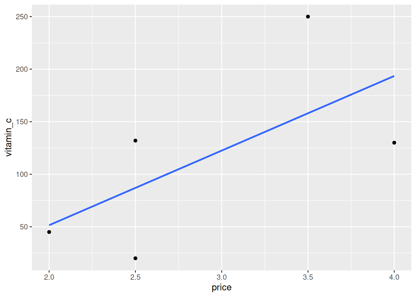
It is easy to add more geoms. For example, we can add a regression line
using geom_smooth with the method "lm" (linear model). We suppress
the confidence interval since we only have 3 data points.
ggplot(fruit, aes(x = price, y = vitamin_c)) +
  geom_point() +
  geom_smooth(method = "lm", se = FALSE)
## `geom_smooth()` using formula = 'y ~ x'
Alternatively, we can visualize each fruit’s vitamin C content per dollar using a bar chart.
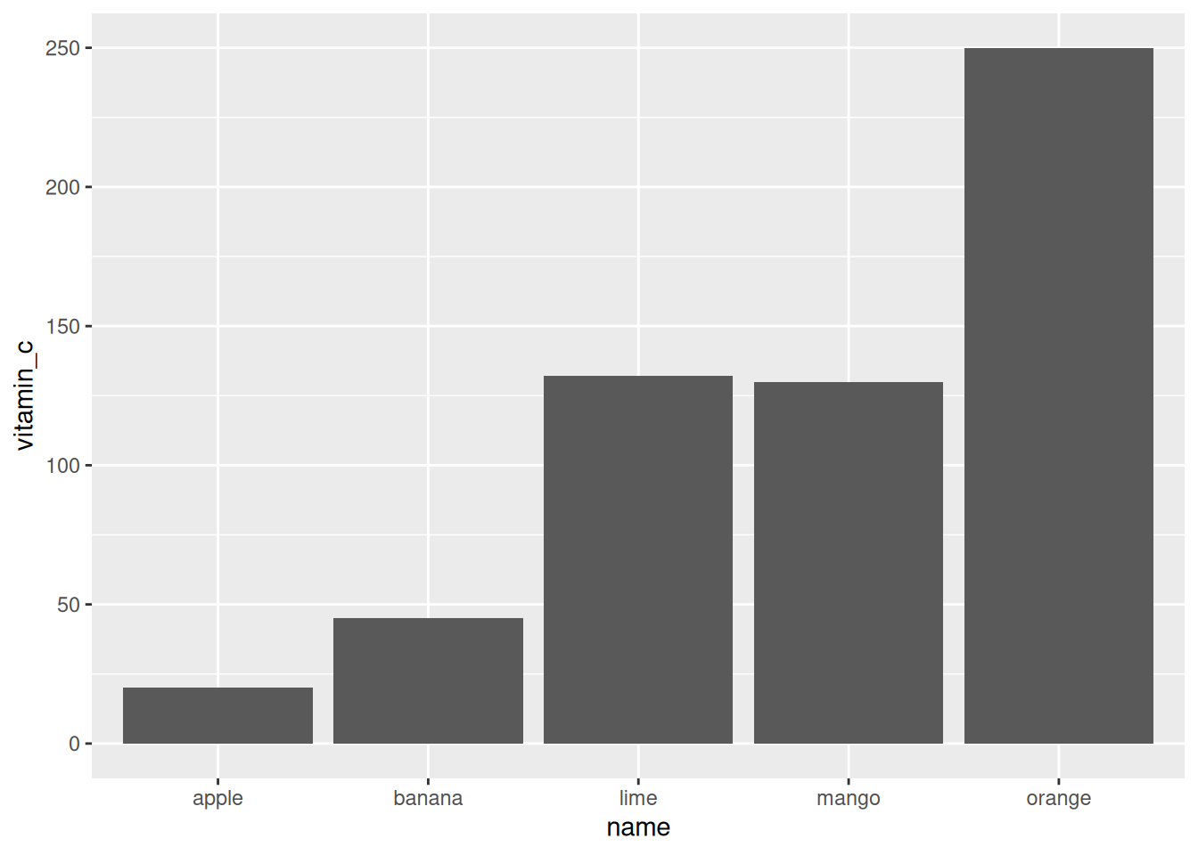
Note that geom_bar by default uses the stat_count function to
aggregate data by counting, but we just want to visualize the value in
the tibble, so we specify the identity function instead.